Apple kicked off its annual developer conference by unveiling the next major release of OS X, named Yosemite after California's Yosemite National Park. The OS X 10.10 update appears to bring more subtle refinements compared to feature-packed releases in previous years, but aside from a new paint job that’s cleaner and directly inspired by iOS' flatter UI, there were a couple of surprise new features that got big cheers from the crowd.
Visual refinements, redesigned Spotlight
Let’s start with design. Apple has done away with gradients and textures in favor of flatter icons and windows as well as plenty of translucency. If you’re familiar with iOS 7 you will feel right at home. Elements like the dock, title bars, Finder menus and sidebars are now translucent, adjusting their color temperature based on a user's selected background. There is also a new, "dark mode" that dims the entire interface to place the focus on the content.
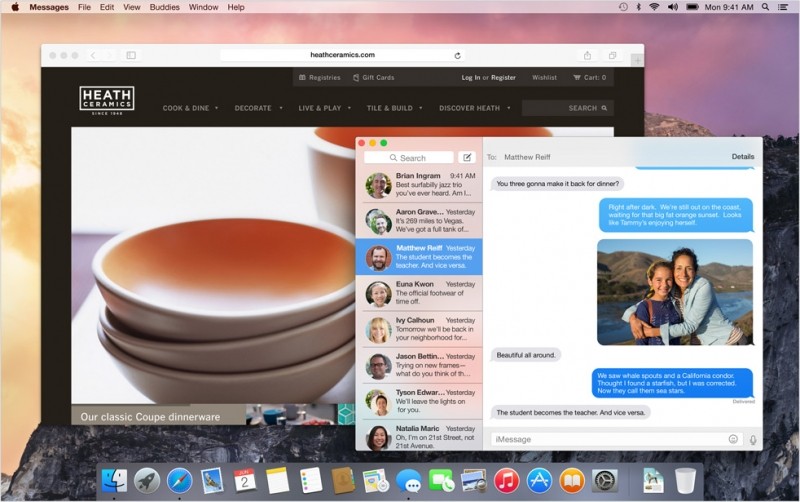
These changes extend to all of Apple’s built-in apps such as Mail, Messages, Calendar, and so on. Notification Center is also getting a few tweaks with a "Today" view and the ability to customise it with content from third-party apps.
Meanwhile, Spotlight got a massive revamp with a search bar appearing front and center -- watch out Alfred -- and better results.
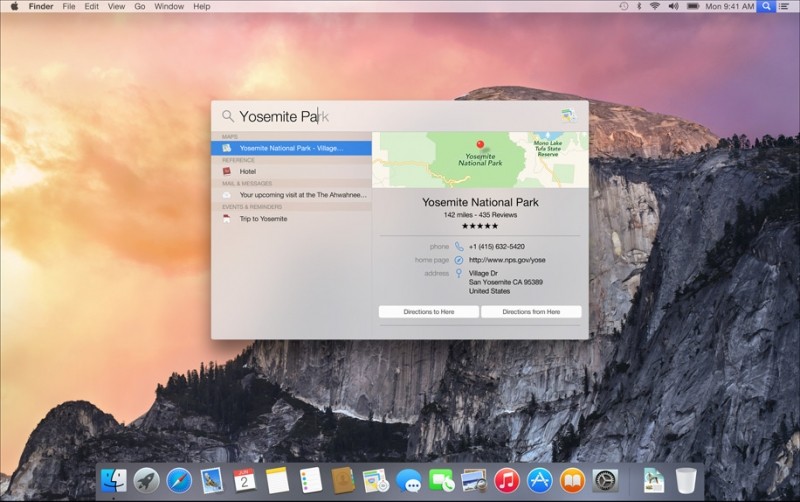
Spotlight can be used to bring up instant results for stuff like contacts as well as online lookups like restaurant information and Wikipedia entries, all from the same interface. This appears to be Apple’s way of bypassing Google for basic web searches and indirectly competing with Google Now's assisted results.
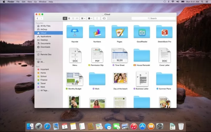
iCloud Drive
Apple appears to be taking on Dropbox head on with iCloud Drive, which brings all files stored in a user's iCloud account into folders accesible through Finder. Each app you use with iCloud Drive gets its own folder or you can can just drop files and folders and have them sync to the cloud a la Dropbox.
iCloud Drive files will sync across Macs and even Windows PCs.
Mail and Safari
Mail and Safari are getting a stripped down look and some new features to go with it. Most notably for the former is MailDrop. Basically you can now send large attachments up to 5GB in size through iCloud Drive. If the recipient is using Apple Mail he'll see the files as regular attachments or if they're on another client they'll get a secure link to them. This all happens automatically with large files so no need to attach with MailDrop manually.
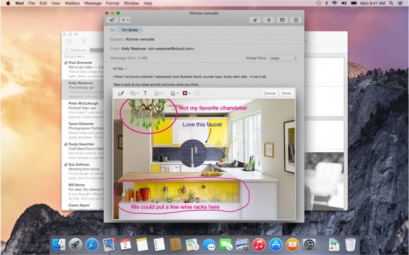
Also new in Mail is an annotation tool called Markup -- much like Evernote’s Skitch and many other screen grabbing tools -- that lets you jot down notes on top of pictures or PDFs before sending them. Markup is smart enough to recognize hand drawn arrows and speech bubbles to make them look nicer.
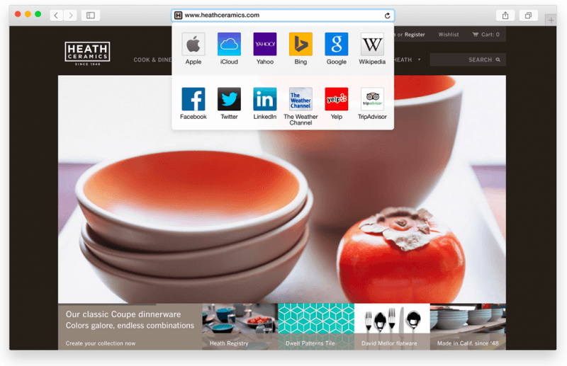
Safari has also received a significant revamp, both visually and under the hood. Favorites are now hidden by default, but users can access them via the address bar, which also displays Spotlight results as you type (again, skipping Google if possible). There’s a new tab view that shows thumbnails of all open tabs, stacking together all tabs belonging to the same website. The integrated share menu has been expanded with recent people you've messaged and RSS feeds, while Private browsing mode now opens on its own sandboxed window -- like Chrome.
Apple touted performance and efficiency improvements over Firefox and Chrome, which we’ll have to put to the test. And support for all the latest standards is there so you can watch, say, Netflix videos without installing Silverlight and get up to an extra 2 hours of battery life on a MacBook Air, according to Apple's numbers.
Continuity
Apple saved arguably the best bits of Yosemite for last, announcing that AirDrop between OS X and iOS is finally supported for seamlessly transferring files, and a new feature called Handoff that let's you start working on your desktop and pick up where you left off on your smartphone.
That works for iWork documents, emails, messages (now including SMS) and even phone calls. Craig Federighi offered a quick demo by calling Dr. Dre from the Mac on stage, using his iPhone as a relay, and welcoming him to the Apple family. This works even if your phone is across the house (assumingly via Wi-Fi).
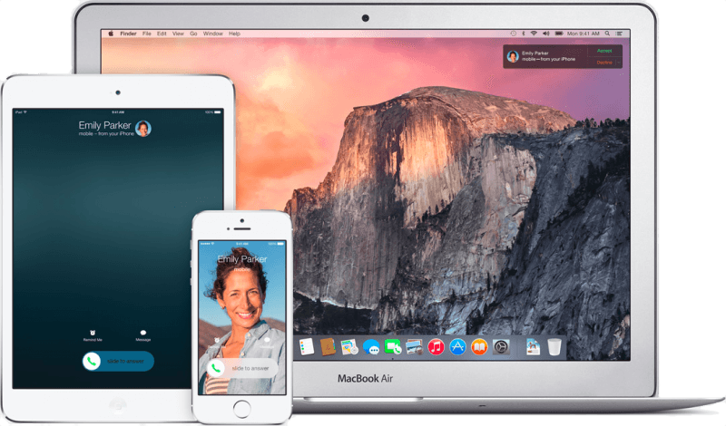
Incoming calls show up through Notification Center, complete with caller ID information, so you pick up calls from your Mac, too.
Another neat proximity awareness based feature is the ability to create instant hotspots from an iPhone whenever you’re on a computer with no wireless networks available. It happens automatically, no configuring required.
Pricing and Availability
OS X 10.10 Yosemite will be available starting today for developers and Apple says it's also opening up a public beta, for the first time, this Summer. As the Mavericks release before it, this one will also be completely free.

