Google offers peek at new Gmail design, Calendar to follow

Jos

Posts: 3,073   +97
Staff

Google's web services are getting a makeover to match their recently launched Google+ social networking site. You may have already noticed a black bar running along the top of their search engine and a few other services, but now the company is giving Gmail users an early look at the changes to come.

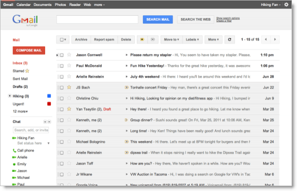
For now the new look is available as a theme. To activate it, head to Mail settings, go to the "Themes" tab and choose either "Preview" or "Preview (dense)." Your inbox will be instantly refreshed with a cleaner, more refined look that draws heavily on the style of Google+. Unlike the ordinary themes that adjust the color scheme, these new themes are part of a larger redesign that addresses elements like the size and shapes of buttons and navigation controls.

gmail google

The color scheme of these two preview themes is predominantly red, white, and gray, but Google says more colors will follow with updated versions of some of the other Gmail themes. The new Gmail interface will eventually expand dynamically to accommodate different screen sizes and user preferences.

Users can also expect similar changes in Google Calendar over the next few days. "This is part of a Google-wide effort to bring you an experience that's more focused, elastic, and effortless across all of our products," Google said in a blog post. The caveat, for now, is that some Google Labs features may not display correctly in this early version, but the company will iron out those issues as it rolls out the changes in the coming months.

Permalink to story.

 
Heh. Calendar to follow?

Yesterday I got the new look for my calendar..
.. and I still have the old look in Gmail.

Not uncommon for Google to roll out changes gradually.
 
Ill stick with my terminal look, hopefully they port that to the new layout. I love the dark theme with the neon green.
 
Yeah you can, its under the theme (Preview). I'm currently using it, though still not sure if its staying.
 
Just tried the "Preview" setting...not very impressed, looks way too 'blocky' for me. I hope that's not forced on us.
 
I like the new condensed preview theme. Calendar also updated here first, looks awesome in comparison.
 
Ugly!

The message you have entered is too short. Please lengthen your message to at least 10 characters.
 
It's like email for beginners. I hope the new themes that come with it might make it look at least a little better.
 
Nice new interface, BUT when you send an email, you are not sent to your Inbox, but instead you are left looking at the email you have just sent! Why?!
 
I love it.

More minimalist. Spacing and padding provides breathing room for the controls.

Changes are probably for touch controls.
 
Speaking of simplifying things. 'minimalist' should not be such a long word. I'd like google to think of a new word. Preferrably one syllable. Anyone have any ideas? Full points for a cool acronym. Like ETUG (Easier To Use GUI) or LIM (Less Is More) Google has stuck their fingers into just about everything else out there... why not fix up some English shortages.
 
Just flipped the preview (dense) on, not too radical a departure from the original classic theme. I'll try it for a few days, calendar definitely looks better.

Comment:

Gave it shot but just too bland and not enough contrast between screen elements.
 
Back