TS 3.0 redesign bug reports

I am using Chrome Version 32.0.1700.107 m and when going through on articles, the Next and Previous article buttons are floating above in the article.
I figured out the problem. My Google Chrome had some how disabled the updates and I was on an old version. I have updated and its good to go
 
I was on forum view of news article, hit back, then decided I wanted to make a comment anyway and hit forward. In the reply box was this mess (although much longer):
Lorem ipsum dolor sit amet, consectetur adipiscing elit. Vestibulum aliquet nunc nunc. Praesent facilisis erat at ipsum venenatis laoreet ultrices arcu mattis. Aenean faucibus urna metus. Aenean risus mauris, tempus vitae condimentum vel, porta vitae nunc. Phasellus congue bibendum metus sed lacinia. ... Done.
I've seen this before but I thought it was at the bottom of the page where an ad should be. Never seen it appear in a text box.
 
I was on forum view of news article, hit back, then decided I wanted to make a comment anyway and hit forward. In the reply box was this mess (although much longer):

I've seen this before but I thought it was at the bottom of the page where an ad should be. Never seen it appear in a text box.
I hope you're not trying to tell me, you don't think archaic Latin gives this joint a touch of class.....?:p And an "ipso facto" back at ya.:cool:

" tempus vitae" = "time life" :confused:
 
Last edited:
Useability of space for desktop and mobile needs drastic improvement.
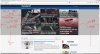
Desktop
Screenshot 1:(Waste of space on desktop)
Mobile
Screenshot 2 (Portrait - want to see more of the page)
Screenshot 3 (Landscape - only see one big article picture )
Screenshot 4 (Comparable site doing it better)
Screenshot 5 (Sometimes only one article visible)

Desktop: Most people use 1080P monitors now and the page content is only 1100 pixels wide, leaving 40% of the monitor space unused (wasted). The graphics are too big and if you want to keep them that big, at least scale the page horizontally for standard size monitors. I also have a 4K screen and the content is a thin strip down the middle of the monitor - with still a ton of scrolling. (no screenshot of the 4K as not many people have those yet - just concerned with the 1080p screens but you should be planning for it. Try design it so it scales to 4K well and you'll fix your problems with 1080P at the same time).

Can only see 3 articles per page on mobile or desktop running all browsers (chrome, firefox, IE) with a 1080P display in portrait view (only 2 in landscape view). This in my opinion is ridiculous. The amount of scrolling involved in reading this site is insane.

There's no ability to zoom out to see more of the page on Mobile devices. Most people reading a tech website likely know how to zoom in if they want to, so maybe start with the zoom factor out much more than it is and scale to fit more articles on the page. Most people reading a tech site have pretty good hardware anyway. It seems like this site was designed for the lowest common denominator (10" netbooks and early 2000's flip phones) with no thought about people who can actually see fine, have normal hardware, and want to be able to scroll less.

I've posted about this before and it was 'improved' for a short while, but now the site is back to frustrating for me and I'm just going to stop reading it altogether if things don't change.

Summary:
Fit more on one page (much more). Don't dumb it down assuming everyone has bad eyesight and wants HUGE graphics and fonts. Have the ability for the "Request Desktop Site" to actually work.

Thanks for listening.,
 

Attachments

  • 01-Wasted Space on Desktop on 1920x1080 Monitor.jpg
    01-Wasted Space on Desktop on 1920x1080 Monitor.jpg
    479.1 KB · Views: 9
  • Screenshot_2014-08-15-11-44-50.png
    Screenshot_2014-08-15-11-44-50.png
    874 KB · Views: 7
  • Screenshot_2014-08-15-11-45-32.png
    Screenshot_2014-08-15-11-45-32.png
    762.5 KB · Views: 6
  • Screenshot_2014-08-15-11-45-44.png
    Screenshot_2014-08-15-11-45-44.png
    380 KB · Views: 7
  • Screenshot_2014-08-15-11-46-47.png
    Screenshot_2014-08-15-11-46-47.png
    579.1 KB · Views: 6
OK, I keep losing editing functions. First, the ability to wrap text in "quotes" disappeared. Now, the ability to change text size, has gone away as well.

Question, are these functions tied to specific scripts, (other than "googleapis")?

Is my browser update, FF 32, or "NoScript", to blame?

Have you removed these functions, or the obvious, are they broken?
 
The 'hover' function seems to have stopped working for the top menus and my own user response alerts. At least for the first minute or so, then it starts to work as normal.

At first I thought it was since updating firefox to 32.01 then I thought it was because of removing java entirely from my system. It turns out to be neither - it's just something taking ages to load, probably out of sequence.
 
Hey Julio, the profiles are very messed up after the update today. Check it out:
Screen Shot 1.png

Also there is a random ad at the bottom of the page:
Screen Shot 2.png
 
Recently comments don't seem to load under articles, I have to go to forum mode to be able to see them. Using Chrome Version 37.0.2062.120 m (64-bit) on Windows 7.
 
Comments aren't showing up below article although the comment count is there. Unable to view or post comments either or read comments quoted from my previous posts.
 
Ok, we've got a bunch of reports all of a sudden. But some are unrelated to the changed we've made and so far I've been unable to replicate, please confirm and advise if you are indeed having an issue:

@gbhall Main menu issue, can't replicate, works fine here. Anyone else?

@JC713, I was able to confirm those bugs, fixes should be here shortly.

@Arris, @Skidmarksdeluxe You can't see comments below news stories? Work fine here when testing with different browsers/OS versions, too, but just in case, I've reset our global JS file. Can you reconfirm it's not working for you and if so, your OS/browser?

Thanks guys.
 
Just curious Julio, but what did you guys roll out? I notice the fonts are different and everyone's profile pictures are tiny. Just wondering what the update contained. Also can you post when the updates are rolled out since the profiles still look messed up :(.
 
The 'hover' function seems to have stopped working for the top menus and my own user response alerts. At least for the first minute or so, then it starts to work as normal.
Julio, whatever you've done recently seems to have greatly improved things. Hover starts to work after a couple of seconds now, not couple of minutes.
 
Hey Julio, since the update today, my alerts have looked weird. Here is a screenshot:
Screen Shot 1.png

Secondly, the tab animations (at the top below the logo) look kind of weird on Safari at the moment (latest version on Mavericks). Chrome tab animations look crisp on the other hand.

Thanks for the hard work Julio (and the whole TS team :p).
 
Back