Usability, Calling/Data/Messaging
Usability
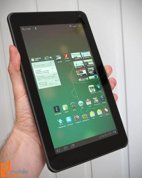
When it comes to the new Android 3.0 Honeycomb OS, you can forget most everything you know about Android's user experience. Having been designed from the ground up for tablets, almost nothing in Honeycomb is the same as on smartphones. In my opinion Google did a good job of designing the basic user interface in Honeycomb, on a macro scale, but failed to get a lot of the finer points right.
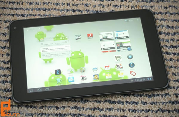
Let's start with the new home screen, which I like. Users can swipe from one screen to the next with ease, and each screen can be configured with shortcuts, widgets, and wallpapers. That works. The main menu leaves me unimpressed, though. Sure there are multiple panels that users can swipe between, but you can't re-order them or group them. Google had the chance to step up here, and once again failed to do so, leaving the task to the manufacturers to implement in future models that will have customized UIs. I do like that there is a separate tab that shows only user-installed apps, and appreciate that apps can be uninstalled by dragging them from the main menu to the trashcan. Newly installed will automatically show up on the home screen as a shortcut, too. That much is progress, at least.

Now on to the main navigation controls. The back, home, task-switcher, and (sometimes) menu buttons sit in the lower left hand corner of the display. The icons could have been better designed, in my opinion, but once you know what they are, they work. I dislike the fact that the menu button only appears some of the time, depending on the app. Some apps built for tablets use only a new control in the upper right hand corner of the screen (which is easy to reach), some use both, and older smartphone apps only use the menu button. That inconsistency bothers me. Google could have handled that better.
I mostly like the new notification area, which is found in the bottom right hand corner of the screen. The curtain is gone, replaced with a list of notifications that are accessed by tapping on the digital clock. Doing so lists all of the notifications and some quick access functions. My complaints are that there is no way to clear all notifications at once (clearing a list of 20 can be torture) and that some of the quick access buttons require too many taps. You can adjust screen brightness or disable notifications easily enough, but turning Wi-Fi on or off requires 5 screen taps (if you count the required back button press). Samsung and others already handle this type of functionality better on smartphones, so Google should have known better.

When it comes to applications, though, things get really awkward. Part of the problem is that there are very few apps that have been optimized for Honeycomb tablets. Very few, indeed. Most smartphone apps run in full screen mode (but not all), but when they do, font sizes are often too small, input boxes and list items too wide, and things just generally feel out of proportion. When you do find a good tablet optimized application, though, you start to understand the platform's potential. Unfortunately, that potential has yet to be realized, and probably won't be for some time to come.
Unlike the problems I experienced with Motorola's Xoom, such as core apps like Android Market and the browser crashing and the home and task switcher function occasionally not working, I have had a stable experience with the G-Slate. I did have the video camera crash once on me (while shooting the videos for this review), but otherwise the only thing I've had crash is a third party app - and that happens frequently enough on Android smartphones.
Calling/Data/Messaging
While the T-Mobile G-Slate has access to the carrier's "4G" HSPA+ data network, it cannot be used for voice calls unless it is paired with an appropriate VoIP client, such as Skype or Fring.
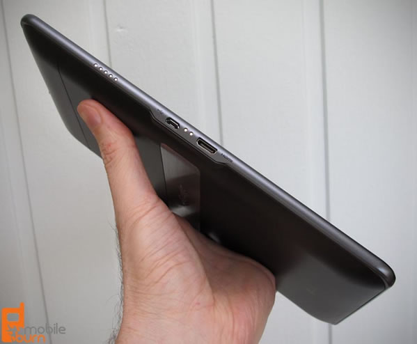
The T-Mobile G-Slate proved to be a worthy data device. I managed to get download speeds generally in the 6.5 to 7.5Mbps range during my tests, with upload speeds very consistently in the 1.0 to 1.2Mbps range (according to the SpeedTest.net app). These speeds, with the tablet's tethering and Wi-Fi hotspot services, mean that it would be quite useful as a modem for other devices like a laptop computer. In any case, the G-Slate managed download speeds 2 to 3 times faster than my Google Nexus S, which lacks HSPA+ support. The G-Slate's USB connectivity allowed me to drag music and other files onto the G-Slate from my computer, but the transfers were not as speedy as what I experienced with the Motorola Xoom. Bluetooth support is provided for connecting to wireless headphones, headsets, and accessories like keyboards.

Considering the size of its on-screen keyboard and of the screen in general, it is no real surprise that the T-Mobile G-Slate is a pretty good messaging platform. There is no support for text or picture messaging, though. There is also no built-in support for social networking sites like Facebook or Twitter, but there's no shortage of free third party applications available to fill that void. The only instant messaging client loaded on the G-Slate is Gtalk, which can be used not only for instant messaging but also for video chatting using the forward-facing camera. The quality, even over Wi-Fi, isn't fantastic, but it is acceptable.
There are two pre-installed email applications on the G-Slate. The first, Gmail, is a new multi-pane version of the popular and fully featured Gmail application seen on Android smartphones. Users are presented with nice views of the folders, message lists, and messages in a very organized and intuitive manner. On top of that, the Gmail client offers the features like Priority Inbox and threaded conversation views that users have come to expect from Gmail. The regular email app offers the same multi-pane view as Gmail, and is equally nice to use, though it lacks some of the Gmail specific features I mentioned. Both offer full HTML email support, which is a handy feature when you are working with a large, high-res display.