Welcome to TechSpot 3.0!

Julio Franco

Posts: 9,095   +2,046
Staff member

I’m personally excited and honored to present to you the new TechSpot.

Around late October we embarked upon the journey of redesigning from the ground up…

Believe it or not, the first meetings and mockups for a design refresh started back in 2012, but after a few weeks in we were unconvinced about the direction the design was taking. We ultimately folded that major project in favor of tweaking and adapting our older design to be flatter, semi-responsive and more visual, among other enhancements that brought new life to the TechSpot design we had come to know and love.

Then mid last year we went back to the drawing board.

Taking cues from past ideas but bringing them to current standards, the new design had to be more visually striking, we wanted to feature more content at a glance on the homepage and around the site, it had to be built with both desktop and mobile devices in mind, we wanted it to look modern, but most importantly, the redesign had to be unmistakably TechSpot, and I believe we have achieved just that.

Over the years we’ve received numerous praises for our clean site layout and straightforward design. We have carried this over to TechSpot 3.0.

Now, understandably change is difficult and it’s been years since we had such a radical transformation, but our bet is that you will feel right at home within the next few days and weeks.

A new logo

The basis of our previous design served us well for over 5 years and we definitely felt it was time to move on. Yet, mid process we were faced with the question of whether we should change our logo, too. That wasn’t part of the original plan, but we weren’t discarding the idea either.

It didn’t take too long before Eliot Orejuela, a young and talented designer and brother of one of our staff members, presented us with a killer concept of superposed polygons (3-6-9) and how we could play around with the elements to add color and variety to our brand identity – for yet another sample of just that see our Twitter and Facebook pages.

The outward nonagon fell right in place to become the ‘O’ in TechSpot and with our new logo we have officially retired the blue sphere.

Pictured below, TechSpot’s homepage circa 2009.

The site redesign

We are very proud of what we’ve achieved with TechSpot 3.0. We tried to avoid putting form over function, and while there are still more than a few rough edges here and there (our responsive/smartphone site is not as polished as we want just yet), it’s no coincidence we haven’t brought in multi-column layouts or “tablet-focused“ designs that look trendy today but will beg to be rewritten a few months later.

The result is a cutting-edge yet intuitive and clean design that allows for easy reading. After all, once the weekend is over (and it literally is, at 5am on Monday) we’ll continue to dedicate all our efforts to bring you in-depth coverage of the PC technology industry and beyond.

New Features

A ton of thought has gone into the smallest of details, but as we carved deeper we began to realize this wasn’t going to be an easy switch. Don’t be surprised if a few areas of the site haven’t been carried over yet.  Without further ado, here are some of our redesign key features:


Homepage grid

techspot website logo website redesign


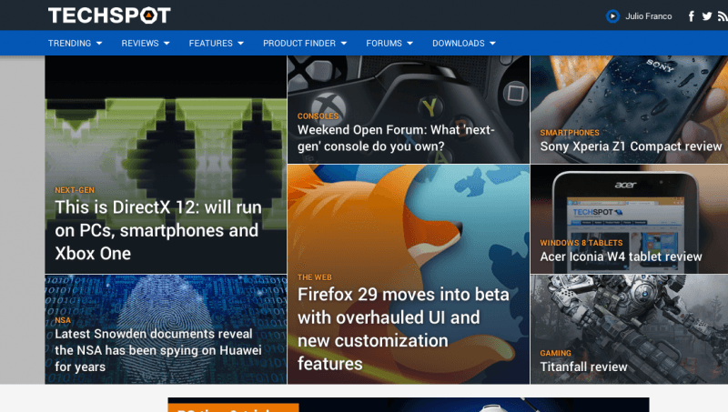
High impact feature landing pages


Fully responsive design


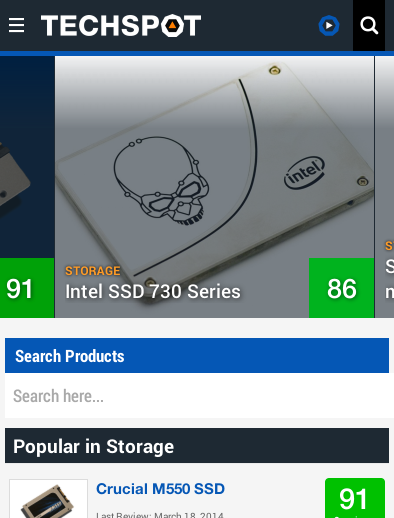
Emphasis on easy reading


Unified login & user alerts


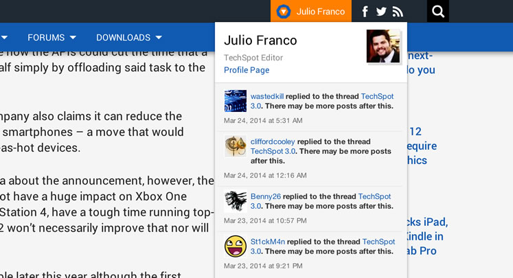
Improved article navigation and social sharing that doesn’t take away from experience


Special thanks:

Adonis Figueroa and Jessica Zuniga, our friends and in house developers devoted countless hours, days and weekends to make this happen.

Eliot Orejuela, brand identity and new logo design.

Evan Agee and Riomar Mccartney from Positive Influence, front end and design implementation, putting our design ideas into actual code.

Permalink to story.

 
Flat design isn't modern, its lazy. It replaces actual aesthetics with a Soviet-style blandness. Fortunately all terrible fads run their course, and typically the worse they are the quicker they die out. I will say this, however: at least you had the good sense to use full-color, recognizable icons and actual pictures unlike most of the MetroChrome trash. But I can't wait until actual *design* becomes in vogue once more.
 
We used to have a search of the entire website right on the front page. Now it is not there !! It's not even a entry on the drop-down menu. That's poor.

Oh, wait.... it's a magnifying glass now.... I just hate having to click something then find a way to force the pop-up text box to open up, and stay open long enough to type into. Just dont like it. Starting from how it's not immediately obvious that there is a search facility.
 
Last edited:
ieframe.dll/syntax.htm
That's what u get if u try open your site with an windows phone, in this case Lumia 820 & L925.

But I like the new looks, it's great.
 
Wow absolutely amazing. Thanks to all your hard work TechSpot team! @Julio Franco (and whoever else I do not know of) Thanks for devoting your effort to the redesign it looks so awesome.

@Julio Franco Are you guys gonna apply the redesign to the forum pages and profiles? they feel quite out of place with the new redesign :D.
 
Love the new design.

I have a suggestion for the site in general though. Do not start reviewing mobile phones etc, stick to computers and computer hardware. The few reviews ive read here are extremely subjective. I'd say stick to doing collaborations with other sites when it comes to reviews.
 
Doesn't look finished, still buggy. I'm writing this on late 2013 Macbook Pro 15", and the text in the edit control appears absolutely tiny, can barely see it while typing.

Text in the news preview should be matched with the article main font size. The new article font is perfect in term of size and authetics.

Also for check boxes the font also looks a bit off, I.e. small check boxes next to big text font.
 
P.S. The size of the comments font is also bigger than that in article, which looks odd. It should be the same size as used in the articles.
 
N.B. In all, you guys really need to fix it for Safari users, there are plenty of us I believe who will find the new look less than usable, with font sizes out of proportion in many places.
 
Looks great guys, the logo did need an update. I'm glad you didn't change the way we can scroll through stories in a list. That's a nice easy way to do it. The dropdown menus at the top are very cool.
 
Really like most of the redesign, not overly keen on the formatting/lay out of the comments sections though. Needs something to separate each comment from those around it, rather than just mounds of giant "like" or "reply" text to differentiate them.

Good work though!
 
At my work we are on XP and IE8 and the site doesnt show right just garbled text :( guess wont be reading this site much anymore.
 
"... we wanted it to look modern, but most importantly, the redesign had to be unmistakably TechSpot."

AMAZING! it is exactly how you describe it. "Modern, Unmistakably TechSpot".
 
It looks great but as some user have already noted, the commenting looks even bigger than the article. Also, when I reach the comment section I see the sharing "popup" on screen which difficults me reading what I'm writting.

Lastly, both the comments and the comment box is way too big, the ratio of comments width/height to the screen size is ridiculous.

Yeah... now that I've scrolled around the "social" script which helps you share the topics is a bit too annoying, it started overlapping other peoples comments. In the end, if I want to share the news I will share them I don't need a script following me all around for when I want to do it.

https://www.dropbox.com/s/fzblxcsxa35u3mb/techspot screenshot.jpg
 
Last edited:
I like it, the main page is specially informative, but when I go to the review section I can't find the comments for any specific review, did you guys remove it or I'm doing something wrong??
 
Back