SuperCheetah
Posts: 704 +1
Found this over at www.warp2search.com It is supposedly screenshots of a beta verson of Windows 98SE. I wonder why this version never materialized???
Anyway, here is the link to the screenshots:
http://www.planet-xp.de/modules.php?name=News&file=article&sid=1082
Anyway, here is the link to the screenshots:
http://www.planet-xp.de/modules.php?name=News&file=article&sid=1082

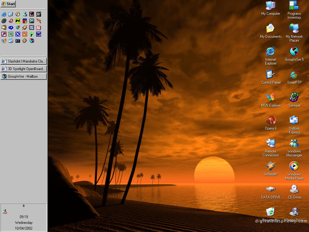

") You mind posting a direct link to that particular theme??? I had one earlier that looked almost like that, but with a different background and it didn't have the keyboard manager on it.
You mind posting a direct link to that particular theme??? I had one earlier that looked almost like that, but with a different background and it didn't have the keyboard manager on it.