Software: Enter Android 4.4 'KitKat'
One of the great benefits of getting a Nexus device is, of course, stock Android. No horrible UIs from smartphone manufacturers, no dodgy features that add bloatware to the operating system, and the promise of fast updates to the latest version of Android when they're available. The Nexus 5 is the first device to come loaded with Android 4.4 'KitKat', and so there's a number of new features to discuss.
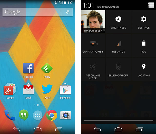
First up, there are several system-wide visual changes that have been made. The status bar at the top and the navigation bar at the bottom are now translucent in the launcher, which now makes the OS feel like it's taking up the entire display, rather than letterboxing the actual usable homescreen space like with Android 4.3. This translucent effect isn't just restricted to the launcher, with refreshed APIs allowing any app to put content behind a translucent status/navigation bars. No apps currently use this feature, although it appears an update to Maps might introduce the effect.

The status bar itself now features entirely white text and icons, which looks great but has introduced several regressions in the information that is displayed. Previously, blue Wi-Fi or network icons indicated the device had a connection to Google's servers (aka. the internet is working) while grey meant there was no connection; the transition to white has removed this indicator. Also gone are the small arrows placed on the Wi-Fi and network icons that showed whether the device was currently uploading or downloading data. Removing these arrows in KitKat has simplified the status bar, but power users like myself can no longer easily troubleshoot whether the device is receiving/transmitting information when, for example, an application won't refresh or connect to the internet.
These features aren't completely removed from Android, but they now reside in the inconvenient quick settings panel accessible via the notification pane. I'm not quite sure what the benefits are to removing the network activity and internet connection indicators, but it's a change that I'll have to get used to.

New to Android 4.4 is an immersive mode that entirely hides the interface, allowing an app to use 100% of the display's real estate. Swiping from the top/bottom of the screen reveals the status bar and navigation buttons, which will be especially useful once games start to take advantage of the feature. Currently, many games keep the navigation bar visible on the display, albeit with the icons reduced to small glowing dots; while this UI mode is still available in KitKat, the immersive mode will provide more flexibility to developers, especially when combined with the translucent effect.
Across KitKat's interface and in many of the included applications, Google has moved away from a dark theme to a lighter one that uses whites and greys in preference to blacks. System-wide this affects a number of highlights that occur when you tap items or overscroll; previously blue, these now show in grey. The included wallpapers and many app icons are using a lighter color pallet than before, which gives the operating system a visually refreshing appearance.

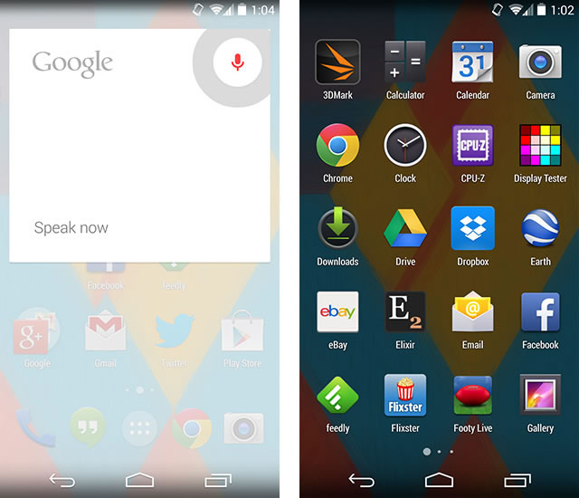
The launcher itself in Android 4.4 has received some significant changes, so much so that it's technically no longer a standalone launcher application, but the Google Search app expanded significantly to incorporate the usual homescreen functionality. This means Google Now is fully integrated into the launcher, and accessible through three ways: flicking to the left of the main homescreen, the permanent Google search bar, and swiping up from the home button.
With Google Now occupying a pane to the left of the main homescreen, you can't have any apps in that pane anymore, restricting your widget/app options to the right panes only. This may be annoying for some users, but personally I don't use more than a few panes, and I enjoy having direct access to Google Now/Search through a quick swipe.

The integration of Google Now also brings support for an 'always listening' feature, where you can say "OK, Google" to your phone when on a homescreen and it will begin a Google voice search, no display tapping required. A similar feature was seen in the Moto X, where you could initiate a Google voice even when the phone's display was off, however in KitKat the feature only works on the homescreens, which restricts its use somewhat. I'm still very skeptical of the speed advantages of using voice search over tapping the Google search bar and typing manually, but at least the feature is reasonably cool and allows you to search even if your hands are full.

Many of the apps included on the Nexus 5 (and thus also in KitKat) out of the box are available already in the Google Play Store, and receive updates separately to core Android. There's not much point in spending time going over the features you can find in the stock Android 4.4 Calendar, Music, Maps, Gmail, Search, Quickoffice apps and so forth as they're identical to the previous versions for the most part and available for anyone to download. Apps you can't find in the Store such as Gallery, People, Clock and Calculator are very similar to the apps found in Android 4.3, with minor visuals changes here and there.
One of the major app changes in Android 4.4 relates to SMS messaging. As we've reported before, Android 4.4 ditches a standalone messaging application and bundles it into the Hangouts app, allowing you to instant message (through Hangouts/Google+) or SMS message in the one application. It's a perfectly functional SMS app, but it does little to merge the worlds of Hangouts and SMS messaging. Switching between SMS and Hangouts requires you to enter an entirely different conversation pane with a separate conversation history, rather than the ideal situation where both are combined.

If you don't want to use Hangouts as the default SMS app, KitKat introduces a way to set third-party applications as the default app. Google has provided a new API for third-party applications to access and send SMS messages officially, which should make the experience of using a non-default messaging app better than it was in previous versions of Android.
Interestingly, Android 4.4 has two different gallery applications, the traditional Gallery application that you've used before, and the new Photos app bundled with Google+. The interface of the Photos app is nicer, simpler and packs an improved sharing menu, but there isn't feature parity between the two apps. Gallery contains a better photo editor and is integrated into the camera application, but the Photos app actually does a better job of loading full-resolution photographs. In the future Google will almost certainly improve the Photos app and leave Gallery in its current state, but in KitKat right now it's somewhat strange to have two apps for the same thing.

The stock Android 4.4 keyboard has been slightly improved, as it now contains a full emoji keyboard accessible from the smiley button. Aside from this, the keyboard is as good as it was in previous editions of Android, packing decent prediction technology and an easy-to-pick-up layout. It's not as quick to use as Swiftkey or other third-party keyboards, but it provides a decent out-of-the-box experience.
Several other UX improvements have been made around the operating system. There's a brand new file picker dialog that's similar to a file browser, the app picker dialog is now easier to use and the Phone application is a much stronger discovery service integrating business names and a full Google search option.

Under the hood, Android 4.4 brings a number of new APIs and new functionality. The OS is optimized for a large range of devices, including those with lower specifications such as just 512 MB of RAM, but we'll have to wait for a lower-end KitKat-powered device to see just how much better it is. Wireless printing has been integrated, there's a step-counter API for fitness apps, NFC Host Card Emulation, an infrared blaster API for devices such as the HTC One and Galaxy S4, new accessibility APIs and more.
KitKat brings a number of great new features to the table, of which I found the Google Now-integrated launcher and UX refinements to be the most useful. The OS visually looks fantastic, especially now that Google has improved the onscreen button implementation, and there's a number of under-the-hood changes that should improve Android further when devices and third-party apps begin to take advantage.
