Microsoft introduces a redesigned Taskbar Overflow experience in latest Windows 11 Insider...

Humza

Posts: 1,026   +171
Staff member
Why it matters: For Windows users with dozens of apps open at the same time, the Taskbar can display a limited number of app icons before it automatically creates an overflow area that shows only the most recently accessed app. In the latest Windows 11 Insider build, Microsoft has redesigned this experience with a three-dot menu that, once invoked, will display all overflowed apps in a single, neatly arranged space.

The new Taskbar Overflow feature for Windows 11 improves usability for power users who want to make use of all the expensive RAM they've bought. With dozens of apps open at the same time, it can become a bit difficult to switch to the right program from a crowded taskbar.

With this newly added feature, Microsoft notes that the taskbar will automatically transition to its overflow state once enough apps have been opened. The capacity is likely dependent on variable factors such as display size and aspect ratio, app icon size, and other taskbar customizations.

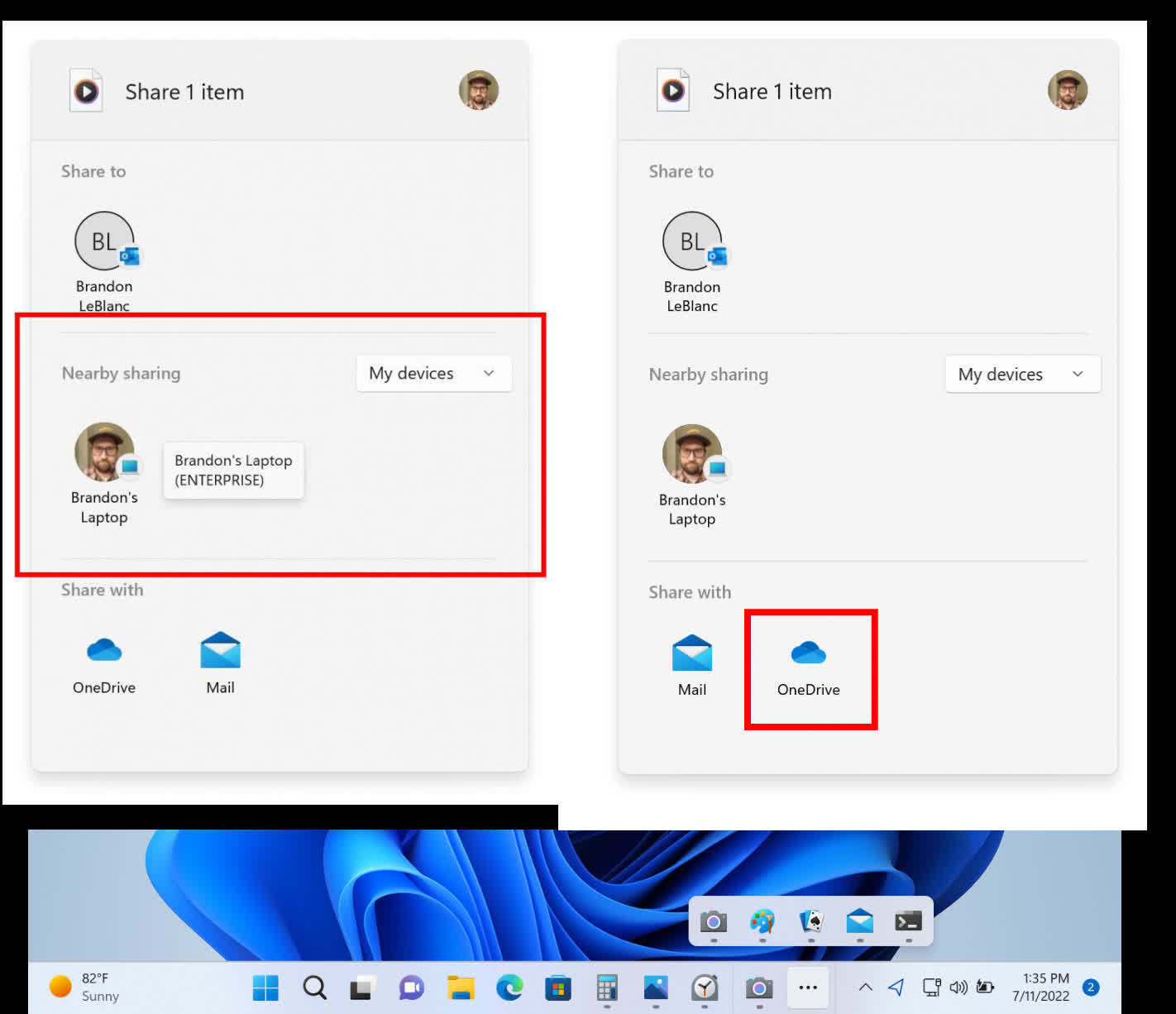
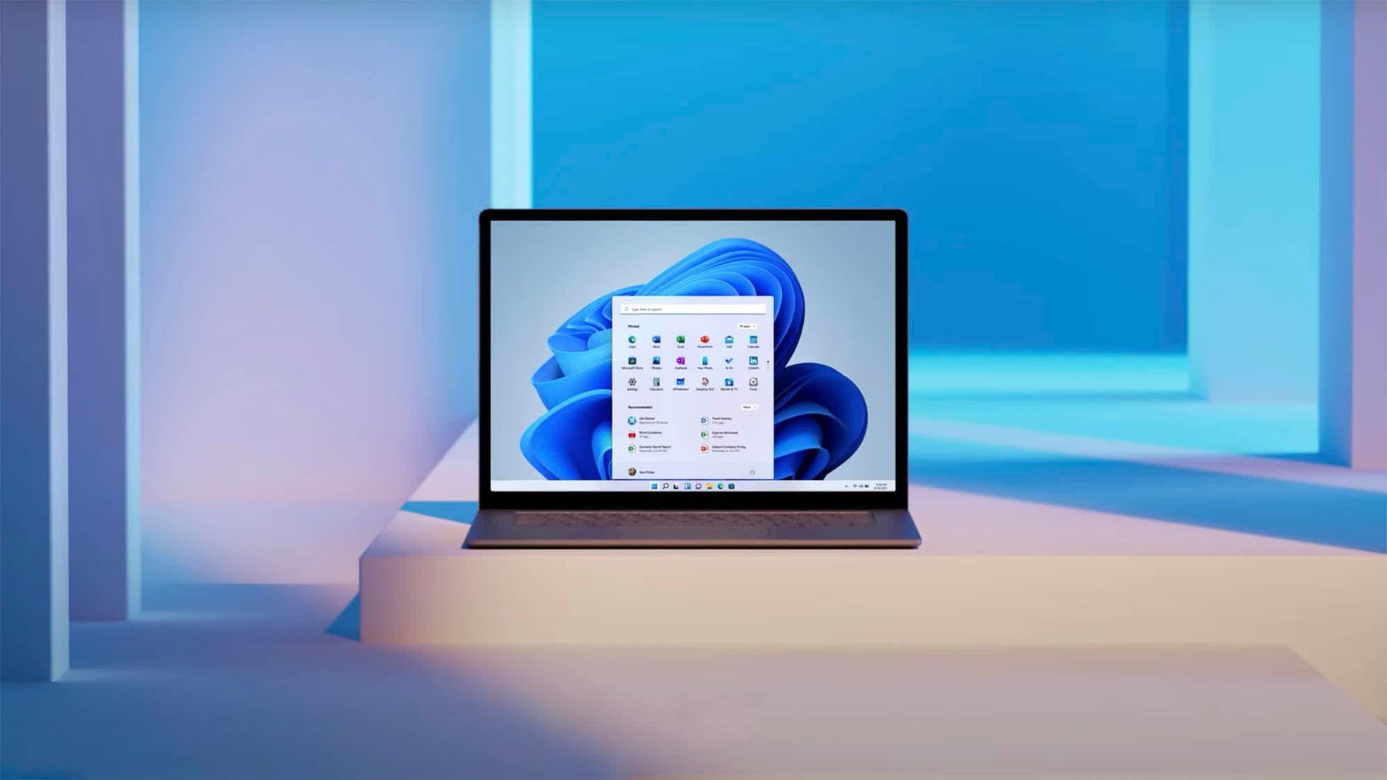
Insider Preview Build 25163 comes with an improved Taskbar (bottom) and sharing experience (top)

Apps displaying in the overflow section support pinning, jump lists (frequent app-specific actions accessible via right-click) and extended UI. Navigating to an app or clicking outside of the overflow menu dismisses it.

Moreover, the latest Insider build now supports UDP (on private networks) for improved device discovery in the built-in Windows share window. For users logged in with their Microsoft account, the native share window now also displays OneDrive as a target under the 'Share with' section for quickly uploading local content to the cloud.

Alongside plenty of bug fixes, this preview build also brings a minor visual update for the Microsoft Store that tweaks how prices are displayed for better readability and also lists together different versions of a game (standard, deluxe etc.) for easier price comparison.

Permalink to story.

 
And yet they claim it's 'too complicated' for them to let us just drag and drop the silly thing to side or top without having to use some hack or edit.

Yo MS, stop bullsh*tting us.

I'd actually consider using win11 if/when they choose to make that change.
Until then I'll stick with my win10 set up where I figured out how to center icons on the task bar, and have it pinned to top of screen where in prefer it.
 
The start menu in w11 is borderline unusable for me. It was quirky in w10 as well, but now it is a joke. I have no idea who came with those *****ic ideas, but really, how could they f up such a simple thing... just take a look on macOS or any linux DM...
 
The start menu in w11 is borderline unusable for me. It was quirky in w10 as well, but now it is a joke. I have no idea who came with those *****ic ideas, but really, how could they f up such a simple thing... just take a look on macOS or any linux DM...

Try Start11
 
Try Start11
The amount of third-party apps you have to install to make modern Windows a decent experience continues to increase in quantity and depth of interference.

There will be an inflection point where the amount of f-ing around with Windows you need to do will be more tedious than if you just installed Linux, and Redmond seems dead set on accelerating to that point as fast as possible.
 
I have a 21:9 screen so for me, the old way of dealing with taskbar icons from windows 10 would be perfect, just let me turn them all on with the "All" slider so I don't have to keep going in there and enabling items as they are installed...... This is truly one of only two gripes I have for windows 11 (the other being having to click on "more options" in the context menu to get some of the other classic options...... if those 2 things would be fixed. I would have no gripes about 11, I can happily deal with all the other UI differences. (I've already gotten used to right clicking on start or doing the 3 finger salute to get to task manager in 11, at first that kinda bugged me).
 
I love the look and feel of Win 11. Feels like programmers didn't design it by slapping UI elements together inconsistently.
 
How about this for an idea, Microsoft?

Bring back the Windows 10 taskbar and Start menu and add in those new features that you've added.

Because the Windows 10 taskbar and Start Menu are already more feature rich than the disgrace that is Windows 11's.
 
Back