Justin Kahn
Posts: 752 +6
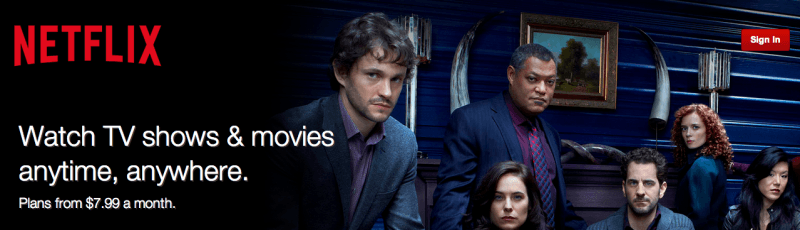
Some may have noticed a slightly different Netflix logo in some of its latest trailers and advertisements. That logo appears to have been put in place on the site along with a cleaner and more simple overall look. The company has decided to replace the bold reds and blacks with a light greys and a much flatter design.
Netflix has also gone for a much flatter aesthetic for the logo as well, doing away with the thick outline and shadow we've come to know, in favor of a much more simple and clean look as you can see above and below. It is very similar to the alternate logo seen in the latest season of Orange is the New Black.
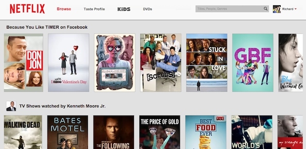
At this point it looks as though the redesign has only been put in place on the desktop version of Netflix, but could be making its way elsewhere. While reports suggest no change on mobile versions, Netflix spokesman Joris Evers told Engadget the updated logo will "gradually" begin appearing in more places.
As we've seen in the past, Netflix has refreshed the look of its service a number of times and appears to be very focused on offering its users the best possible experience. In 2013, the popular streaming service made over its TV interface with a much more user friendly approach. It is likely that, barring some unforeseen negative user feedback, the changes will spread throughout Netflix's service.
