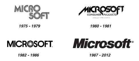
Microsoft today revealed a new look for its corporate logo, marking the first time in 25 years the company has changed its image and the fifth time overall. The new logo features the name "Microsoft" in the Segoe font --- a proprietary font used in the firm's products and marketing for several years – alongside a multicolored Windows symbol intended to "signal the heritage but also signal the future."
Microsoft is preparing to launch a range of products this fall, including Windows 8 and a new Surface tablet running the OS, as well as Windows Phone 8. The software giant's new logo reflects a change in its products' look and feel which relies heavily on a tile-based UI formerly known as Metro – now it's just called Windows 8 Style. It also arrives just months after introducing a new single-colored Windows 8 logo.

The new corporate image will begin its rollout today, appearing on Microsoft.com and the company's Twitter and Facebook accounts, followed by new TV commercials airing over the news few weeks.
Speaking with Seattle Times, Microsoft's general manager of brand strategy Jeff Hansen also commented on the company's past logos and their influences. The first logo, used from 1975 to 1979, featured a disco-y typeface with the words Micro on one line and Soft below it, reflecting how co-founders Bill Gates and Paul Allen came up with the original company name using the words "microcomputers" and "software."
The second logo has briefly used between 1980 and 1981 and its jagged edges, strong diagonals typography reflected the computer and video-game culture of the time. The third logo was used from 1982 to 1986 introduced a stylized letter "o" with lines through it, while some tweaks in 1987 resulted in the logo most people are familiar with, featuring a slice in the first "o" and a connection between the letters "f" and "t".
