Microsoft gets a logo makeover for the first time since 1987

Jos

Posts: 3,073   +97
Staff

Microsoft today revealed a new look for its corporate logo, marking the first time in 25 years the company has changed its image and the fifth time overall. The new logo features the name "Microsoft" in the Segoe font — a proprietary font used in the firm’s products and marketing for several years -- alongside a multicolored Windows symbol intended to "signal the heritage but also signal the future.”

Microsoft is preparing to launch a range of products this fall, including Windows 8 and a new Surface tablet running the OS, as well as Windows Phone 8. The software giant's new logo reflects a change in its products’ look and feel which relies heavily on a tile-based UI formerly known as Metro -- now it’s just called Windows 8 Style. It also arrives just months after introducing a new single-colored Windows 8 logo.

The new corporate image will begin its rollout today, appearing on Microsoft.com and the company’s Twitter and Facebook accounts, followed by new TV commercials airing over the news few weeks.

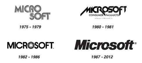
Speaking with Seattle Times, Microsoft's general manager of brand strategy Jeff Hansen also commented on the company’s past logos and their influences. The first logo, used from 1975 to 1979, featured a disco-y typeface with the words Micro on one line and Soft below it, reflecting how co-founders Bill Gates and Paul Allen came up with the original company name using the words "microcomputers" and "software."

The second logo has briefly used between 1980 and 1981 and its jagged edges, strong diagonals typography reflected the computer and video-game culture of the time. The third logo was used from 1982 to 1986 introduced a stylized letter "o" with lines through it, while some tweaks in 1987 resulted in the logo most people are familiar with, featuring a slice in the first “o” and a connection between the letters "f" and “t”.

microsoft

Permalink to story.

 
Not loving it. They could have done something much better. As someone pointed out on another site, when the logo is small, the gap between the red and green looks much narrowed compared to the other gaps.
 
Does it need flashy lights and colors? What is wrong with simple and easy? Just look at how good Apple is doing with thier dumbed down devices and logo.
 
I'm personally not surprised at all with this sudden change with the Microsoft logo. Granted, some can argue that a change was very much needed, seeing that they've had the same one for basically 25 years. But I'm not one that could be pooled into a group that can argue a change was needed. I have been very happy and pleased with the prior logo......

microsoft270x167.jpg

I personally feel that this change is curiously and somewhat suspiciously being done around the anticipated launch of Windows 8. I feel this to be more of a marketing push, as to better promote Windows 8 than anything else. Microsoft didn't need to do this, the prior logo was doing them just fine! I more so believe that this logo change also could be more so done out of possible desperation than anything else. I have a funny feeling that Microsoft knows darn well the resistance it's getting out there about Windows 8, but if a company pony's up and makes a change like implementing the Windows 8 logo as their own, they might feel it could go a ways towards possibly prompting the Windows 8 line of products.

To me this is nothing more than a last minute marketing ploy, one last moment before the launch of Windows 8 to garner some spot light and make the worlds attention focus upon Windows 8.
 
Simple is better and cheaper!, who needs to hire a graphics designer when they can get some monkey of a street.
 
The world is round. Round mean they are innovative and creative. When change to square mean they are not moving anymore.
 
"Hey did you finish that new logo yet? We're supposed to present it today!"

"Hold on a sec" *Opens up paint...
 
It's boring. I know it's suppose to personify the new Metro theme but couldn't they have done anything to spruce it up a bit?
 
I don't know about the rest of the world but personally, I couldn't give two sh_ts about anyones logo. It's the product I care about, not some stupid iconic image that supposedly represents the products name. I can't say I care for the changes that were placed on the logo but honestly how is that going to change how the product works to my benefit?
 
How appropriate, the previous logo has that rather timeless Serious Business look that showed up in the 80's but which still in 2012 commands respect if you have anything to do with (and want to appeal to) big business. Bold, black, with the smallest concession to style. The new logo is more like a high school kid, holding up bright colors in an empty field to try and (desperately) get your attention.

This is a testament to both the graphics designers, who have managed to communicate Microsoft's new direction, and to Microsoft's management, who have taken the company from glorious domination in the peak of the PC era and parlayed it into a noisy also-ran, fighting for the crumbs left over from Apple and Google.

Great Job.
 
I hope they know what they're doing, risking everything with such an imaginative, courageous design....

Rarely, and I do mean rarely do posts get a belly chuckle out of me.....hahahaha........"imaginative".....lol..........."courageous".......LMAO..........and "design".......hahaha.......I think lack there of!
 
Looks absolutley fine to me. Very clean and modern.

Not sure whythe "f" and "t" are joined together. That is curious.

People who are liable to moan about it probaby moan about everything. It's really not that bit a deal and it doesn't look bad. It shows confidence. Will it still show that in a year? Remains to be seen but I hope so.
 
It's clean...that is all I like about it...otherwise it's just another logo really. Anyways, onto the next article!
 
that's the first thing I noticed myself. I won't be surprised if it has to do with stupid copyright laws, just in case the "f" standing on its own could suggest certain famous site, it's getting to that point, I'm afraid...
 
Back