While budget smartphones don't get as much attention in the media as their flagship brothers, they're arguably more important globally. The businesses that manage to harness the entry-level market can see huge gains in sales and market share in key growth areas where a majority of buyers simply can't afford a device as expensive as the Samsung Galaxy S5 or Apple iPhone 5s.
Although budget handsets are critical to a company's smartphone portfolio, they often receive less polish and less development time than the high-end models. Sometimes they come out half-baked, with a greater number of compromises than you would hope for or expect. The abysmal Nokia X is a perfect example of this and the result is a severely underdone phone.
Over at Motorola, it's a completely different story from other major manufacturers. Having gone through two acquisitions in recent times, their product portfolio is barebones, significantly less diverse or complicated than its competitors. In fact you can count the amount of products in their current line on one hand: the Moto X, the Moto G, and now the Moto E.
Having just three phones on the market has allowed each one to receive enough time and polish. The Moto X's innovative contextual processing features made it a solid flagship option, especially on the software front, while the Moto G is arguably the best sub-$200 device you can buy.
The device I'm reviewing today, the Moto E, is Motorola's budget model and it has received the same treatment as the X and G. It's a highly polished device, naturally with some compromises, that aims to be the best option for buyers looking for a $130 handset, unlocked and off-contract.
Visually the Moto E looks like a more compact, slightly chubbier version of the Moto G. It's not an elegant, slender design that is part phone and part fashion statement, like you'd get with an iPhone. Instead the focus has been placed on ergonomics, making the Moto E one of the most comfortable smartphones of this size.
The edges of the handset are curved in such a way that the body is essentially perfectly sculpted for a human hand. The power button on the right edge is in an ideal position for either left- or right-handed users; there's no awkward top button on the Moto E. Below that is the volume rocker, with both buttons having a metallic coating and a solid yet shallow clicking action.
Except for the Gorilla Glass 3 protecting the display, the majority of the Moto E is constructed from plastic. A small rim around the glass is made from glossy polycarbonate, while the removable back cover is coated with a soft, rubberized material that feels great to touch. Although the back panel isn't glossy, it does seem to collect fingerprints over time, likely a by-product of the coating.
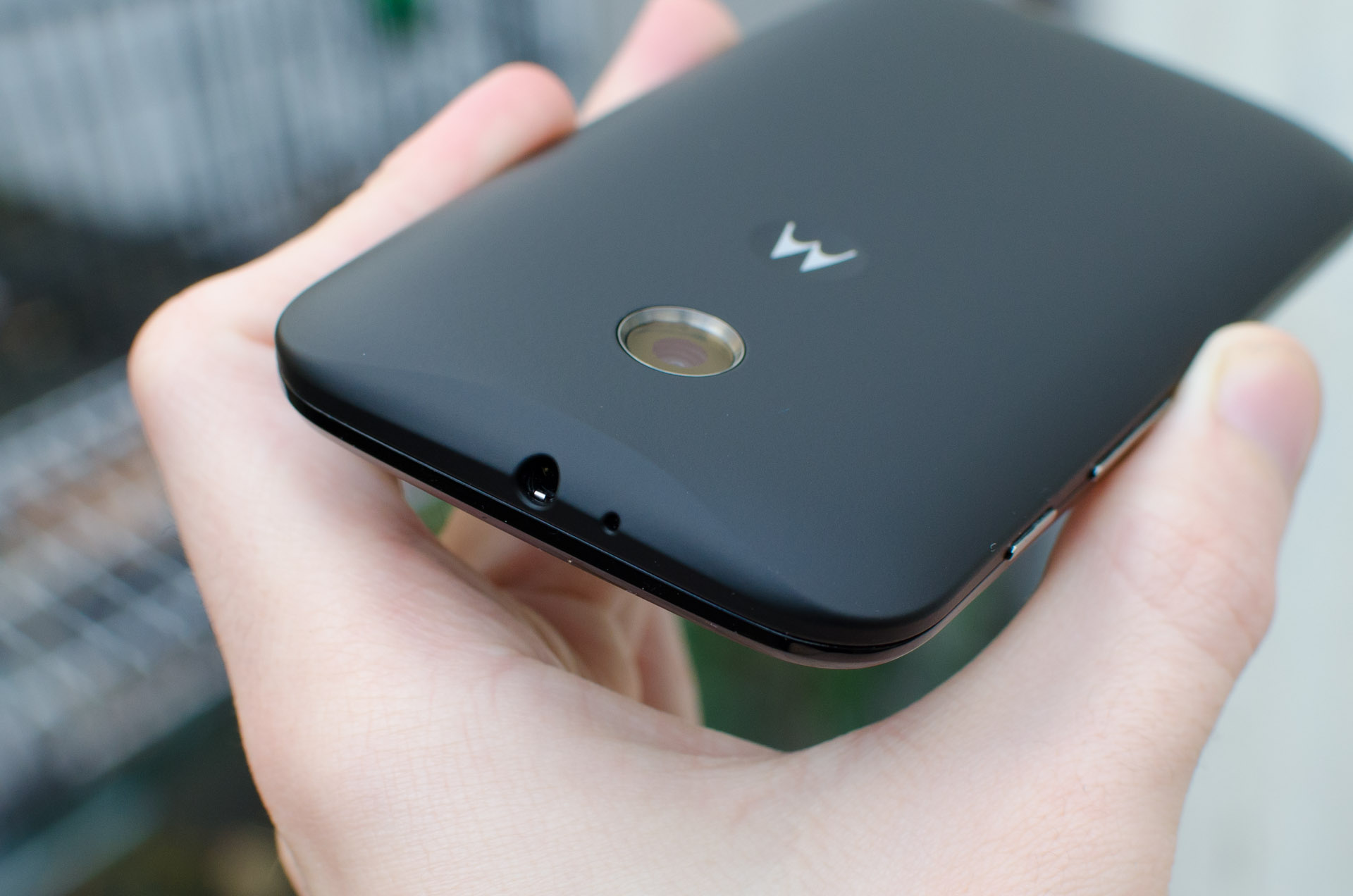
As I mentioned, the entire back cover is removable, revealing the two micro-SIM and single microSD card slots. It's incredibly tough to remove the back panel, which keeps it secured well, but causes anguish when you want to set up the smartphone. There's no obvious point of entry, and I found pulling up on the case near the micro-USB port on the bottom was the easiest way to snap it off.
The back cover, or Motorola Shell as the company calls them, can be swapped if you want to try a different color. Each Shell retails for $15 and there's nine to choose from, including the default black Shell as seen throughout this review.
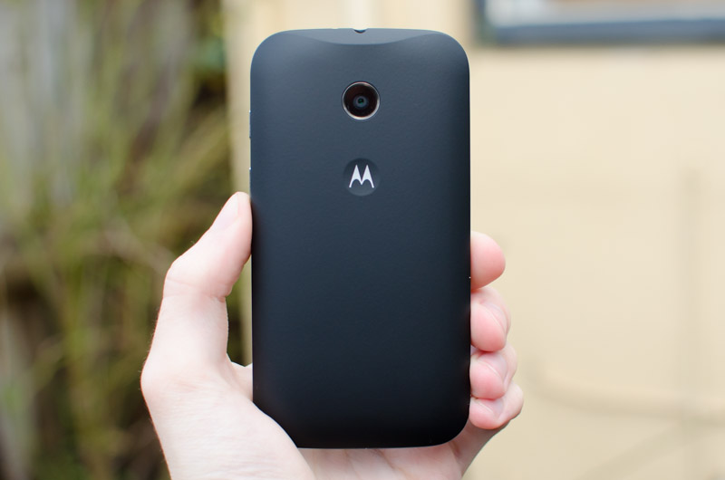
The back of the smartphone itself is quite minimal, containing just the camera lens - there's no LED flash on the rear of the Moto E - as well as a small Motorola logo contained within a concave dimple. I was told that the dimple is included specifically for your index finger to rest in during usage, stopping it from sliding around in your hand, and it's remarkably effective at achieving this goal.
The front of the E is mostly display, with two metallic strips seen above and below it. While each strip is a different length, sure to annoy those with OCPD, they serve different purposes. The strip at the top hides the in-call speaker that you normally place to your ear, and the longer one at the bottom is the loudspeaker that's also used for playing notification tones and music.
Although the Moto E has two speakers on the front, they aren't used simultaneously. This means you won't get a stereo effect like you would with HTC's dual front-facing 'BoomSound' speaker setup. Unsurprisingly, the quality from the loudspeaker is very poor, but it'll suffice for notification and ring tones.
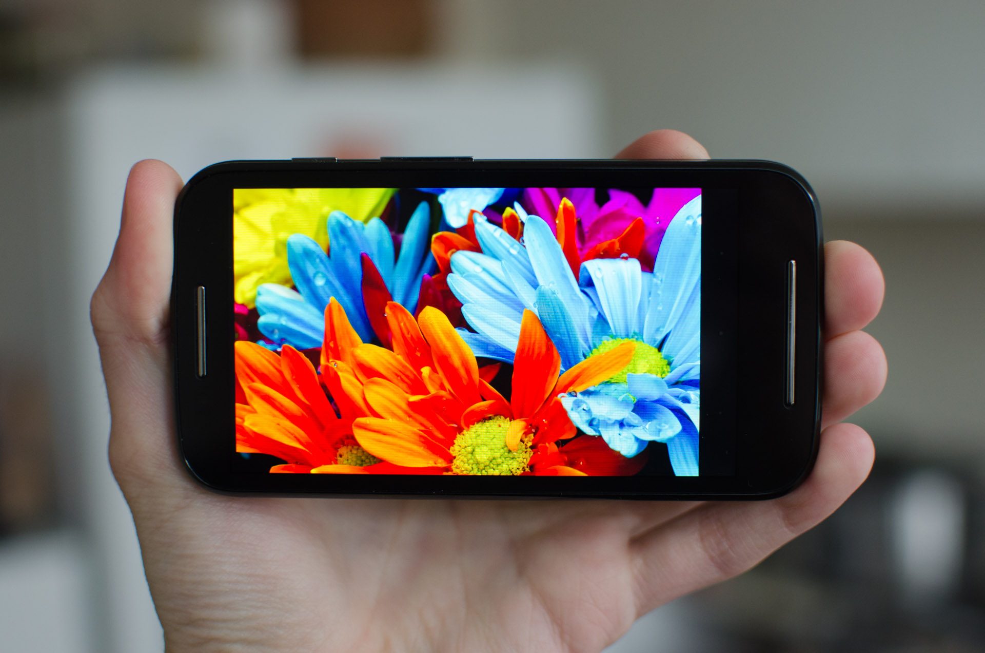
The display Motorola has used for the Moto E is a 4.3-inch TFT LCD panel with a resolution of 960 x 540 (qHD), equating to a pixel density of 256 ppi. The company hasn't disclosed what type of LCD panel this is, which typically means it's a TN panel. However on inspection it looks more like a cheap IPS panel, judging by decent (although not top-end) viewing angles.
The Moto E has a slight one-up on its competitors in that it uses a qHD display instead of the usual WVGA (800 x 480) panel. Using this higher-resolution display leads to a 17% higher pixel density and a 35% higher pixel count, both which are good news when the panel still falls below 300 ppi. At this price point, qHD is as good as you'll find, considering 720p panels are still a tad too expensive to fit into the materials cost.
Comparing the Moto E's display to WVGA equivalents reveals a slight, but noticeable sharpness advantage to the Moto E, as you'd expect. Text looks that little bit sharper, and images look that little bit clearer, even though individual pixels are still distinguishable when holding the smartphone a reasonable distance from your eyes.
Of course on higher-end devices, including the Moto G which has a 720p display, you'll get the benefits of pixel densities over 300 ppi, where it becomes very difficult to distinguish pixels and items look extremely crisp. For $130 I'm certainly very pleased with what the Moto E brings to the table, though; it's certainly several steps above what you'd get a year ago (goodbye, awful HVGA).
Color quality is quite good, although it's not quite as accurate as I'd like, with a slight tendency to oversaturate greens and blues. Images look quite good when the source material is vibrant, so there's no knocking Motorola for a weak display in this regard. Saturation does appear to reduce at lower brightness levels, so keep that in mind.
Speaking of brightness, the panel's backlight is capable of a maximum level that's bright enough to make the display visible outdoors. This is helped by a minimal gap between the panel and protective glass, which reduces reflections from strong light sources. Unfortunately there's a fair bit of backlight bleed when viewing blacks or dark images, reducing the overall contrast of the panel.
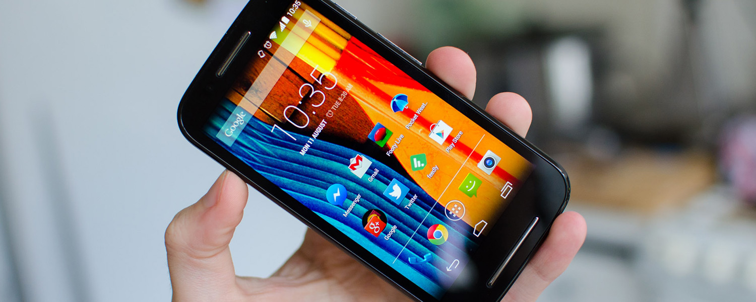
The Moto E uses Android's on-screen navigation buttons, taking up a small portion of space at the bottom of the panel. With the release of Android 4.4 last year, the on-screen buttons became much more flexible, allowing more screen space to be utilized more of the time. Still, some applications don't make use of the changes, reducing the effective display size down to 4.0-inches from 4.3.
The configuration of buttons is the same as the stock Android configuration, meaning you get Back, Home and Recent Apps in that order. Unlike LG smartphones, you can't change the order of the buttons.


