Google rolls out 'simpler, cleaner' search results page

Jos

Posts: 3,073   +97
Staff

Google has unveiled a new design for its search results page that gives more real estate to its Knowledge Graph results and makes the look and feel on desktop computers consistent with those on smartphones and tablets. In a nutshell, the new layout shifts the advanced search options from the left sidebar to the horizontal bar above results where options to search verticals like Images, News and Maps are located.

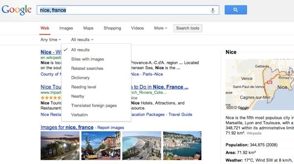
The advanced search tools themselves aren’t changing. Clicking on the “Search tools” link brings up virtually the same options as before, allowing you to filter results by date ranges and a handful of other criteria (sites with images, related searches, nearby, translated foreign pages, etc.)

google

Google says the new search results page will be available only to users in the US initially, with a gradual roll out to other languages and regions coming as soon as possible. A quick browse to Google.com shows the new design is live even for users outside the US, however. Here's the full announcement:

You’ll notice a new simpler, cleaner design on the search results page — we’ve been working on ways to create a consistent search experience across the wide variety of devices and screen sizes people use today. We started with tablets last year, got it to mobile phones a few weeks ago, and are now rolling out to the desktop.

With the new design, there’s a bit more breathing room, and more focus on the answers you’re looking for, whether from web results or from a feature like the Knowledge Graph:

The same advanced tools you’re used to are still there when you need them. Just click on “Search tools” to filter or drill down on your results:

It’s going out to Google.com users in the U.S. to start, and we want to get it to users in other languages and regions as soon as we can. We hope you enjoy this design refresh — let us know what you think on our Google+ page.

Permalink to story.

 
I'm having a really hard time finding an option for exact dimensions on the image search now though.
 
I don't like having to click "More" and then "News" to do a News search! Surely News is searched more frequently than Blogs, which appears in the header. And then to get the most current news I must click More, then Search Tools, then select Past hour or Past 24 hours from a drop down menu. It's all very inconvenient. At least make News one of the header options.
 
If my preferences can't be saved to a cookie or my Google profile, then this is yet another example of web design moving backwards. This obsession with hiding every control or element the user interfaces with is ridiculous.
 
I'm having a really hard time finding an option for exact dimensions on the image search now though.

You're right, I don't see it anymore. It was there on the left side yesterday, and now it's gone from the top in the new interface. I ended up using the "large" option and specifying the image size in the search box.
 
I like how the new design is cleaner, however I agree with the above, if you want to use filters it takes more clicks to get there. Google being Google has likely arithmetically optimized based on the number of people that use the different options on-screen and (drum roll) what produces better results for their ads and possibly for showing off the "Knowledge Graph" sidebar.
 
I don't like having to click "More" and then "News" to do a News search! Surely News is searched more frequently than Blogs, which appears in the header. And then to get the most current news I must click More, then Search Tools, then select Past hour or Past 24 hours from a drop down menu. It's all very inconvenient. At least make News one of the header options.
You looking for google news ? Is this what you're looking for ? https://news.google.com/
 
I don't want everything to be "consistent with those on smartphones and tablets." I want a desktop version that has all the options I need to quickly get the results I want. You know, like the original Google used to. Web design in general is indeed getting worse, IMO. Smartphones and tablets are useful, but they are destroying the desktop experience.
 
Back