Microsoft reimagined logo for Windows 8 is official

Shawn Knight

Posts: 15,284   +192
Staff member

Microsoft has revealed a redesigned logo for Windows 8 in a recent post on the company’s official Windows team blog. Redmond’s new operating system logo borrows heavily from the original Windows logo that was introduced alongside Windows 1.0 in 1985. Earlier this week we had pointed out the Windows logo was getting a Metro makeover, but the software giant just made it official today.

Sam Moreau, Principal Director of User Experience for Windows, notes that in addition to a complete reimagination of the Windows operating system, the team wanted to revise the existing Windows OS logo. Microsoft hired renowned design firm Pentagram to help with the project and it was during an early meeting with the firm that executives were presented with a very basic question.

Paula Scher from Pentagram asked the team, “your name is Windows. Why are you a flag?”

microsoft windows windows 8 logo

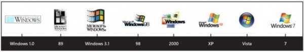
Moreau feels that users can trace the evolution of the Windows logo in parallel with advancements in computer technology used to create them. Windows logo rendering became more detailed with each major release. As such, the current generation eventually morphed into a flying or waving flag rather than the window it originally started life as.

With Windows 8, the company wanted to go back to the basics to better reflect the Metro style design principles. The new logo is indeed more window-like than flag-like, using simple lines and a straightforward concept that Microsoft describes as being “Authentically Digital.” The design itself is based on the International Typographic Style, also called the Swiss Style, which was developed in the ‘50s to emphasize cleanliness, objectivity and readability.

Permalink to story.

 
Don't like it. Windows98 was decent, XP not bad and Windows 7 (W7 Proffesional) was the best imho.... This one just does not look right :S
 
This logo needs to change color and rotate itself 90 degrees; still looks like a flag. Look at the 89 logo.
 
Windows 1 logo is far better from that. My proposal http://i44.tinypic.com/ra6h3m.jpg
ra6h3m.jpg
 
I always thought they had a flag because it was more creative than just windows ^.^
 
I think it needs the red, green, blue and yellow back. Those colours have become part of the Microsoft Windows brand and without them it the new logo looks soulless.

6ooob9.png
- my suggestion made using Microsoft PowerPoint
 
taimuraly said:
I think it needs the red, green, blue and yellow back. Those colours have become part of the Microsoft Windows brand and without them it the new logo looks soulless.

6ooob9.png
- my suggestion made using Microsoft PowerPoint

QFT
 
I liked the Vista one best - nice and tidy and with colors. The Windows 8 one looks like a logo you'd see for a dentist office. :p
 
Needs some more color to it! Time to bring back Billy Boy as the VP that running it now only going for the lighter shades of blue!
 
Not a fan, very dull especially considering the past logos. Think they could've done a much better job.
 
It looks like Sweden and Greece's flags got jiggy with it, like a Will Smith song...

... not original. I liked their first icon better.

-RC
 
It looks like a flag if you want to see it like a flag. True, it does not look like a window either but I suppose the marketing guys just need to prove they worth the money by actually doing something.
Just thinking what real improvement a new logo can do to a operating system. Maybe fool you to buy it cause you will think it's something brand new ? ;)
 
Win7's was the most elegant amongst all these IMO, although the new proposed logo doesn't look as 'charming', but it will look alright provided they add the colors.
 
Back