
While Dropbox is an excellent product used by over 500 million people, making a storage service look sexy and exciting isn't easy, no matter how good it is. But the company is attempting to appeal to creative types with a redesign, which adds a myriad of colors, an updated logo, and a new typeface.
Dropbox's new logo moves away from the previous 10-year-old design, which was easily identifiable as a box, to a more abstract image consisting of five isometric squares. The company calls it "a flatter, simpler" icon. Additionally, the logo will no longer be limited to the blue and white colors favored by the likes of Twitter and Facebook, but will "change based on the situation."

Dropbox told Adweek it hopes the new colors help set it apart from competitors such as Microsoft OneDrive and iCloud, and that the palette is a "nod to the creativity of our users."
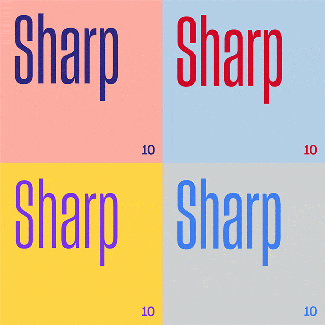
The revamp also introduces a new typeface called Sharp Grotesk. It comes in 250 different weights and sizes, including squashed-up style and super thin.
Despite the revamp, many users might not even notice the changes. Dropbox's UI in both its app and web versions will remain mostly the same, with the new colors and logo being more prominently displayed in the company's marketing materials. These ad campaigns will be "strategically placed in cities and neighborhoods where creative people tend to live and work."
Check out the rebranding video below, most of which doesn't appear related to a cloud storage firm in any way.