In context: Developer-heavy corporations are constantly searching for the perfect typeface to write code in. Intel is part of the race too, and the Santa Clara company's got a new offering that's specifically designed for people with vision issues.
Intel Corporation worked with the Frere-Jones Type design studio and marketing agency VMLY&R to create a new font, one that would be easier to read and free to use. Intel One Mono is better than free, because it is provided with an open source license and was designed with a low-vision developer audience in mind.
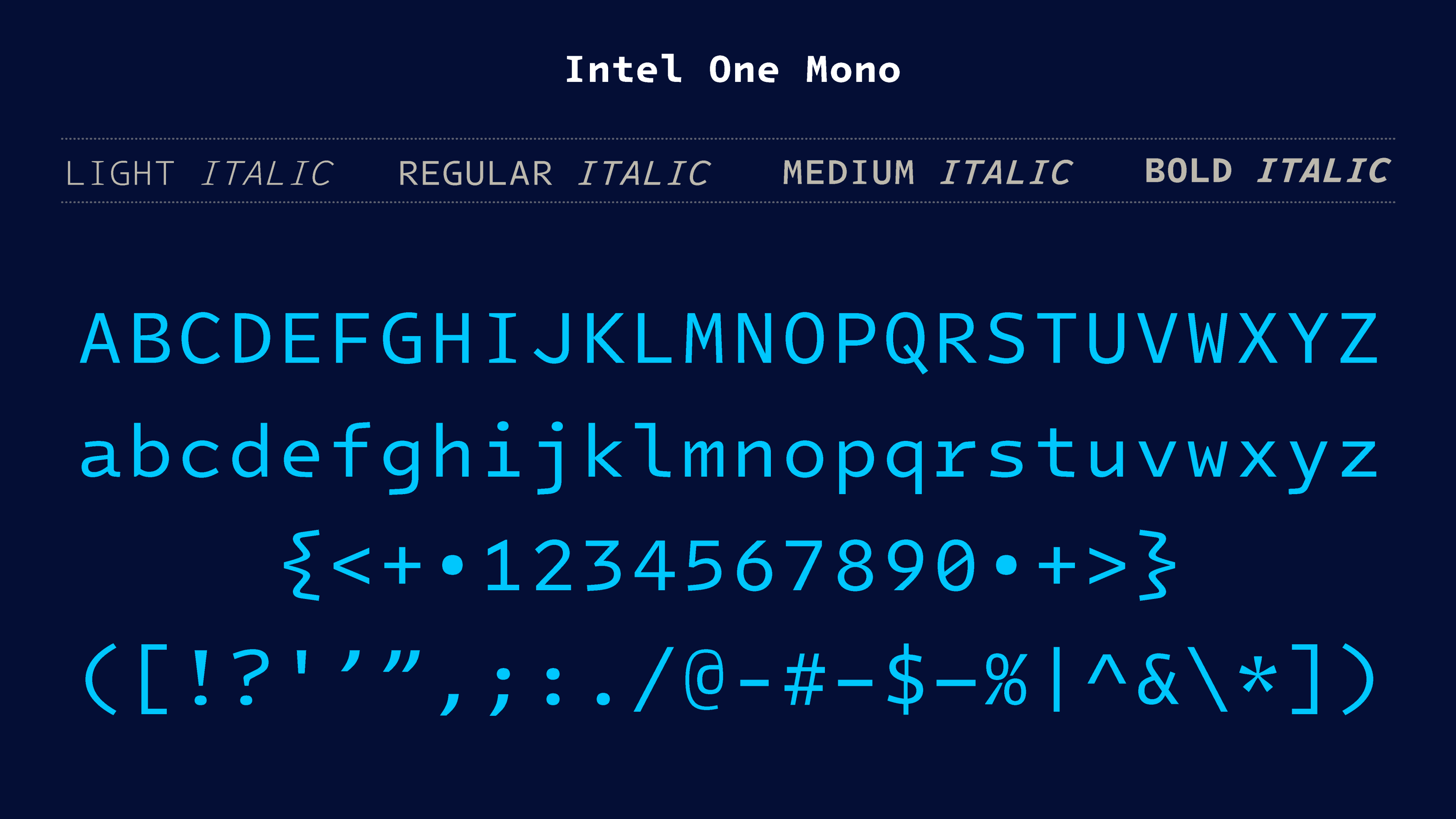
Intel One Mono is an "expressive" monospaced font family, which means that each letter and character occupies the same amount of horizontal space like in the good old days of terminals and MS-DOS prompt. The typeface was built with clarity, legibility, and the needs of developers in mind, Intel says.
Intel One Mono covers a "wide range" of over 200 languages using the Latin script, and it provides four different weights (Light, Regular, Medium, and Bold) with matching italics. According to Intel designers, developers with sight issues are "typographically underserved," and it took the company more than a dozen live testing sessions to check if One Mono was up to the task.
Visually impaired programmers were asked to write their code using Intel One Mono, while the font designers at Frere-Jones Type took notes about the eventual issues said programmers were experiencing trying to read characters on the screen.
Sitting behind programmers, the Intel One Mono creators collected some interesting feedback about the most "surprising" pain points in the new font. Some people had issues with telling apart a capital "M" from a capital "N," for instance, while others couldn't tell the letter "e" from the letter "c." In each of these cases, the developers tweaked their design until the final version of the font took form.
Intel One Mono is now online for everyone to see, try and (ab)use, and people are mostly pleased with the new monospaced font. Some still have issues with curly brackets, though, which are really "extra" curly compared to other monospaced and developer-oriented fonts. In this particular case, Tobias Frere-Jones said his design choices were about "reinforcing the identity of any shape," including the extra curly brackets.
https://www.techspot.com/news/99168-intel-one-mono-new-open-source-typeface-visually.html
