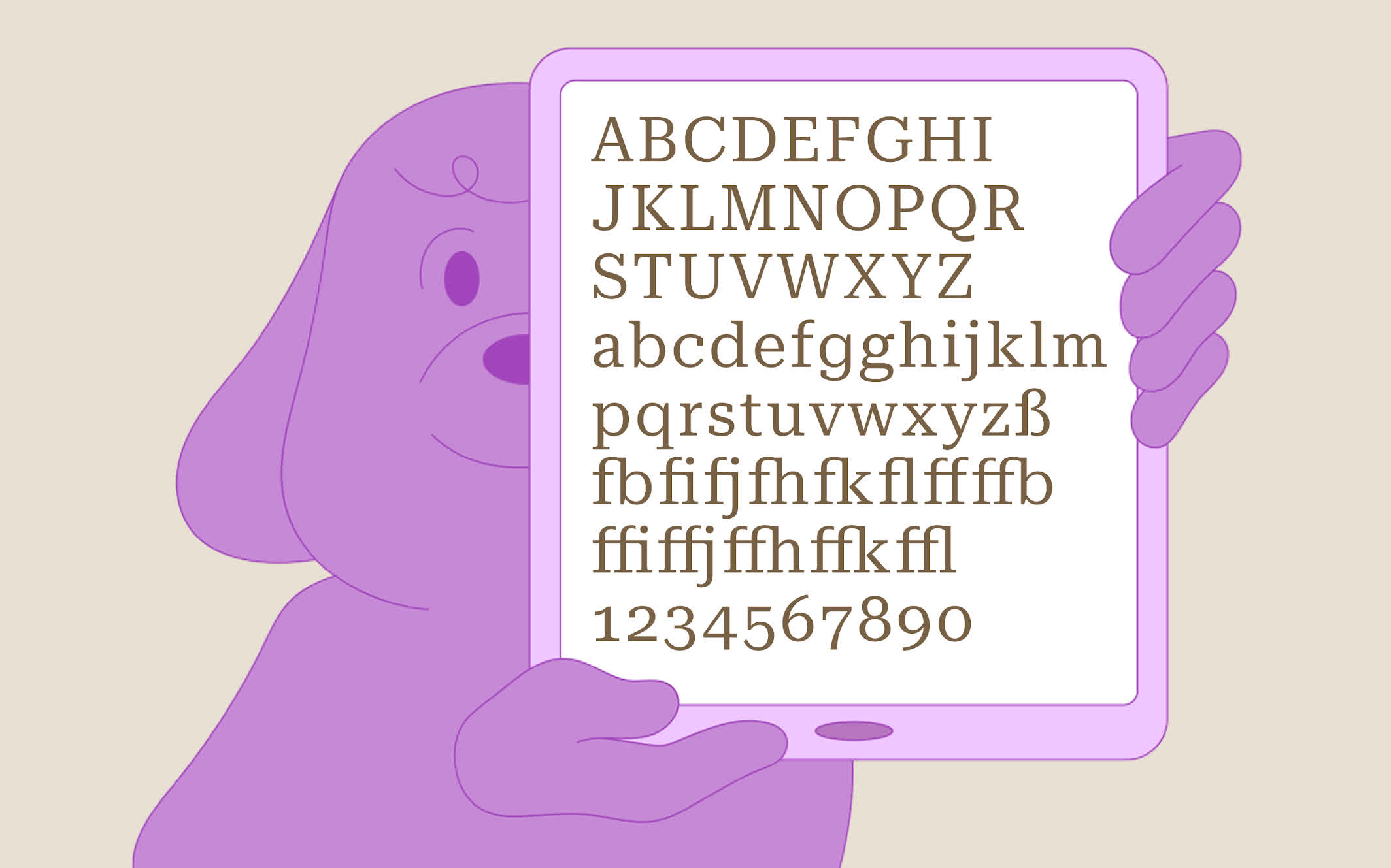
In context: The Roboto typeface was developed by Google to become the default font on the Android operating system, and later some of its most popular services like YouTube. The company recently unveiled Roboto Serif, detailing the extensive effort the typeface designers put into it, and why it's more flexible than its family members.
The headline on this article uses the Roboto sans-serif font, which we use extensively across TechSpot, and is part of the Roboto family, downloadable from Google Fonts. That family now has a serif version that its designers say should be more readable on various screens and even in print.
Typeface designer Greg Gazdowicz and his team at Commercial Type describe Roboto Serif as a minimalist design that doesn't scream that it's a serif font. They created it for things like user interfaces, menus, and infographics.

Roboto Serif is also more customizable than its predecessors. Roboto Sans-Serif has 12 set styles, and Roboto Condensed has six. Roboto Slab is variable with adjustable weight, while Roboto Mono can be adjusted according to weight and italic. The new serif version has customizable weight, italic, and width.
To introduce the new font, Google has published a lengthy PDF introducing Roboto Serif. The PDF covers the design process behind the font and provides plenty of example uses for it, like instruction pamphlets. The original Roboto fonts include Latin, Cyrillic, and Greek characters. For now, Roboto Serif only supports the Latin alphabet.