iOS 7: "dramatic" e-mail and calendar revamp causes delay

Rick

Posts: 4,512   +66
Staff

Rumors earlier this month suggested Apple's iOS 7 may be running behind schedule. Sources in contact with Bloomberg indicate this delay stems from a impending overhaul of iOS' user interface and "dramatic" changes to Apple's e-mail and calendar apps. These arguably much-needed enhancements come at the behest of Jonathan Ive -- Apple's long-time hardware (and now software) design visionary -- as he attempts to refine and even undo some of Scott Forstall's most questionable work.
ios apple iphone ipad software wwdc mail ipod touch updates jonathan ive operating systems jony ive mobile computing ios 7 calendar mail app calendar app

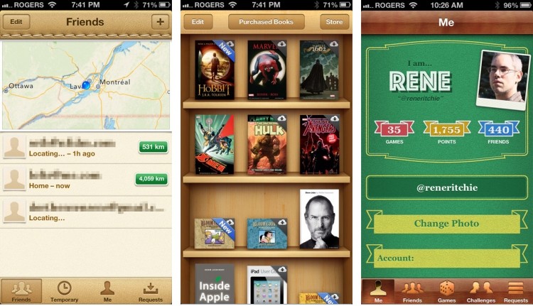
Apple "skeuomorphism" on current iOS apps (image credit: iMore).

If rumors hold true, vanquished will be skeuomorphic design elements -- possibly ones like yellow paper-looking notepads and e-books nestled upon virtual wooden shelves. Instead, sources claim Ive and company are working toward a "very, very flat" and modern look which is to become uniform throughout iOS. Changes in store for e-mail and calendar apps are unknown at this point, but there's certainly plenty of room for improvement: a truth which projects like Mailbox seem well aware of.

So, wait a moment -- flatter? Are we talking "Windows 8" flatter or just the removal of electronically simulated leather and wood grain? 9to5Mac recently took a stab at explaining what this could mean. Naturally though, such details about upcoming iOS changes remain elusive. However, we may get a glimpse of iOS 7 on June 10; Apple is expected to pull the curtain on both Mac OS X 10.9 and its latest iOS at this year's WWDC.

Despite purported internal delays, Bloomberg's sources claim iOS 7 remains on track for its anticipated September release. This apparent confidence concerning a still-timely release may be due in part to Apple's decision to enlist additional help from Mac OS X 10.9 engineers.

Permalink to story.

 
I dont use either, there are tons of better replacements for Mail and Calendar that Apple cant replicate.
 
No, it means Android's Holo flat. A good example of this would be the Google Maps app on iOS. On Android it would be Google Now or Google Keep.

They are referring to the use of flat, solid-looking, chrome-less menus that often hover over the content or integrate with it without metaphors of leather or wood.
Kind of, they want the operating system to be clean, and not have a bunch of different textures.
 
Well, I don't see any skeuomorphism with the calendar and email app, they just generally suck.

The animations I speak of - delete, back, send. This is all just on the email app.
 
Well, I don't see any skeuomorphism with the calendar and email app, they just generally suck.

The animations I speak of - delete, back, send. This is all just on the email app.
I dont really know what animations you are talking about. The only animation I notice on my phone is the trash bin in photos. Nothing else. The skeuomorphism they speak of is this for example:
Screenshots-iPad-Notes-App.jpg
 
Haha yeah, I know about the notepad, game centre, etc. :p

Seriously, delete an email: The whole screen gets 'sucked' into the trash icon. There's small delays both before and after that animation. Overall, it takes longer than a second, which is unacceptable.

On email, click the 'back' icon in top-left. This takes you back to the mailbox, then to other accounts, etc. The screen 'slide' animation takes too long.

Clicking the home button , the 'zoom out' animation takes too long.


All of these animation timings are remnants of first-gen iPhone with extremely limited hardware. To be honest, I think they're used extensively throughout iPhone 4's too. Basically, these long animations hide the 'loading time' of the app change or app action. Instead of the screen doing nothing with just a loading icon, the user is presented with a pretty animation and a sense of "hey, it's actually doing something and isn't frozen".
 
Back