Microsoft shows off Windows 10's new Start Menu

midian182

Posts: 9,763   +121
Staff member
Forward-looking: We’ve been hearing about the redesigned Windows 10 Start Menu for some time. Now, Microsoft has given us another look at what we can expect. It’s not a huge change, but it definitely looks sleeker.

Earlier this year, we heard rumors that Microsoft would be killing off Live Tiles in Windows 10’s Start Menu. The feature continuously pulls information in real-time from the likes of Mail, Spotify, and news and weather applications, but it hasn’t received much support from Microsoft recently, and more third-party app makers have dropped their support.

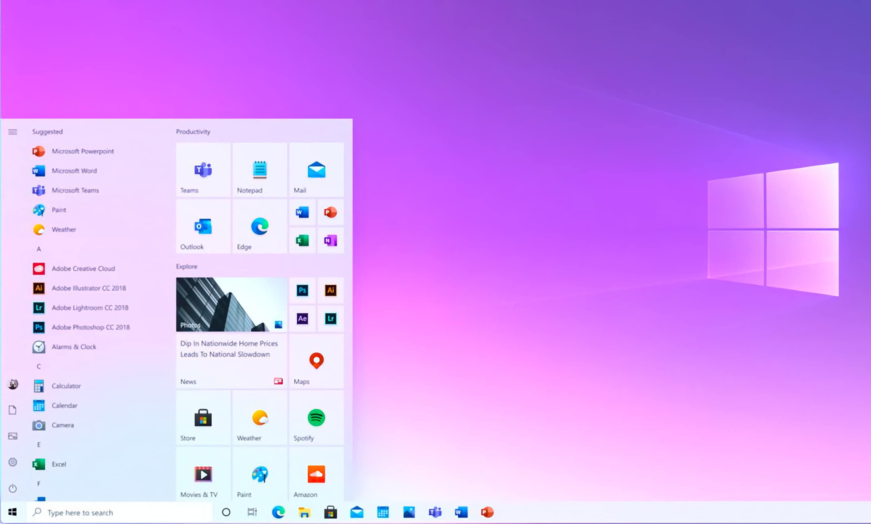
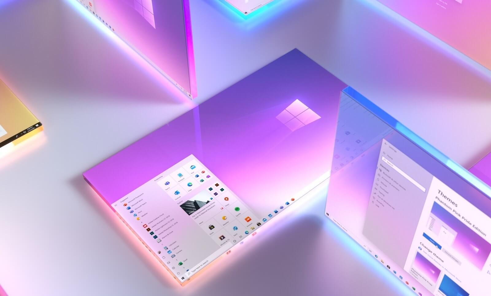
In March, Microsoft said it is “exploring” a new direction for the Start Menu, confirming that the Live Tiles feature wasn’t going away. It also showed off images of the redesign it’s considering, which includes app icons in translucent blocks.

The new Start Menu, which is expected to arrive next year, will have Live Tiles with a background that matches users’ light or dark themes. In a Microsoft 365 Facebook post (via Windows Latest), the company shared the latest images of the revamp.

We see that the Live Tiles are switched off, but rather than showing a solid block of color, they use the Fluent Design icons with the translucent backgrounds we saw earlier this year.

The images also show how app icons on the left of the Start Menu are no longer placed inside blocks; instead, they sit next to their names.

We don’t know exactly when Microsoft will add the new Start Menu, beyond the ‘sometime in 2021’ guess. What do you think of the updated design? Should Microsoft have gone further, or do you prefer things the way they are?

Permalink to story.

 
After all this time and all the complaints they still hang on desperately to "live tiles". Really hoped that after Gates left they might figure it out and start moving in a more positive direction but apparently they just don't get it. A very common issue for most large corporations .....
 
Eh, I use the pins for stuff I want to access quicker. Easy to customize (though unlisted programs are a few extra steps to add).
 
Even through I use Windows 10 every day, I find it hard to notice what is new or different on those screens.
TBH I don't care for Start all that much anymore, I feel like I have to use search/CMD more and more often to the point it's becoming second nature for me.
 
It looks like its just white.
This means I would have to use a completely black wallpaper to make it a bit darker which is something I don't want.
They should make an option to change the color
 
Eh, I use the pins for stuff I want to access quicker. Easy to customize (though unlisted programs are a few extra steps to add).

Yeah same ... I went through all the live tiles and realized there's already a ton of options for them. I turned off all the "liveness" of them, removed all the garbage tiles and replaced them with what I actually use. Works fine, but it took a fair bit of time to customize the entire start menu to the way I wanted it.

You can remove all the tiles if one wants to. But I suspect most people don't want to take the time.
 
If there's a way to f it up, leave it to Microsoft. If they want to "fix it", then look to the past and Windows 7. A few mods to the Win7 start menu and you have a winner!
I never really liked the Win7 start menu. It was slow and barely had any use for it. We need something better than what MS has made.
 
I'd kind of rather see them finish all the other UI that you still have to use Control Panel for?

One area MS totally messed up was adding "settings". Control Panel was the home for everything in settings until some fool decided it was better to separate. Now we have to dance back and forth between control panel and settings until we find what we need. DUMB!
 
If there's a way to f it up, leave it to Microsoft. If they want to "fix it", then look to the past and Windows 7. A few mods to the Win7 start menu and you have a winner!

I'm glad Windows 10 isn't using the Win7 start menu. It's just too limited for my liking.
They could (and maybe should) add the Win7 menu as a possible alternative to use instead of the Win10 one, but I think they won't because that would be "too much of a compromise".
 
Definite improvement over the current start menu. The "mini" tiles behind the All Apps / All Programs list has always looked pretty bad, this minor change makes a world of a difference.
 
The start menu is fine the way it is.

How about fixing the abomination that the settings applet is? It's clearly replaced the now deprecated control panel, except when you actually have to change a serious setting and then it just kicks you right back into the control panel. The lack of uniformity and functionality is dreadful.
 
Back