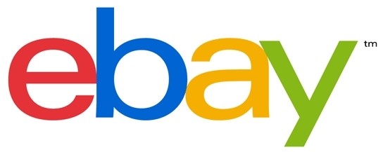
eBay president Devin Wenig has unveiled the new logo his company plans to implement later this year as part of a reinvention of the site. The executive says the simplified logo helps to reflect the cleaner and more consistent website that eBay has now become.
Wenig noted in a site announcement that the decision to create a new logo wasn't easy as the existing eBay logo is known the world over but at the same time, he said the time felt right. Much like Microsoft did with their new logo earlier this year, eBay's new brand is extremely modern (or plain, depending on whom you ask).

The company went with the font Univers Extended, says New York designer Dianna McDougall, which is described as relatively open with virtually no space between the letters. Wenig said it was important to keep the same color palette since it represents eBay's connected and diverse community of buyers and sellers.
eBay's president goes on to explain that the site still plays host to a number of auction-style listings that helped build the brand over the past 17 years. The majority of transactions on the site today, however, take place using the "Buy It Now" option instead of the traditional auction format. eBay seems content with this new storefront role which likely helps them compete with other big players like Amazon.
The site will be launching the new logo in mid-October in addition to some other changes designed to make the site more personalized. This includes more local and global features, Wenig said.