Display
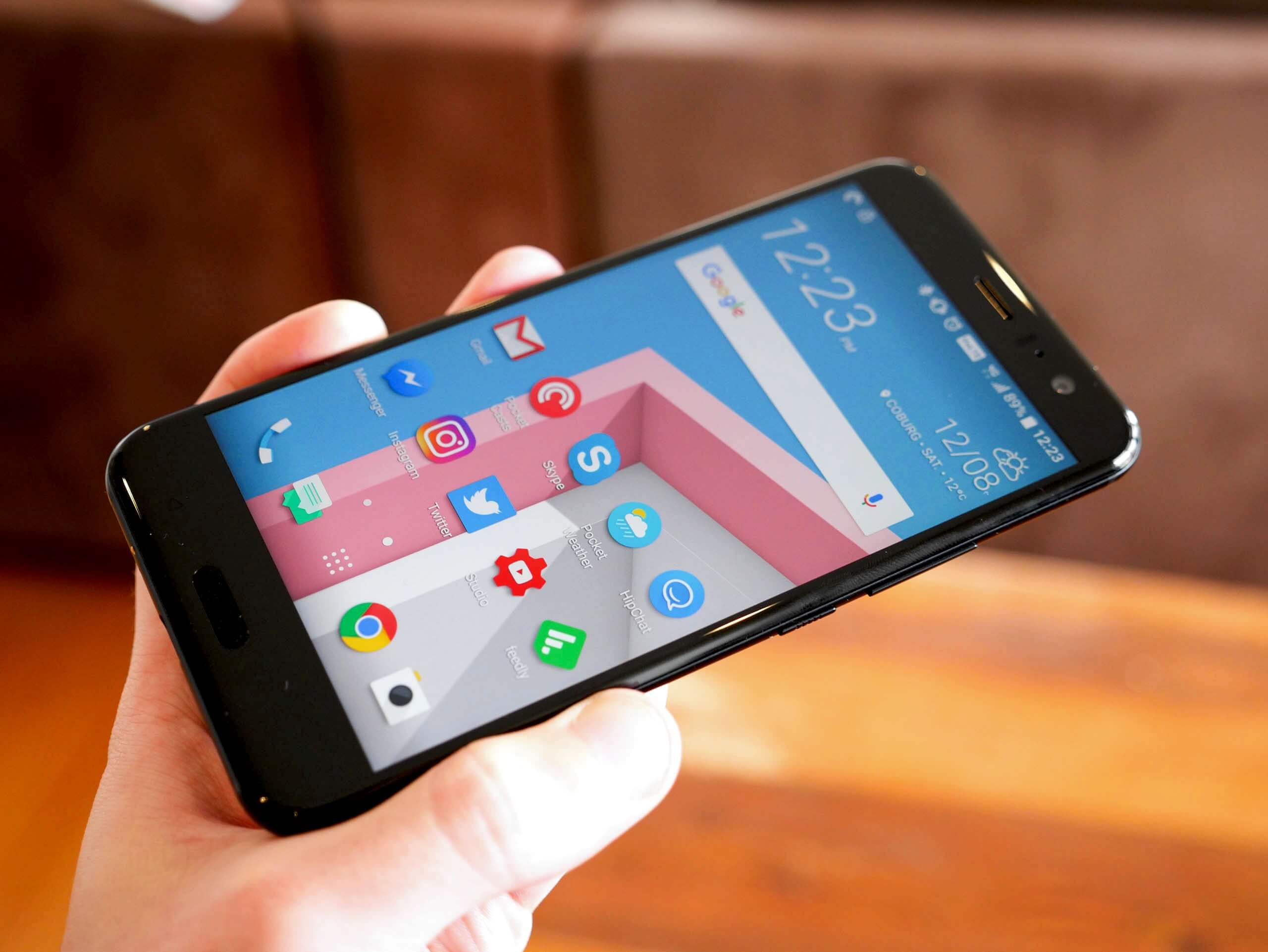
The HTC U11 comes with a 5.5-inch 2560 x 1440 Super LCD5, with a pixel density of 534 PPI. Relative to last year's flagship, the HTC 10, we're getting 0.3-inches of additional space at the same resolution, which is a decent upgrade for those that prefer a larger display. Of course, this has made the phone larger as well with no attempt to shrink the bezels.
HTC has kept their "Super LCD" branded display technology, which is essentially a type of IPS with better-than-normal viewing angles, at least as far as I've seen. The viewing angles here are still fantastic, as is the contrast ratio of nearly 2000:1; higher than some other flagship LCDs.


The U11's 5.5-inch display is about 120 nits brighter than the HTC 10's display at peak, with HTC now implementing a brightness boost function when in sunny conditions. Now pushing upwards of 580 nits makes the U11's screen highly visible in bright outdoor environments, and anything above 500 nits I class as very good for smartphone LCDs. Auto brightness can be a bit aggressive, but otherwise the brightness functionality has improved since last year.
As for color performance, HTC has made some slight tweaks here to improve the color temperature. The HTC 10's display was very cold out of the box, at nearly 8000K, which I think delivers a pretty unpleasant viewing experience, particularly under warm artificial lighting. The HTC U11, on the other hand, is much warmer by default, pulling near accurate at 100% white and fairly decent on average across the grey range.


The U11's display is still oversaturated, falling outside the sRGB gamut in greens and reds. Android doesn't support color management, so software can't make proper use of the extended gamut, which just results in oversaturation across the board. Most people (including me) tend to like a more saturated smartphone display - the U11's screen looks great in general - though anyone who prefers accuracy won't appreciate the unnatural saturation.
Diving into the settings you will find a color temperature slider, which for the best results should be set two notches to the left. This produces pretty accurate grayscale results, though as it doesn't correct oversaturation, it only has a minor effect on general color accuracy. There's also an sRGB mode toggle in the developer options, which doesn't work.
