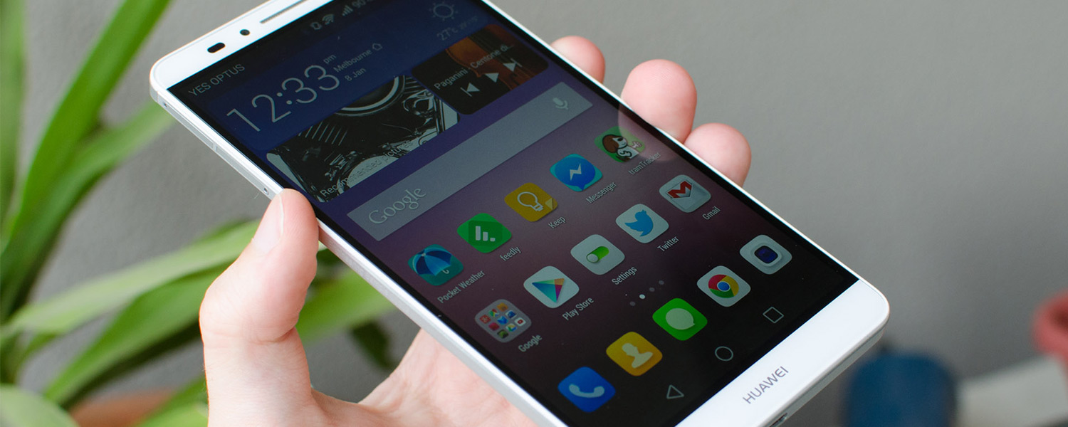
Software: Huawei's Emotion UI
The Huawei Ascend Mate 7 runs Android 4.4.2 out of the box with a custom skin, called the Emotion UI, atop. Unfortunately we're not seeing Android 5.0 on this device just yet, though hopefully Huawei will release an update in the near future.
The Emotion UI is an interesting skin, first and foremost because it ditches the app tray in favor of the iPhone-style layout which sees all apps on the homescreens. It's not the first Android launcher to remove the app drawer, but it's the first I've used on a regular basis.
I tend to prefer having the app drawer so I can place just my most frequently accessed apps on the homescreen and have the rest sorted alphabetically, but with the Emotion UI you can just chuck everything you don't want into a folder or the last screen.
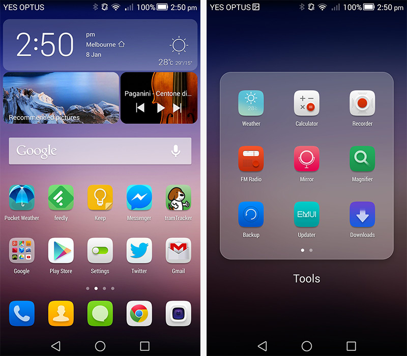
The general style of the UI is pleasant, though not hugely similar to the Android Material design. This creates a somewhat disjointed experience between using the stock Huawei apps and the wide selection of Google apps. While this is always a letdown, I'll be nicer than I usually would to Huawei, because I like the use of thin lines and colors throughout the skin. It doesn't feel as cluttered as LG's skin, or as downright ugly as TouchWiz.
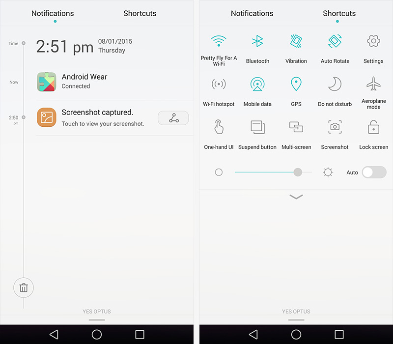
I like the way the Emotion UI handles notifications, with a timeline view making it easy to see when you've received notifications and in what order. A second tab is available in the notification pane, giving you quick access to a variety of settings. Splitting the notifications and quick toggles reduces clutter, and also allows the phone to display more of both in each tab.
One thing I found hugely annoying, though, was the frequent battery consumption warnings. It's nice to know when some apps might be consuming battery in the background, but it felt like I was constantly dismissing and blocking these warnings as they kept appearing. Toning these down or keeping them just to the battery section of the settings screen would be preferred.
Most of the standard applications, like the messaging, contacts and calendar apps, come with easy to use interfaces. Everything in these apps is nicely laid out, any extra features are easy to find in menus, and the general look of them is quite nice. Not cluttering up the interface with too many unidentifiable icons is a good thing in my books.
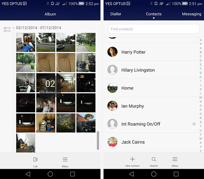
I was a little disappointed that many of the stock Emotion UI apps don't make better use of the large, six-inch display with the font set to a reasonable size. The messaging and contacts apps specifically contain a lot of useless white space, while other apps like the gallery and music apps have unnecessarily large headers or button sections. Allocating more space in these apps to showing content, like more messages or album art next to tracks, wouldn't go astray.

One advantage to having that larger display is a larger keyboard, which at least on the Ascend Mate 7 makes it easier to type on. Keys were very responsive, easy to hit, and there's also swipe functionality if you prefer to type that way. I'd like to see the spacebar a little wider, and emoji integration, though these are minor complaints.
The rest of the included applications on the Ascend Mate 7 are nothing special, and could even be classed as bloatware considering you can't remove them from the homescreens.
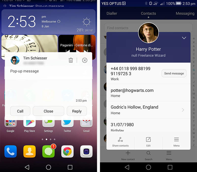
One of the signature aspects of the Emotion UI is its use of pop-up windows, such as when you click on a contact anywhere in the stock applications, or when messages arrive. Having messages pop-up over apps when one arrives can be a blessing if you always want to keep up with them, but at other times it can take away your focus from whatever app you're using.
In the settings screen you'll find a typical array of features, like a do not disturb mode, a step counter and motion controls. I liked the inclusion of adjustable navigation buttons, and there's a solid data usage meter. But some of the stuff I liked most revolved around app permissions. The notification manager and protected apps screens allow you to block apps from sending notifications and running while the screen is off respectively, which can cut down on annoying spam messages and battery wasters.
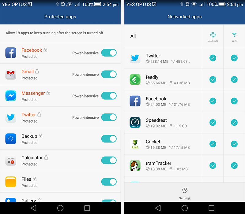
Another feature, found under networked apps, allows you to restrict certain apps' access to mobile data and wireless networks. With this feature, you could completely cut off internet access to some apps, or restrict heavy data users just to Wi-Fi. It also gives you a breakdown of how much data each app is using, allowing you to make the best decisions as to which apps to restrict. Kudos to Huawei for introducing something new like this.
