TechSpot Weekly: Our homepage revamp

Julio Franco

Posts: 9,099   +2,049
Staff member

Last week we launched TechSpot's new homepage bringing the biggest change we've made to the site since our last full redesign over two years ago. As you have likely noticed, the revamp consists, among other things, of a new 'headline view' which is our new default, while the legacy full-view mode remains an easily accessible option.

The reasoning behind the change was multifold, but perhaps the most important factor is that we wanted you to have a better way to browse through our news without having to scroll indefinitely, something that was becoming a bigger challenge as we tried to improve our coverage, bring you more detailed features, and embed rich media whenever possible. Whether you prefer the new headline view or the full layout, your browser will remember your setting whenever you click on either mode.


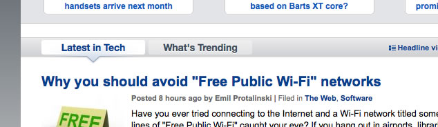
Other notable features that were part of the revamp are the "What's Trending" tab, a mix of the most commented and read news topics in the last week, improved page navigation with AJAX story loading on the headline-view, and topic-specific archives that are also easier to browse. The admittedly dull 'Top Stories' section that we had before has been reworked and married to the trending algorithm, so you can check out TechSpot's most popular news topics in the last week or the past month.

We are glad to report that so far the transition has gone smoothly and we've received mostly positive feedback. That said, we were surprised that almost none of you felt compelled to comment about this on the forum, so here's your opportunity to do so and in the process help us improve further based on your suggestions.

Permalink to story.

 
while the legacy full-view mode remains an easily accessible option...

No its not the same :(

I don't like it, I have actually used the website less since the change because I just don't like the redesign. IMO it does not feel modern at all.
 
That Facebook/Twitter search bar is annoying. One thing I liked about this site is that it wasn't cluttered with unnecessary annoyances like that.
 
I really like the new layout, though I only use the full-view mode.
Site seems slightly faster overall as well.

Regarding the Twitter/FB bar, I doubt I'll ever use, but some might. Also, the bar can be hidden by clicking the left double-arrow-down icon, so I don't see what's so annoying.

The headline-view IMO doesn't present news in a clear way to read it. I think readability would be improved if the news pictures were moved to the right since we read text from left to right.
 
I like it, but I stay on legacy mode. Most people just don't react to change very well. Look at facebook; every week they change something and everyone cries, but everyone today would agree the layout is better today than four years ago.

But that facebook/twitter bar is kinda annoying.

otherwise Good Job
 
I always look at the articles through my RSS feed, I don't think I've been on the front page in a long time, lol.

Looks really nice.
 
Homepage got messy, I always should look through the pictures to find titles.
 
I like the revamp! Nice to browse quickly with headline view.
I have to agree with other users, I don't like the facebook box/sidebar thing.
 
Naa im just been picky. but I don't like the headline view. It seems to save it as full view when signed in so should be all good. But Yea I dunno y just not been using the site as much since the change. I don't like ''whats trending'' Its juts a big long list of storys, was great when you got most the story without having to change page. If the storys where as a list layed out to make better use of the space. (IE like on computerandvideogames.com)
 
Can't hide the FB bar. It's glitchy on Opera I'd guess. Can't hide sometimes, always pops up, and pushes the page to the top when it loads (I open page, scroll down, then get bumped to top).

Otherwise, the revamp is nice.
 
Change is good. I've been coming to this site since it came on and It's my home page. Keep up the good work.
 
I like it - adds more flexibility to reading/browsing. The twitter bar is a minor annoyance, but has already been pointed out can be easily removed.
 
Thanks for the great feedback so far. About the sidebar, soon we will add a customization drop down and based on your comments I will make sure we have an option to get rid of the social bar easily. This will be better than the current hiding option as it will stop loading any code related to it. Give us a week or two and we should have this implemented.
 
i'm kinda late to the party! but i like it the new page! precious comments have stated what i wan't to so yea..

new page is a step in the right direction, even loads fast with my slow internet.
 
I dint like the new interface of your homepage. Was much better off with the old one. Please if you can get the original back?
 
@ruzveh, if you read the story above you will realize you can go back to the previous homepage view with a single click...
 
It took me 2 minutes to find the facebook/twitter thing everyone is raving about so apparently its not an issue for me. I do click on the "what's trending," tab so I can keep up with what's being talked about.
 
I mostly spend time on the forums, so its been a while since I went to the home page. So I just checked and I like it a lot.
 
Maybe do the comments next, be nice if able to edit comments if make mistakes, I know it says double check, but Pff who does that!?
 
good work on the design. i like it a lot more than the other one. Is it just me or does it feel a lot snappier when loading now?
 
Back