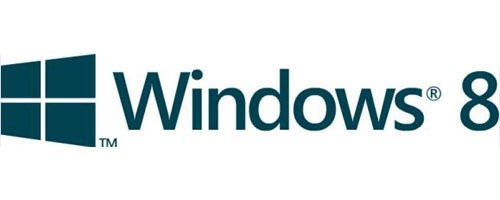
As part of its planned redesigns for the upcoming Windows 8 operating system Microsoft looks set to completely change its legendary logo, according to pictures leaked by Chinese site CN Beta.
The multi-colored flag design has served the company for 22 years, and was first featured alongside Microsoft's Windows 3.1 operating system. The iconic logo has undergone many changes since those days, with some more successful than others. There is no denying that the current flag design is perhaps one of the most instantly recognizable logos in the world. That said, the planned change ties in well with Microsoft's "Windows reimagined" marketing and looks like it will complement the Metro interface perfectly.

If the slides are to be believed, the new logo to be unveiled with Windows 8 has returned to a dark green monotone 2D design with angled rectangular more window-like boxes. While at first glance it appears a significant step away from previous designs, it's actually quite similar to the original Windows 1.0 logo that debuted back in November 1985, as pictured below.

The Verge has since confirmed with sources familiar with the matter that it is authentic and will debut alongside the Windows 8 release later this year.
They also divulged that the new logo will appear on the "Windows" button of ARM tablets, as well as in the new Charms bar, and will feature throughout the multiple interfaces of Windows 8. It is said to be the "first of many changes to the way the Microsoft markets Windows and its brand identity throughout 2012."
Microsoft is not the first company to move from a multi-colored design to a simple monochrome alternative. Apple changed their iconic rainbow "bitten" Apple logo to a simple monochrome version back in 1998.