Google experiment replaces blue links with black text - do you approve?

Shawn Knight

Posts: 15,288   +192
Staff member

Upon submitting a Google query, you’re presented a handful of results in which the site name is written in blue and the URL for said site is listed directly below in green… or at least, that’s what most people see.

The search giant is apparently toying around with how it presents web links and URLs. As The Telegraph notes, multiple users have taken to Twitter to share a new look that replaces the traditional blue site names in search results with black text. The URL and body text remain unchanged.

Something as trivial as the color of a link in a search result sounds trivial but when the world’s most popular search engine makes even a small change, users take notice.
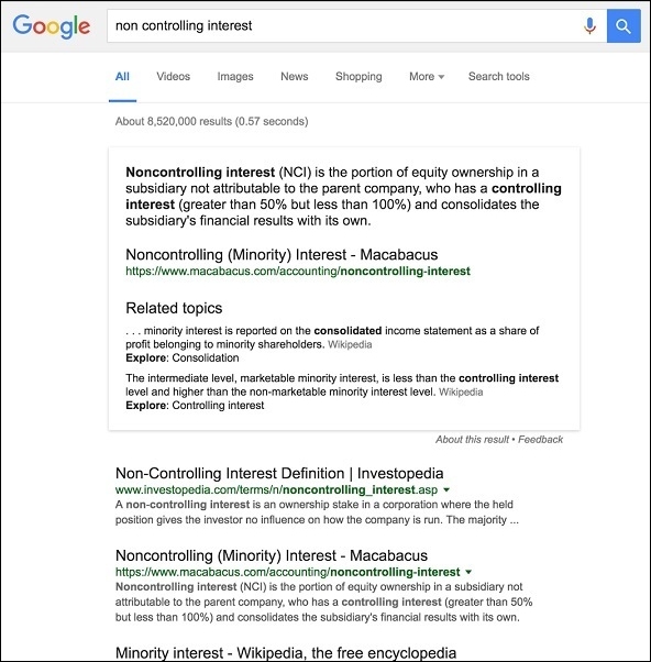
People by and large dislike change, especially to sites and services they utilize on a daily basis. Such appears to be the case here as several have taken to social media to voice their opinions of the new link color.

It’s no different than when people get all worked up each time Facebook makes a change to its Timeline. When asked for comment, Google said they’re always running many small-scale experiments with the design of the results page, adding that they’re not quite sure that black is the new blue.

If you’re experiencing the black links and want to revert back to the way things used to be, logging out of your Google account then signing back in apparently does the trick.

What do you think about Google’s black links? I don’t mind them personally although I’m unsure how one would differentiate between a clicked and unclicked link (maybe the black links turn grey?). Let us know what you think in the comments section below.

Permalink to story.

 
Not a good idea. People equate bolding with an emphasis of the subject - not a hyperlink. What happens when they want to bold something without using it as a hyperlink? Confusing...

This is one of those "if it's not broke, don't fix it" things.
 
Blue and purple links work perfectly with the normally black text it needs no changing. With those 3 colors there is no confusion and everything works perfectly, this is not needed.
 
Not a good idea. People equate bolding with an emphasis of the subject - not a hyperlink. What happens when they want to bold something without using it as a hyperlink? Confusing...

This is one of those "if it's not broke, don't fix it" things.

I couldn't agree more!
 
You can bet there's another part to this: a whole new class of links they can charge advertisers for. Colors would be a little extra, underlines or flashing text would be even more costly and so on. Needless to say this should be rejected completely. The web is on the verge of being almost unusable thanks to the endless proliferation of spyware and site-breaking garbage pushed by the admongers.
 
First of all this change makes no difference to me. Second, I like it. I don't understand for all the reasons above.

"People equate bolding with an emphasis of the subject?" Huh? Google.com does one thing and that's to search for data. People will know what part of the search results to click. Just look at THIS site. The link to the Telegraph isn't even a different color. Oh well....
 
I had a fellow developer in my company decide she didn't like the colour of visited links. Changed it so they remained blue instead of going purple. We had quite a few client calls complaining that they could no longer tell which files/documents they had already accessed. No reason to do this at all. Majority of text is black, so it has to be something other than black or have another indicator to show that its a link and not a heading/title. I thought Google had a strenuous recruitment process guaranteeing they only get top employees. Obviously someone slipped through the net and landed a position with them.
 
Sounds like someone at Google with a high-paying job needs to justify their position and value to the company. Nothing more, nothing less. This is the new great corporate engine in America....changing font colors. Just think of how many people this little change will keep employed. Federal Government works the same way.
 
Ok this might not be popular but most of my posts aren't so here it goes...

"Deal with it". EDIT: I would've put it in bold but... you may get the urge to click it...

We get used to it, it's as simple as that. This might be the same as when facebook made changes in the past to how it worked, EVERYONE bitched but it changed and people got used to it and it was as simple as that.

You might get used to it at one point or you might not, if they make a change they just make it and if you don't like it go *cough* bing yourself. They might revert, they might not, in the end it's up to Google even if everyone complains about it.
Since they didn't roll it out to everyone and are calling it an experiment, Google cares what we think.
 
It probably won't be any more annoying than Techspot's purplish-gray text on off-white backgrounds. That's harder to read then black text is over the same background. Any yet, they do it anyway. Companies will do what they want,, not what makes life easier for the people that use their services.
 
It's a good thing I use custom stylesheets to ensure that all links are blue (purple if visited) and underlined on all pages. That's what links look like... if it's a link, it needs to look like that to most efficiently communicate its status to me.

As it is, I sometimes try to click on the (strangely not clickable) URL listed for the search results on Google (below each actual link), even though it's the wrong color. I've been accustomed to clicking blue, underlined links for decades, yet when I see a URL, my brain focuses on that as the place I want to go, and the green color differentiates it from the cited text enough that it seems to be a link. I don't know why Google makes the URL itself not clickable-- what would be the downside to linkifying the URL as well as the link title?

When I have page colors off (simple click of an icon on the status bar toggles it), FF then renders all non-link text as black, so the URL is the same color as the summary text, and only the blue text grabs my attention. I never try to click the URL in that case since black text means "this is the default color, so definitely not a link."

So if I was actually using Google in the way mentioned, with the actual link being black, the URL being green, and the summary text being black, I'd be clicking the URL exclusively, and getting frustrated that it doesn't work. Black means NOT A LINK, Google!

Stuff like this is why I insist on using Firefox, despite the doctrine of "let's be Chrome" that has infected Mozilla for the last few years. Nothing else has the addons that so successfully wrest control from the web developers and return it to me. The original idea of the web was that it content was to be displayed the way the USER wants, and I still cling to that idea.

About a third of my addons are things that overcome Mozilla's boneheaded design errors (Australis, removal of status bar, that kind of thing), a third add important function (uBlock Origin, Self-Destructing Cookies, Greasemonkey, etc.), and a third are things that overcome web designers' "visions" for sites. I don't know how people can browse without such tools-- I get frustrated with the general stupidity far too quickly.

Earlier I was reading a page about geared steam locomotives. I found a term in the page I wanted to search for, so I go to highlight it (so I can then right click to get the context menu and "Search Google for <term>"), but for some reason, the site author had decided to disable text highlighting. Yeah, 'cause if I wanted to plagiarize the page, that'd stop me for sure, and all of the annoyance it causes to readers is surely worth it.

Annoyances like that pop up very often, of course. This one was easy enough to fix... I click an icon in the status bar (for RightToClick) and I can highlight again, and away I go with the search I intended.
 
Back