In a nutshell: The OS updates coming to Apple devices later this year will institute the company's first major UI design shift in over a decade, but eagle-eyed observers noticed similarities with an old version of Windows – comparisons that haven't escaped Microsoft's notice. Thankfully, users concerned about Apple's upcoming interface will have options to change its visual presentation.
Some of Microsoft's social media accounts recently poked fun at the upcoming "Liquid Glass" user interface design language Apple unveiled at WWDC this week. Although the Cupertino giant has hailed the update as a major innovation, many immediately began comparing it to Microsoft's nearly two-decade-old Windows Vista UI.
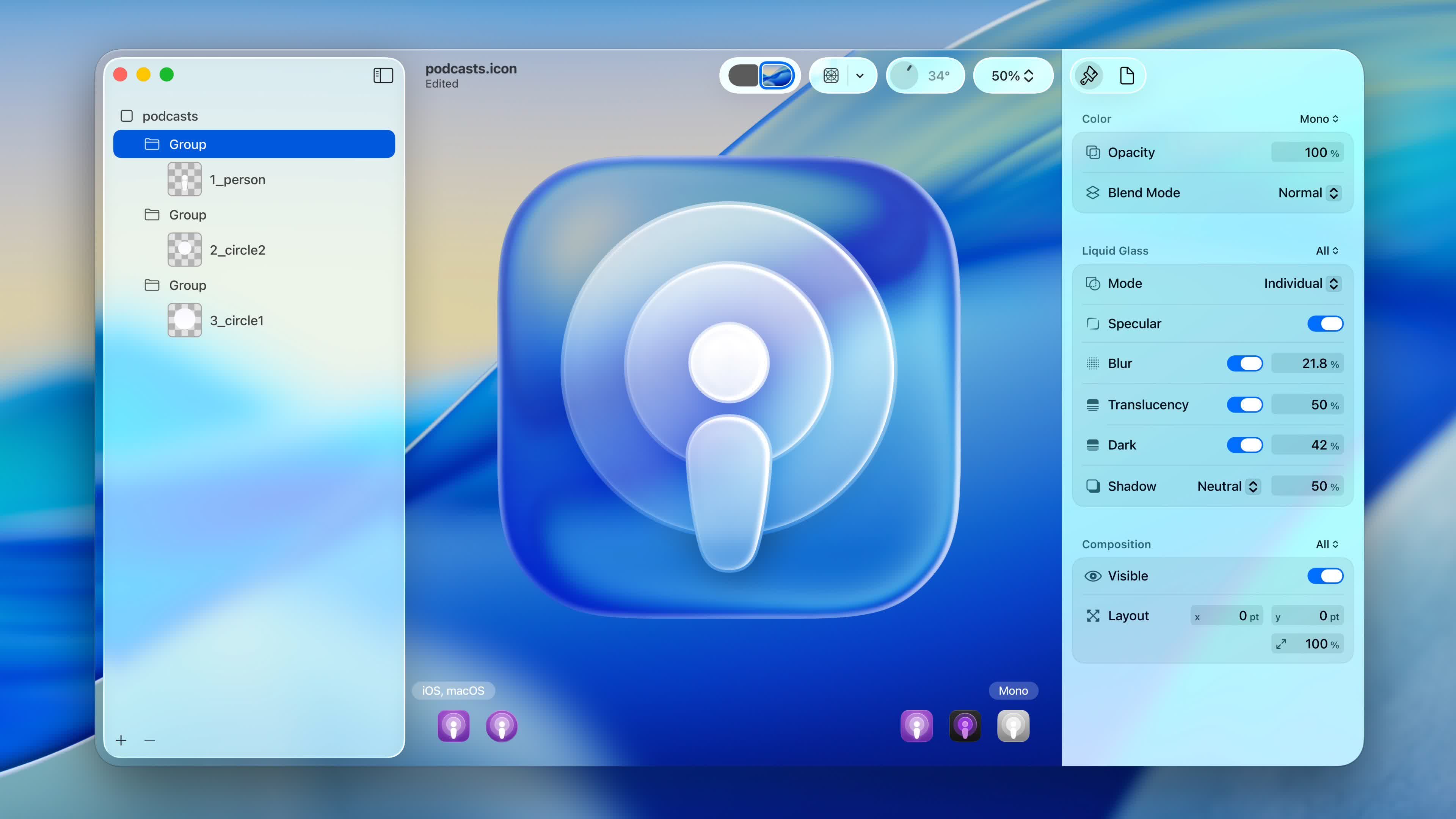
Liquid Glass is Apple's name for the new visual style arriving in iOS 26, iPadOS 26, macOS 26 Tahoe, watchOS 26, and tvOS 26, which will launch this fall. Inspired by the Apple Vision Pro's visionOS, the design language favors rounded edges and transparent backgrounds for inputs and other UI functions.
It is Apple's most significant design change since iOS 7 debuted almost 12 years ago, and the first to establish a unified language across all of the company's devices.
On the left: nice Liquid Glass UI minimalistic look. On the right: Liquid Glass looking all kinds of wrong in the current beta.
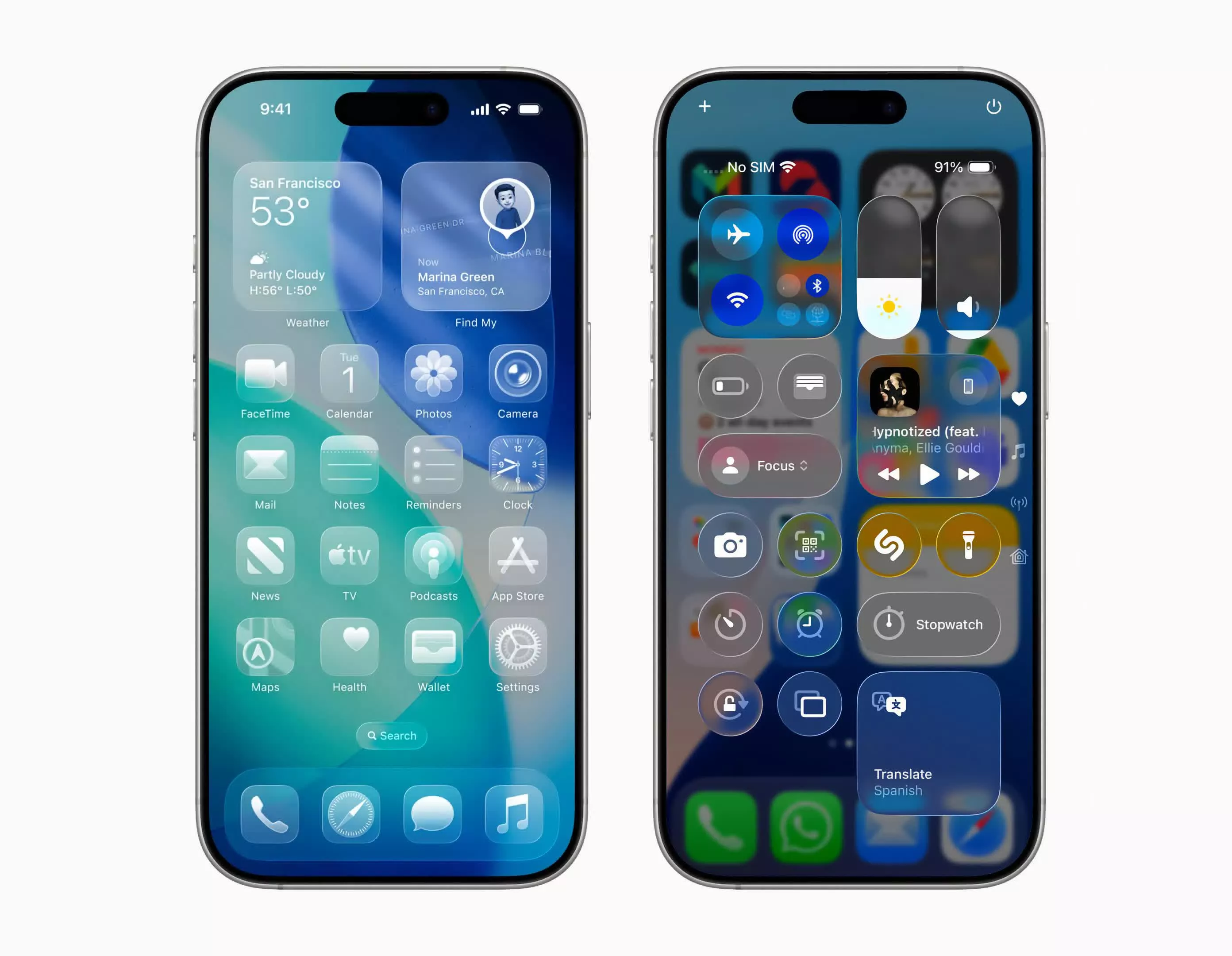
Apps, wallpapers, and other background content will be visible through app icons, notifications, and menu elements for a glass-like appearance. Apple claims that the effect will improve cohesion across the interface, but beta testers are concerned that text will become less readable.
Liquid glass surface animation on #iOS26
– Matteo.sui (@matteodotsui) June 10, 2025
Behaves like a true liquid
Mindblowing pic.twitter.com/dD6Ha51eh8
All interactions of Apple's new Liquid Glass UI in one video: pic.twitter.com/eRHF1xfo5T
– Adam Pietrasiak (@pie6k) June 10, 2025
Others, including Microsoft, mocked the update's resemblance to Windows Vista's glass-like "Aero" aesthetic, which debuted in 2007. That OS also made UI elements partially transparent, but Microsoft eventually phased it out when it began moving toward its current design language.
the attachment to the user icon we chose at 13 is unmatched pic.twitter.com/ATdIYctPVq
– Windows (@Windows) June 10, 2025
The official Windows Instagram account recently responded to Apple's presentation by posting a slideshow of Vista screenshots played over a nostalgic Windows boot tune. The Windows Twitter account also shared a picture recalling the Vista-era profile icons.
Other social media users joined in on the fun. Some highlighted the unfortunate placement of the YouTube icon in Apple's Liquid Glass explainer video, which the company altered. Others compared the design language to the unique chassis for Apple's 2000 Power Mac G4 Cube and the main menu for Nintendo's 2012 Wii U game console.
very unfortunate play button pic.twitter.com/RsxTamA1gL
– juan (@juanbuis) June 9, 2025
Fortunately, users can customize Liquid Glass by switching between transparent, light, and dark modes. They can also opt for a slightly more opaque presentation with a toggle located under Settings > Accessibility > Display & Text Size > Reduce Transparency.
I am a graphics programmer, and here's my feedback on Apple's Liquid Glass beta. The idea is cool, but it's difficult to work with from a UX perspective.
– Xor (@XorDev) June 10, 2025
Let's start with the main problems:
1 - Low Contrast: It's clearly not readable, but there are many different ways to fix it. pic.twitter.com/qLNY1FYYwW
If you don't like Liquid Glass, you can easily switch to Frosted Glass pic.twitter.com/yWZCBqAio7
– Andreas Storm (@avstorm) June 11, 2025
I can't believe Apple copied the Wii U's glass icons with iOS 26… pic.twitter.com/WJl2OLjHHA
– Smoky ✿🇵🇷 (@smokypogg) June 9, 2025
Apple G4 Cube + Liquid Glass UI pic.twitter.com/y3Qeq5sBvL
– Basic Apple Guy (@BasicAppleGuy) June 12, 2025
Microsoft trolls Apple's new Liquid Glass UI for looking like Windows Vista
