Editor's take: A quick test of the service using my home address proved insightful. In addition to the handful of ISPs I was already aware of offering fixed service, I learned that several providers including SpaceX and HughesNet service my area with satellite-based Internet.
The Federal Communications Commission has launched an interactive broadband map that provides a snapshot of broadband coverage across the US.
Maps that highlight the availability of various services are nothing new (remember those early, spotty cell phone coverage maps?). The FCC has maintained broadband coverage maps for a while but up to this point, they were based on data collected at the census block level. This meant that if a single home in a census block was served by broadband, the entire block would show up as served on its maps regardless of whether or not other homes actually had access to service.
The census block method resulted in coverage maps that were overly optimistic and not representative of actual broadband availability.
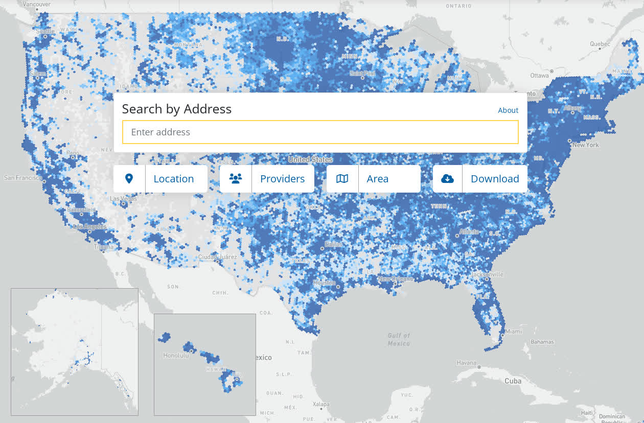
The FCC's new broadband map, available now as a pre-production draft, aggregates data directly from broadband providers and "hundreds of location-specific data sources" to paint a more accurate picture. Now, consumers can plug in their address and see which ISPs claim to offer service as well as what technology they use and even the maximum upload and download speeds afforded. There is also a system in place for consumers to challenge inaccuracies and provide feedback if data does not match what they know to be true.
The FCC's improved coverage map could be incredibly handy when contemplating a move, especially in the post-pandemic world where lots of people are now working from home and must have connectivity at their residence.
FCC Chairwoman Jessica Rosenworcel believes the enhanced transparency of the new map will create market pressure on service providers to improve their coverage and assist policymakers in targeting unserved and underserved communities to narrow the digital divide.
Rosenworcel added that the new broadband maps represent the beginning, not an endpoint. "Releasing this early version of the new maps is intended to kickstart an ongoing, iterative process where we are consistently adding new data to improve and refine the maps," she added.
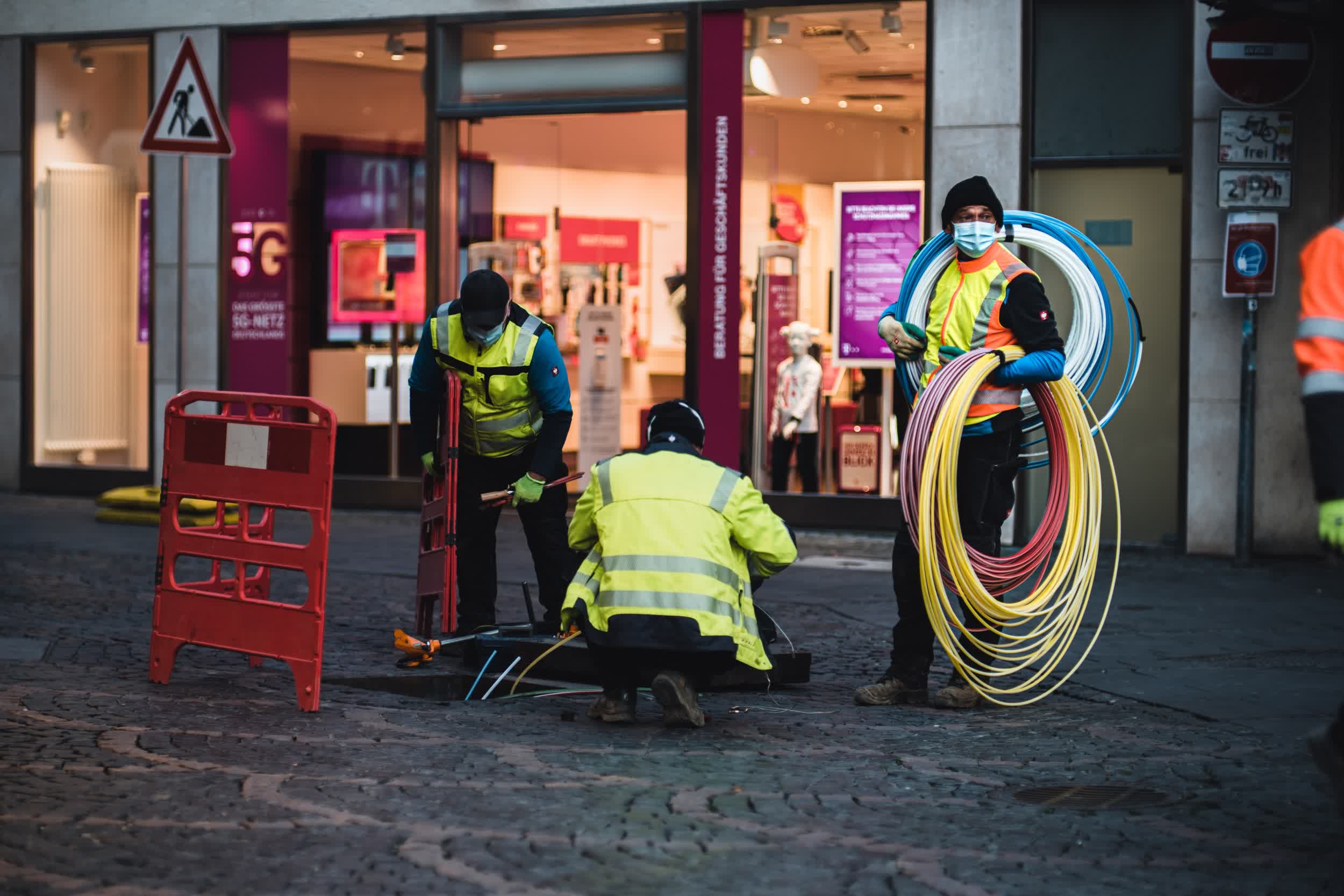
Image credit: Mika Baumeister, Alina Grubnyak
https://www.techspot.com/news/96723-fcc-launches-detailed-broadband-coverage-maps.html
