Windows logo to get a Metro makeover in Windows 8

Leeky

Posts: 3,357   +116

As part of its planned redesigns for the upcoming Windows 8 operating system Microsoft looks set to completely change its legendary logo, according to pictures leaked by Chinese site CN Beta.

The multi-colored flag design has served the company for 22 years, and was first featured alongside Microsoft’s Windows 3.1 operating system. The iconic logo has undergone many changes since those days, with some more successful than others. There is no denying that the current flag design is perhaps one of the most instantly recognizable logos in the world. That said, the planned change ties in well with Microsoft’s “Windows reimagined” marketing and looks like it will complement the Metro interface perfectly.

windows metro

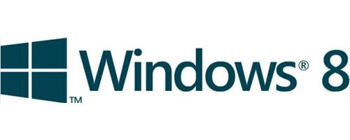
If the slides are to be believed, the new logo to be unveiled with Windows 8 has returned to a dark green monotone 2D design with angled rectangular more window-like boxes. While at first glance it appears a significant step away from previous designs, it's actually quite similar to the original Windows 1.0 logo that debuted back in November 1985, as pictured below.

windows metro

The Verge has since confirmed with sources familiar with the matter that it is authentic and will debut alongside the Windows 8 release later this year.

They also divulged that the new logo will appear on the “Windows” button of ARM tablets, as well as in the new Charms bar, and will feature throughout the multiple interfaces of Windows 8. It is said to be the "first of many changes to the way the Microsoft markets Windows and its brand identity throughout 2012."

Microsoft is not the first company to move from a multi-colored design to a simple monochrome alternative. Apple changed their iconic rainbow "bitten" Apple logo to a simple monochrome version back in 1998.

Permalink to story.

 
I'm not sure about that new logo, the old one is very unique and recognizable even without the 'Windows 8' letters. Now the new one without any context can look like a box or a present, and the perspective is kind of off.
 
This is a terrible move by Microsoft. Apple changing their logo to the monochromatic one of today wasn't such a big step. It still remained instantly recognisable and without thinking you could still instantly identify the brand on sight. The new Windows logo is just so bland and generic, at first glance the names of several local glaziers come to mind before Microsoft.
 
Metro interface for desktops is such a drastic makeover for the worst, maybe a drastic makeover of the logo for the worst is appropriate.
 
well is it going to look more like this:

http://translate.google.com/translate?hl=en&sl=auto&tl=en&u=http%3A%2F%2Fwww.windowsblogitalia.com%2F2012%2F02%2Frivelata-la-lista-dei-giochi-presenti.html
 
Why do they even bother calling Windows 8 "windows" at all since everything in metro runs full screen and wont really let you have overlapping windows? Then again I guess windows 1.0 wouldn't let you either but at least you could have 3 or 4 applications open on the screen at the same time... Maybe Microsoft's next innovation in Windows 9 will be to revert everything back to the command line, immagine DOS integrated with the searching functionality of Vista/7! ugh.
 
I like the change at first glance, and I agree it needs color in certain scenarios to make it recognizable. But as it's been shown time and time again, logo creation is not an exact science and only time will tell if it stands the test.
 
By comparing these to logos(pictured above) , windows 1.0 logo seems more attractive to me. windows 8 logo is just too bad.
 
not so bad with color : http://www.windowsblogitalia.com/2012/02/sara-questo-il-nuovo-logo-di-microsoft.html
 
Why not ditch the Windows franchise at this point ? Just call this OS "Microsoft Tiles 2012" or something like that.. Yes that's risky (brand recognition and everything else..) but what do you guys think ?
 
Guest said:
Why not ditch the Windows franchise at this point ? Just call this OS "Microsoft Tiles 2012" or something like that.. Yes that's risky (brand recognition and everything else..) but what do you guys think ?
Seems legit :)
 
Considering the amount of money is at stake, I'd be willing to bet that MS hired someone to research this move and seems they gave it the green light.

Weren't we all just bitching about ASUS changing their logo or something?
 
Why the disgusting green color everywhere? It's not even an environmental company, quite the opposite!
 
@Julio a great logo must be simple, unique and instantly recognizable. That Windows 8 logo only has the simple part right.
 
Microsoft and Google are just not refined enough; I'm pretty confident my new computer and mobile phone will be from Apple; I just wish they would add a simple but useful email service to complete my satisfaction, because even that is in the ditch.
 
Back