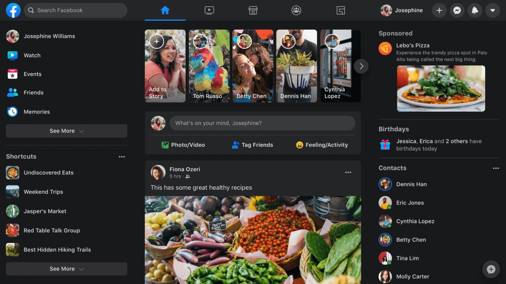
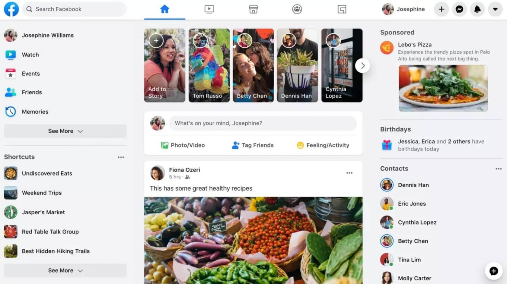
What just happened? Facebook has changed multiple times over the years, but lately, the website has been experimenting with one of its biggest overhauls to date. After months of adjustments, testing, and feedback from users, the overhaul is finally rolling out for everyone, with the goal of streamlining the Facebook experience.
Indeed, Facebook's interface has been simplified so heavily that it's started to resemble competitor Twitter (as well as Facebook's own mobile app) in many ways. The icon design is similar, there are plenty of Twitter-like, bubble-shaped UI elements, and the top navigation bar bears some resemblance to Twitter's as well.
At any rate, while some people undoubtedly relished Facebook's old look, the hope among Facebook's leadership team is that the new UI will make it easier to browse the site and access its various features. The updated top navigation bar emphasizes this focus.
The new navigation bar has simple, dedicated buttons for your main feed, as well as Facebook's Gaming, Marketplace, Groups, and Watch pages.

According to Facebook, the new site will also speed up loading times between pages, and fresh posts on your home feed should appear faster than before. The difference will likely not be noticeable for everyone, but for those on particularly slow connections or machines, it could be a godsend.
Other miscellaneous changes arriving with this overhaul include larger fonts, a more responsive layout that scales and adapts to different screen sizes better (though we've seen some of our readers complain about wasted space on larger screens), and, of course, the new "Dark Mode" option.
If you haven't gained access to Facebook's redesign yet, note that the roll-out is taking place over several days, so you might have to wait a bit before it arrives for you. When it does, it'll become the new default interface. You can reportedly opt-out and revert to the classic look through the drop-down menu, but we're not sure how long that option will be available.
