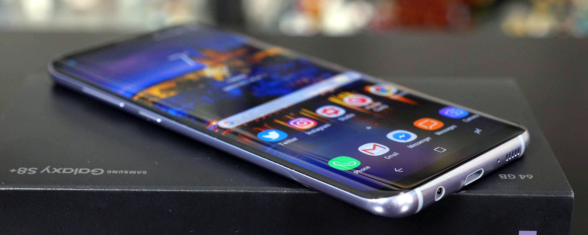
Software
Samsung includes Android 7.0 on the Galaxy S8+ out of the box, with the latest version of what the company is now calling "Samsung Experience" (aka. a custom skin). Samsung's software has become increasingly better across the last few generations, and what you get on the S8+ is the best version of their software yet.
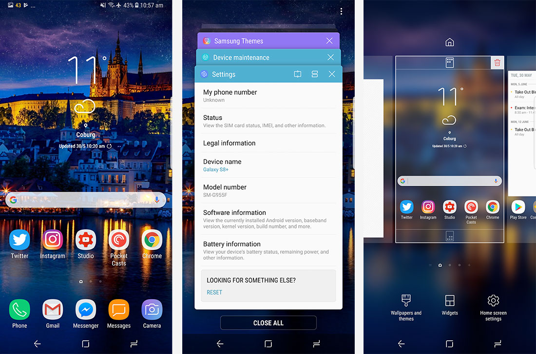
For starters, Samsung's skin has a much nicer visual design than any previous version of TouchWiz. The company is now using a clean yet unique style that looks like it belongs in a modern Android world. Every cartoon element that was a feature of TouchWiz in the past is now a more stylized, futuristic element, with a greater use of rounded edges and far fewer gradients. The design looks pretty good these days, and stands out from the crowd of other Android handsets.
As always, Samsung has changed basically every element possible in the OS to reflect their design language, aside from stock Google applications. The mix of Samsung's skin and traditional Android design tends to work reasonably well, and many apps use elements from Google's design handbook, although it's clear that most of Samsung's stock apps have been designed with a different style in mind. Previous versions of Samsung's skin have looked nothing like stock Android, so I'm glad Samsung has hired some design experts for their latest efforts.
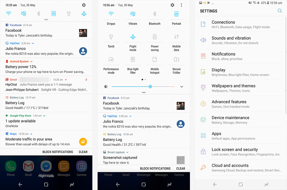
Where you'll likely notice the biggest changes compared to stock Android is in the notification pane, which uses a vastly different style. Most of the changes are purely visual though, so you'll still see the same highly-informative notifications as you get with Android 7.0's more card-based layout. At the top you'll find the traditional range of quick setting toggles, which can be expanded into a two-pane smattering of controls, along with a brightness slider. Samsung has cut down on unnecessary crap here in favor of just the elements you need.
The settings screen has also been changed significantly, with a simplified design making it far easier to navigate than any previous Samsung handset. The condensed submenus are a godsend and they just make sense, separating settings into clear categories. Previously this area was an absolute mess. In fact, Samsung even gives you hints about where to find stuff if you happen to accidentally stumble into the wrong section, making it even easier to find what you're looking for.
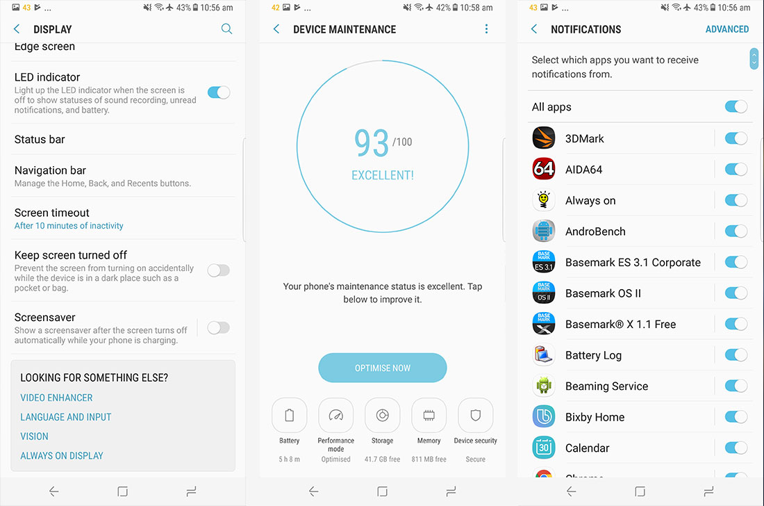
As you'd expect from a Samsung device, there are a lot of features throughout the software. I'm not going to discuss everything, because many of these features are of limited use, and some aren't hugely original. You will find handy things like the app notification blocker, full theming support, a one-handed mode, gesture support, and the game launcher. There's even a new maintenance tool that makes it easy to manage battery life and storage, turn on performance modes, and secure your handset.
Bloatware is not nearly as much of an issue on the Galaxy S8+, because Samsung allows you to remove it all during the installation process. In a surprise move, Samsung actually asks you if you want to install a bunch of unnecessary crap like S Health and their duplicate internet browser. I didn't want any of that garbage on my phone, so I opted not to install it.
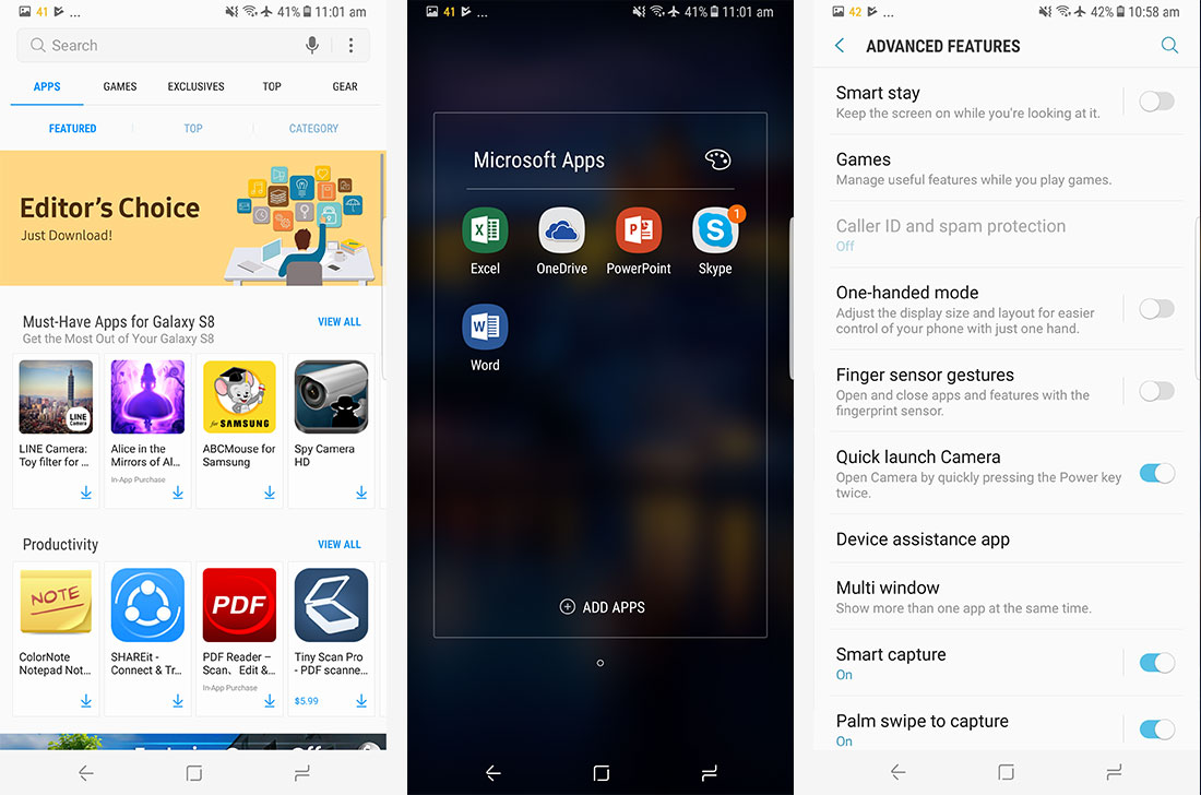
This doesn't rid the S8+ of bloatware entirely. There are still two duplicate apps - Gallery and Galaxy Apps - and a few other bits of junk like mySamsung and a full suite of Microsoft apps. I still have no idea why Samsung persists with their own app store when the Play Store is at least one million times better, but it's the only way to update their pre-installed apps. I guess you can't win everything.
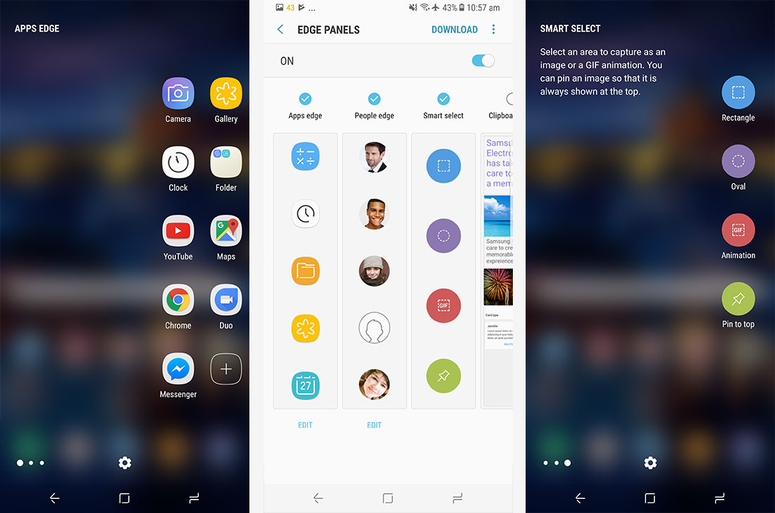
I would talk about the Edge screen features, but there's not a whole lot to discuss. I found the Edge screen more annoying than anything, bringing up some useless panes when I just wanted to swipe across the screen. I don't need quick access to apps or contacts; I can do those things from the homescreen or within the contact app. Perhaps the only useful feature here are the screenshot tools.
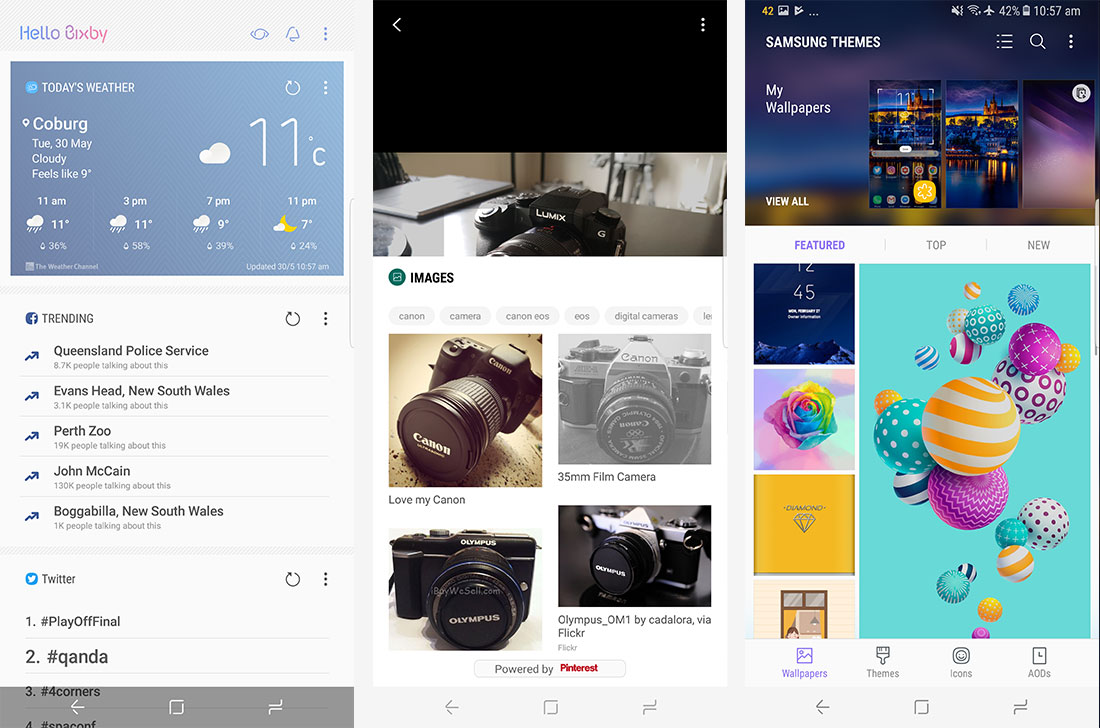
Another thing I'm not going to spend much time on, much to the chagrin of Samsung I'm sure, is Bixby, their new virtual assistant application to rival Google's Assistant. The Galaxy S8+ even has a dedicated button for launching Bixby, which frustratingly can't be remapped to something useful. I say this because Bixby is basically a clone of Assistant and Google Now, and there's no compelling reason to use it over Google's alternative.
Bixby is split into three parts: Home, Voice and Vision. Home is the leftmost pane of your homescreen that shows you stuff like calendar appointments, the weather, news and so forth. This sounds a lot like Google Now, and that's because it is, except it doesn't have the power of Google behind it. Vision uses your camera to recognize objects, like Google Goggles back in the day, making it a neat but ultimately gimmicky inclusion. And Voice wasn't available in Australia, so I couldn't test it.
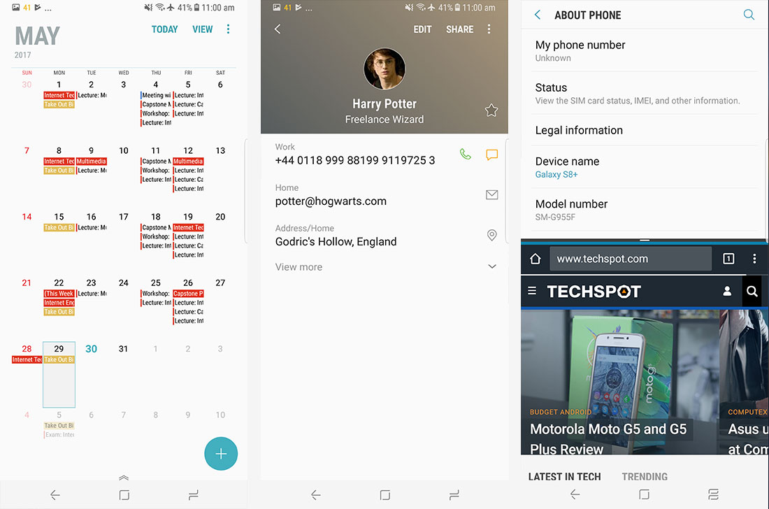
As for updates, Samsung's track record here is better than a lot of other Android OEMs, but still a fair way behind Google and their Pixel handsets. My review unit does currently have the May security patches installed, which is a good start from Samsung, though I'm not convinced the handset will receive monthly updates.
