Google Chrome and Chromium to get new logos

Emil

Posts: 152   +0
Staff

Google Chrome will be getting a new logo in the next version. Those on the dev branch are already seeing it in version 11.0.696.12 dev.

Last week, the good old guys at the Polish forum FrazPC provided a comparison screenshot between the old and new logos for Chrome. They also got their hands on a comparison that showed Chromium would also be getting a new logo.

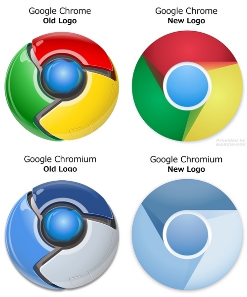
If you look closely, however, the new Chrome logo is actually slightly different in Chrome 11 when compared to what the Polish guys found. Clearly Google was still making changes when the comparisons were leaked.

Either way, I can't figure out whether I like the new logo or not. On the one hand, I was a big fan of the old 3D logo. On the other hand, the new 2D one seems much cleaner, and could go well with the perception of the browser.

I never realized how often I see Chrome's new logo: every time I hit Alt+Tab, it pops out at me. What do you think of the new logos for Chrome and Chromium?

Permalink to story.

 
Old one is much better. New one looks like a CD, a CD from someone without any decent label maker and used crayons instead.
 
As a logo the new one might be better but as an application icon definitely the old one is the way to go, I believe it integrates better cross-platform because in OS X that chromo logo/icon will definitely look weird on the dock.
 
Definitely like the old ones better, might help if they would add some depth to the new logos.
 
The new one is way more effective. Logos don't need to look pretty, they just serve a purpose.
 
I way prefer the old one! I like the depth and shine and the deeper colors. Wish they had kept the old one.
 
Guest said:
The new one is way more effective. Logos don't need to look pretty, they just serve a purpose.

The purpose is to look pretty and be recognizable.

Old one serves both, new one is now generic and dull.
 
Guest said:
The new one is way more effective. Logos don't need to look pretty, they just serve a purpose.

The purpose is to look pretty and be recognizable.

Old one serves both, new one is now generic and dull.
 
rajwraith said:
I guess I'm the only one here who likes the new one :p

That's ok, I'm sure there's another person besides you, the creator of the logo, and the guy who approved it to share in your bad taste. :p
 
The old one is machine-like and almost intimidating. I think the improvement here are the new 'friendly' and 'pleasant' looks of the logo.

In graphics arts terms, the old one displays superior technical proficiency. Fancy logos don't always (And usually do not) make the best brand images though.
 
This shows how hard it is to design for clients sometimes. What you think they would like an run with is the exact opposite. Sometimes its best to save those brainstorm concepts,.... they may just be your lucky stars waiting to shine.
 
ramonsterns said:
Guest said:
The new one is way more effective. Logos don't need to look pretty, they just serve a purpose.

The purpose is to look pretty and be recognizable.

Old one serves both, new one is now generic and dull.

I raise my glass to you.
 
Rick said:
The old one is machine-like and almost intimidating. I think the improvement here are the new 'friendly' and 'pleasant' looks of the logo.

In graphics arts terms, the old one displays superior technical proficiency. Fancy logos don't always (And usually do not) make the best brand images though.

True, a simple logo can work well, if not better than a complicated one. But going from a 3D-like logo with reflection (like it was chromed, get it?) to a generic, flat multicolored pokeball is not the way to do it.
 
Back