Image Quality Comparison
Use the images below to compare the three available visual quality settings and get a better understanding of what sacrifices you make when going from high to medium and from medium to low presets.
The bigger differences from my perspective seem to be texture and lighting quality. For larger, more detailed images click on any of the pictures for a 2560x1600 version of it.
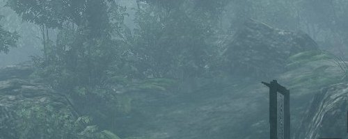
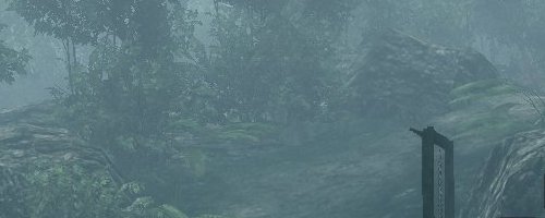
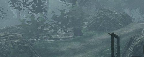
Comparing the high and medium quality screenshots above do not really give us many clues as to what is better about the high quality setting. The textures look much the same, as does the lighting and detail levels. Perhaps the only thing we've been able to spot is that on high quality there appears to be an improved draw distance as the trees in the background appear to be more detailed.
However, when going from the medium to low there is a significant reduction in visual quality. The most noticeable difference can be seen in the trees which go from realistic looking trees to blobs. The lighting is also diminished, much of the detail is removed and the texture quality is very poor.
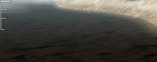
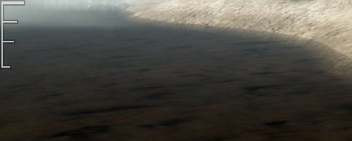
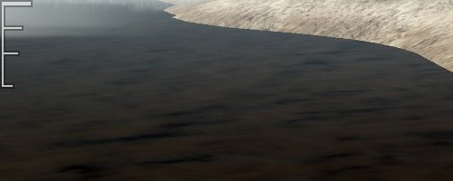
The biggest difference between the high and medium quality presets in the above screenshots can be seen to the right of the full size images on the cliff face. Here we have some rocks that jut out from the cliff face and the high quality preset shows stronger more pronounced shadowing. Although this is a subtle difference it is the only real difference we could spot.
When going from the high/medium settings to low, the water is no longer transparent and does not blend naturally with the shoreline. Shadows are gone along with most of the lighting and the texture quality is quite poor.