
If you're a fan of minimalist web designs, Google has some good news for you. As reported by The Next Web, the search giant's simplistic "Material Design" language could be making its way to Google Search in the near future.
This information comes from a few Reddit users who recently noticed some stylistic changes to their Google Search pages on March 5, suggesting Google could be split-testing Material Design in the wild.
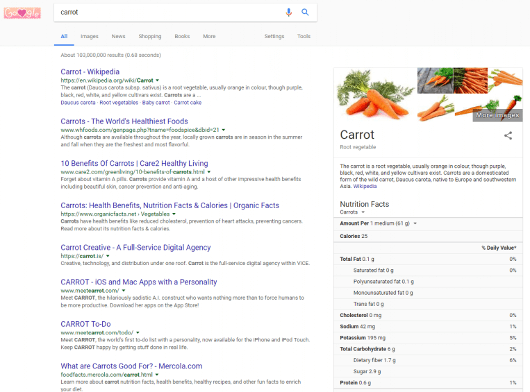
From the screenshots provided by the users in question, it seems Google Search's overall layout will remain the same. Search results and side information such as food nutrition facts all appear to be in roughly the same location as they were before. However, the key difference with the new design lies in the separation of on-page elements with each being packed neatly into its own box.
The following image showcases the changes:
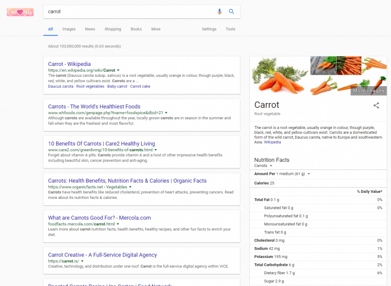
By contrast, the old Google Search page looks like this:
Though Google's primary goal with this redesign is most likely to improve page readability and create a cleaner interface for their users, there may be a few unfortunate side effects. As one Reddit user points out, due to the increased spacing between results, some webmasters may see their content pushed further down the page, forcing users to scroll to find it. This may lead some site owners to pay for sponsored placement in Google Search results to stay competitive.
Additionally, assuming the above comparison screenshots were taken with the same level of zoom, it seems the redesign will also slightly reduce the amount of information the average user can obtain from Search at a glance. The new design seems to have dropped two results from its above-the-fold listings.
Search wouldn't be the first of Google's services to migrate to Material Design. YouTube and Google News both made the switch last year. Search is one of the most popular services the company offers, so time will tell if the general public will embrace or reject the redesign.
https://www.techspot.com/news/73570-google-testing-minimalist-material-design-language-search.html
