Google releases Chrome 6 with an even simpler UI

Matthew DeCarlo

Posts: 5,271   +104
Staff

Celebrating its second birthday, Google has released the sixth version of its browser. Chrome 6 features numerous changes, including an updated user interface, improved syncing tools with support for web form data and extensions, as well as the obligatory bug fixes and speed gains.

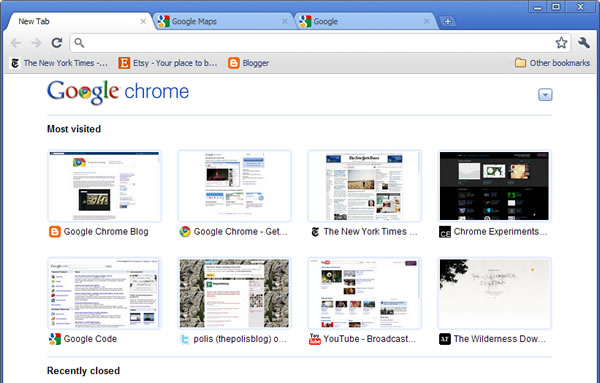
The interface tweaks aren't major, but add to the browser's simplicity. Most noticeably, Chrome's two major menus have been consolidated into one. Some buttons (like bookmarks) have been shifted around, the color scheme has been revisited, and loading a page over HTTPS now displays a green padlock in the URL bar.


Google says today's JavaScript performance is three times faster than the original build in 2008, and plenty of low, medium and high-ranking security holes have been patched in the latest edition. You can download build 6 here: Windows, OS X, Linux -- or if you like living on the edge, take Chrome 7 beta for a spin.

Permalink to story.

 
Six browsers in 2 years, have these people never heard of sub-versions. At this rate Google will be in double digits before IE9 even comes out which has taken 15 years for MS to reach that number.
 
Why is that stupid "Other bookmarks" button still there? It takes up so much space...
 
Yeah I kinda laughed about the "Other Bookmarks" button after reading the "simplier UI" title.
 
They could make Chrome and firefox make coffe but if they dont allow you to config the default zoom I will have to be with IE9. It is very unconfortable to me the text size on my 24'' 1080p lcd.
 
increasing your DPI has adverse affects on video games in full screen mode. On my 30 inch monitor I couldn't play certain games like crysis, SC2, BC2, and a few others including things like remote system access with my monitors resolution. If I did my mouse would turn invisible or get extremely big. It would be fine if you didn't have to reboot after every DPI change.

Unlike the guest though, I have no problem with firefox or chrome. If something is hard to read I Ctrl+ scroll up once or twice and be sure to return it back to default afterwards.
 
But a 24 inch 1080p has around the same PPI (pixels per sq inch ..?) as any other monitor, so the text isn't smaller. It just doesn't cover much of the screen lol.
 
At work I use a 17'' CRT (yeah, end of the world and everything) on a resolution of 1024*624 and the text is bigger than on my home 24'' lcd, even if it cover less of the screen on the lcd. I dont know if you are right on the number but in practice the text is way smaller. Also if you increase the dpi it is a mess. I'm not the only one than think that way about the size of the text at 1080p
 
If you use Chrome - big brother (aka Google) will know everything about your life. It's your choice. ;)
 
Well, I admit the pixel size is probably not exactly the same on every monitor, but I don't think it's a huge difference. And I'm pretty sure web-pages size is according to pixels.

Techspot for example, has huge blank areas on the sides on my 24", while on 19" 4:3 it still looks pretty much the same only less blank space on the sides. The pixels are also slightly bigger on the smaller screen, but in text it's not exactly noticeable. Add to that the illusion that things are bigger because it covers most of the screen, versus most of the screen being empty on the bigger display, and I think that's the problem. Unless I got it all wrong, that's the way I see it lol. :p

As for default-zoom, Opera has an option for that, and always has a zoom button on the bottom-right too!
 
st1ckm4n said:
Well, I admit the pixel size is probably not exactly the same on every monitor, but I don't think it's a huge difference. And I'm pretty sure web-pages size is according to pixels.

Techspot for example, has huge blank areas on the sides on my 24", while on 19" 4:3 it still looks pretty much the same only less blank space on the sides. The pixels are also slightly bigger on the smaller screen, but in text it's not exactly noticeable. Add to that the illusion that things are bigger because it covers most of the screen, versus most of the screen being empty on the bigger display, and I think that's the problem. Unless I got it all wrong, that's the way I see it lol. :p

As for default-zoom, Opera has an option for that, and always has a zoom button on the bottom-right too!

First off: Gotta love Opera!

Second, same here, on my 24" 1920*1200, there is a ton of blank space on the sides, but on my 17", there is barely any white space
 
If you find yourself squinting all the time, try changing the default font size for all webpages.

Google it to find out how.
 
What an unsecure piece of garbage- Google needs to go out of business...!
 
Back