In context: As we have seen with the quickly sold out pre-orders, PlayStation fans are chomping at the bit to get their hands on the next-gen console. With the PlayStation5's launch precisely four weeks away, they don't have much longer to wait. So Sony is drip feeding fans a bit more info on the new system.
On Thursday, Sony's State of Play gave users a glimpse of the new user interface and experience on the PlayStation 5 (above). As a brief first look at the new UX, Sony avoided the deep dive. Instead, it provided a quick overview of some of the interface highlights, including a remodeled XrossMediaBar (pronounced: cross media bar), parties, and the new navigation feature it calls "Cards."
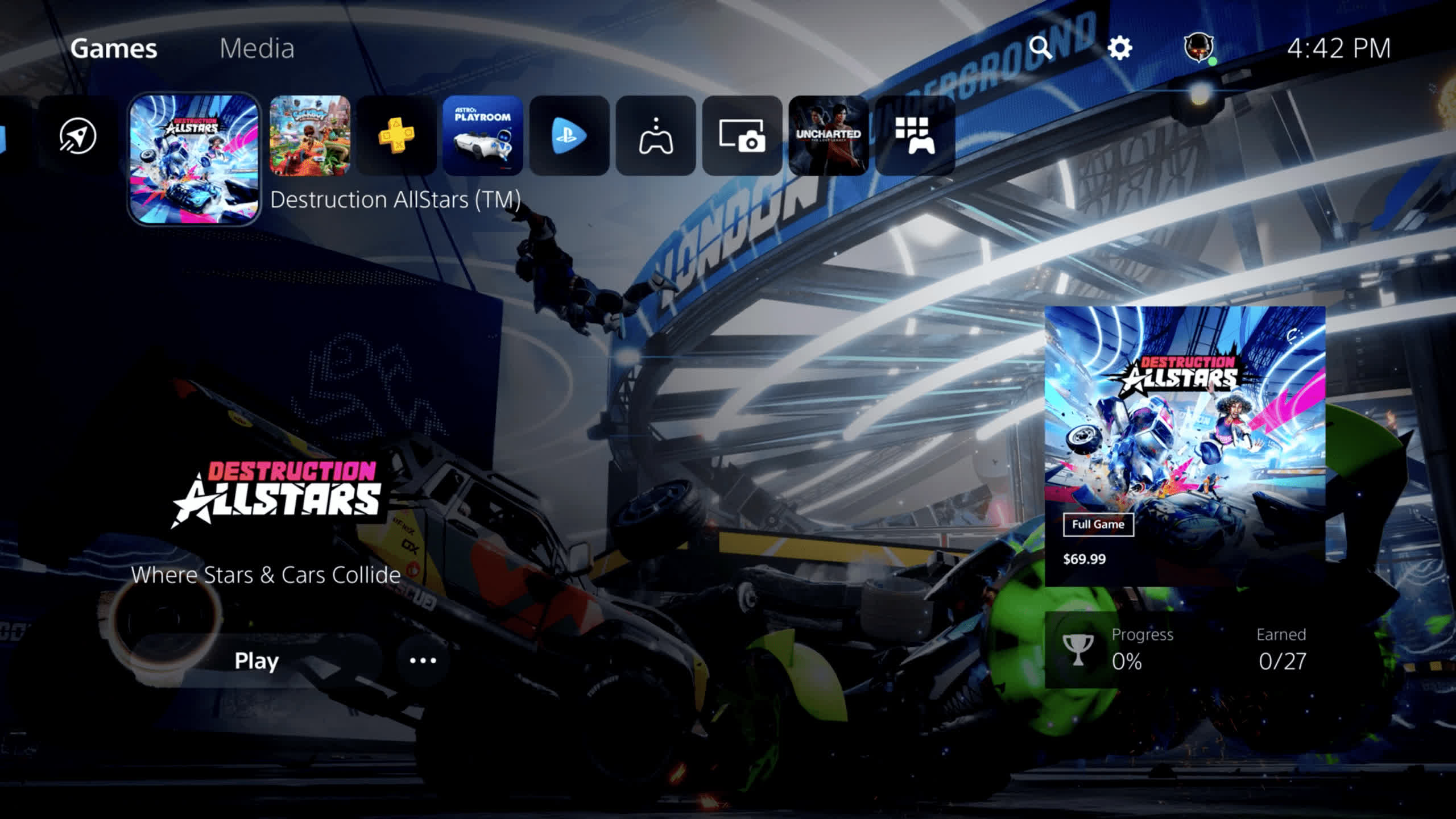
Right off the bat, you can tell the UI is entirely different from any previous PlayStation model. Instead of a XrossMediaBar (XMB) that takes up the entire screen as it does on the PS4 and PS3, the PlayStation 5's XMB is smaller and is oriented more to the upper left of the home screen (above). Other than its size and location, it still looks like Sony's traditional XMB with icons for games, library, capture gallery, the PlayStation Store, and the rest of what users have come to expect.

However, Sony's Sid Shuman noted that users would spend much less time on the XMB, thanks to "Cards." Cards are boxes that you can pull up at any time, even right in the middle of your game, to perform various functions. You can think of Cards as the PS5's alternative to the quick menu that you can access on the PlayStation 4 by holding in the PS button for a couple of seconds. From the Cards, users can jump to activities, check the latest news from games and publishers they follow, edit and share screenshots, and more.
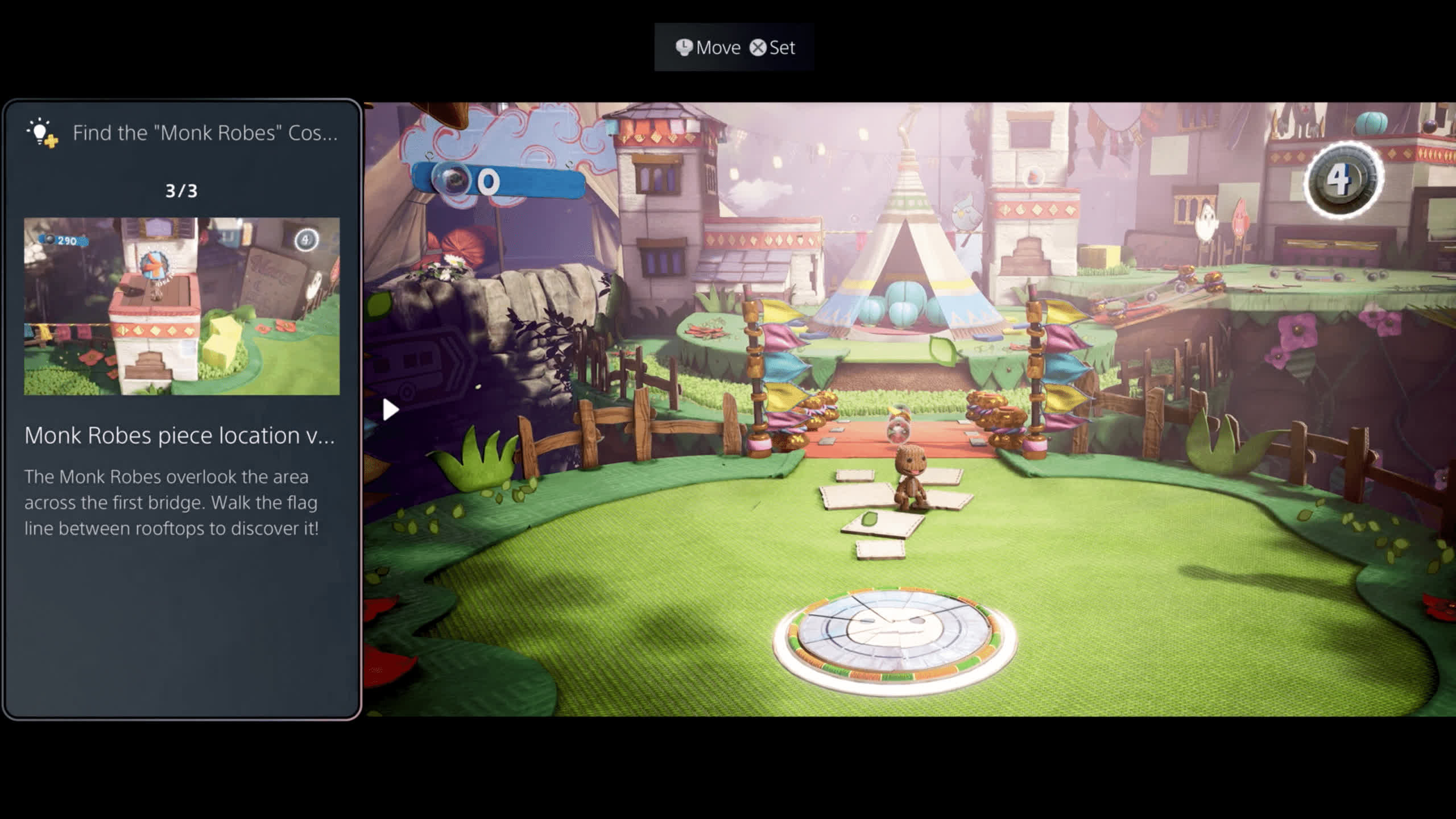
One of the coolest features of Cards is a help option that is available in some games. The help card is a PlayStation Plus member-only benefit that allows users to get hints and even video walkthroughs for the particular part of the game they are on without having to exit the game and fire up the web browser. The help cards will also notify users if the hint they are about to view contains spoilers. Tips and videos will appear right on the card, which users can place in various ways on the screen, so it does not obstruct their view while playing (above).
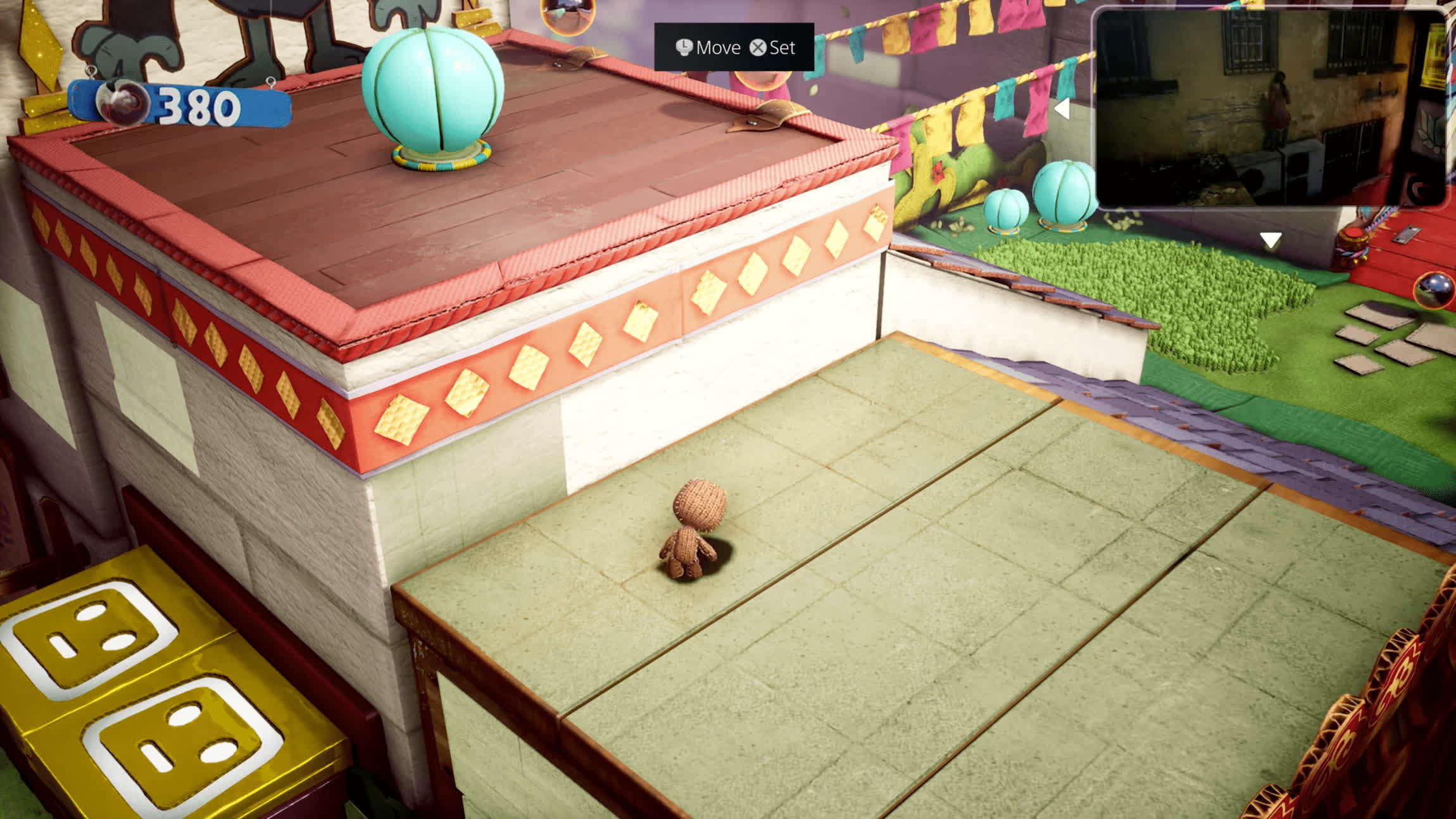
Although somewhat dark, you can see Shuman is watching his buddy play Uncharted in PIP while he plays Sackboy.
Similarly, players can display video picture-in-picture in one of six out-of-the-way zones. For example, this feature allows players to run a video walkthrough in the corner of the screen they can follow while playing along. Shuman emphasized that not all games will support this feature, likely because it is something developers have to code in themselves. Still, you can expect that many studios will take advantage of Cards, especially as they grow accustomed to the new programming environment. Picture-in-picture does work for screen sharing in any game as you can seeing the screenshot above because it is part of the PS5 OS.
Users can also easily access parties and chat through the cards. While in chat, players can share their screen with party members, and this can be displayed in PIP mode, even if you are playing a different game. Voice chat is, of course, available, but for those that would rather text, there is a voice-to-text option using the DualSense controller's integrated microphone. Time will tell how well this works. Experience has shown that even some of the best dictation software is less than ideal for chatting in real-time.
Lastly, it is worth mentioning that the PlayStation Store is no longer a stand-alone app. Sony's digital marketplace has been integrated into the PlayStation 5's operating system to make the experience of browsing and buying games more seamless and fast. This quicker experience is a pretty big deal. Previous versions of the PlayStation Store on the PS3 and PS4 were clunky and slow.
Shuman said there was a lot more to show and that Sony would reveal more in the next few weeks leading up to launch.
https://www.techspot.com/news/87131-here-first-look-playstation-5-new-user-interface.html
