New Windows 9 screenshots give us a closer look at the desktop, start menu and taskbar

Shawn Knight

Posts: 15,289   +192
Staff member

A couple of German tech sites have published nearly two dozen Windows 9 “Threshold” screenshots. The images allegedly come from the “Windows Technical Preview,” a version of the operating system that is expected to be available later this month.

Specifically, the images are said to have come from an early build of the OS seeded to close Microsoft partners. By all accouts, they appear to be authentic.

leaked windows microsoft windows desktop operating system start menu screenshot windows 9

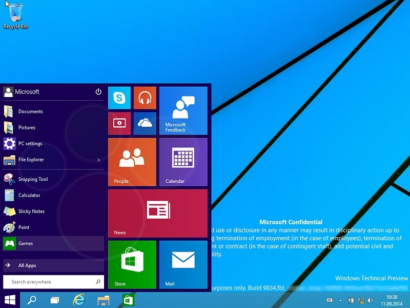
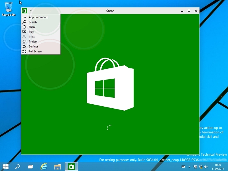
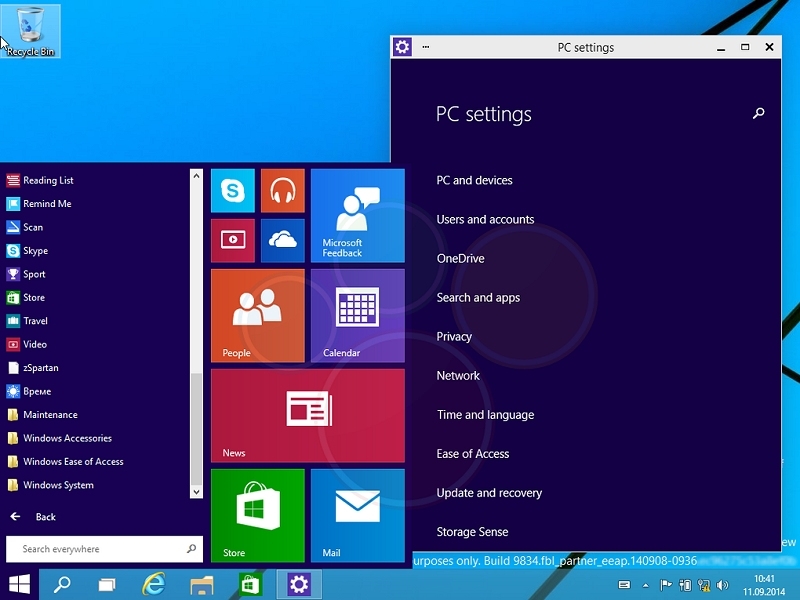
These aren’t the first Windows 9 photos to leak onto the web but they do provide a closer look at the return of the Start Menu. If you recall, Microsoft removed the Start Menu in Windows 8 which left many users up in arms.

The images also show some obvious changes to the taskbar like a new search icon beside the Windows button as well as one for what could be the virtual desktops feature.

leaked windows microsoft windows desktop operating system start menu screenshot windows 9

As is trendy in the UI world, it would seem that Microsoft has created new “flatter” icons for the file explorer and desktop. As The Verge points out, this will help it match the “Metro-style” look and feel of Windows 8.

Last month, the same publication said Microsoft was preparing to showcase the new operating system at a special media event on September 30. This date corroborated an earlier report that suggested the OS would break cover in late September or early October. Most expect Microsoft to release a preview version of Windows 9 to developers and enthusiasts at the unveiling.

leaked windows microsoft windows desktop operating system start menu screenshot windows 9

Permalink to story.

 
I like it a lot more than windows 8, but I don't like how colorful it is. Maybe if you can do a monochrome theme I could accept the UI on the start menu, but all those colors make it look like a kids toy. It looks far from "professional". For a gaming computer, sure, it's cool. However, I wouldn't want to look at that all day in the office in front of my computer.
 
I like it a lot more than windows 8, but I don't like how colorful it is. Maybe if you can do a monochrome theme I could accept the UI on the start menu, but all those colors make it look like a kids toy. It looks far from "professional". For a gaming computer, sure, it's cool. However, I wouldn't want to look at that all day in the office in front of my computer.

I wouldn't mind the colors but that should have been the path from desktop to metro interface and finally introduction of Windows 8 Metro interface in this version. M$ introduced Metro out of nowhere and it dropped like a bomb on users. Hopefully this iteration of Windows will not disappoint users.
 
Nobody want Metro interface.
Windows 8 = Windows 7 - Start button-menu
Windows 9 = Windows 8 + Start button-menu
Who remember?
And the new Windows 7 will be revolutionary different than previous Windows versions.
Will running on very small microkernels, every application will use own kernels and no system crash anymore.
and the Windows 7 = Windows Vista - DRM
There is no change almost since Windows 95.
But after Windows 7 no need any change bc its perfect.
Maybe too perfect for humans.

Well perfect except search indexing and major scaling issues to 4K
 
Ohhh ahhh, look at all the pretty colors. Errr, well, I mean, look at all the pretty green and white. *cough, *cough*.
Windows 9 = Failure. Same square windows, same 4-bit color pallette. It still looks, as yRaz says, like a toy. It looks like an operating system for pre-schoolers. How can Microsoft be this retarded? So they think that putting a mini start menu back into the next release is all that they needed to do to woo millions of holdouts back into their cash cow? *sigh*

Oh my God. I guess this is it then. Windows 7 for life. Sad but true.
 
So long as I am not forced to create a Microsoft account I may consider it. I built a computer for a friend who wanted 8.1 and was forced to make an account for him... I hate things that force me to make accounts like that. I'll stick with 7 as long as I can.
 
As usual, Microsoft is wasting far too much time on these customized front ends. Give us back a simple front end that we can tailor for ourselves and put the effort into functionality, more genuinely worthwhile utilities and better over all controls. If they must continue this, then put out two versions, making the PRO the one with a simpler user interface and leave the baby block version to those more easily amused!
 
Looks like a modern version of windows 3.1
LOL! I was thinking about Windows 3.1 the other day, when I was downloading a 100 MB iTunes update... Thinking to myself, "Windows 3.1 was a entire operating system which its install fit in about 6 MB of disk space. What the heck is in this iTunes install?!" But yeah, Windows 9 pictures do look a bit like Windows 3.1. Especially the 2nd picture with the PC Settings.
 
You DO know that everything is completely changeable via the control panel, correct? =_= that includes all of those colors. and a theme. sooo um. yeah.
 
After all this time, MS still have icon with solid background (e.g. the Modern-UI based icons like Settings). They just look so out of place. It would have made it much more sleek if all the icons are consistent with a transparent background.
 
Great, I reaaaally need a way to search with bing in everyplace of my pc. I can't live without bing..... oh, and the windows phone like control panel...thank you microsoft :confused:
 
Win 8 ain't bad as long as I am using Classic Shell. I can pretty much much ignore most of the bad interface that way. As for gaming, I have no problems with the few games I have tried but my Win 8 computer is my backup and is used only for trying things out. 9 looks like hellish as 8.

I don't think there has been much adoption of the Win 8 interface look by other software companies but I have noticed some. I wish none had but what I wish more is that Win 8 would be ignored as a test bench. That may all be clear it may not
 
So long as I am not forced to create a Microsoft account I may consider it. I built a computer for a friend who wanted 8.1 and was forced to make an account for him... I hate things that force me to make accounts like that. I'll stick with 7 as long as I can.
You weren't forced to make an account for Windows 8.x. People are so uneducated about Windows 8.x its mind boggling.
 
"You weren't forced to make an account for Windows 8.x. People are so uneducated about Windows 8.x its mind boggling."

There are several options hide or non intuitive that you have to look for them. And they say windows 8 UI is made to be more intuitive, ha.
 
So long as I am not forced to create a Microsoft account I may consider it. I built a computer for a friend who wanted 8.1 and was forced to make an account for him... I hate things that force me to make accounts like that. I'll stick with 7 as long as I can.
You weren't forced to make an account for Windows 8.x. People are so uneducated about Windows 8.x its mind boggling.

But that's the impression that Microsoft wanted to give to people and so that's the impression that they have. If you read enough news stories about the whole Windows 8 catastrophe you will learn that even the developers regret some of the decisions they made. So, forced, no? But did they want to make it look that way? Yes.
 
Win 8 ain't bad as long as I am using Classic Shell. I can pretty much much ignore most of the bad interface that way. As for gaming, I have no problems with the few games I have tried but my Win 8 computer is my backup and is used only for trying things out. 9 looks like hellish as 8.

I don't think there has been much adoption of the Win 8 interface look by other software companies but I have noticed some. I wish none had but what I wish more is that Win 8 would be ignored as a test bench. That may all be clear it may not

How do you ignore the square windows? If you can tell me that I might think about upgrading to Windows 9. How do you ignore a catastrophic interface that permeates the entire operating system? I am sorry but adding(or bringing back a start menu) just isn't enough.
 
I like it a lot more than windows 8, but I don't like how colorful it is. Maybe if you can do a monochrome theme I could accept the UI on the start menu
Windows 9 = Failure. Same square windows, same 4-bit color pallette. It still looks, as yRaz says, like a toy. It looks like an operating system for pre-schoolers.
Looks like a modern version of windows 3.1
I'd take windows 95 control panel which is still somewhat in windows 7 EVERY DAY over that horsedung PC Settings menu in windows 9.
After all this time, MS still have icon with solid background (e.g. the Modern-UI based icons like Settings). They just look so out of place. It would have made it much more sleek if all the icons are consistent with a transparent background.
I think all the quoted text above has said enough for me. I will stand behind the quotes above and wait for further details.
 
How do you ignore the square windows? If you can tell me that I might think about upgrading to Windows 9. How do you ignore a catastrophic interface that permeates the entire operating system? I am sorry but adding(or bringing back a start menu) just isn't enough.

I don't. I'm actually a fan of ModernUI. The performance gains from Windows 7 to 8 were worth it alone. Not to mention that Win7 will not be able to support future monitor resolutions or newer versions of DirectX, if you're going to want to keep current you will have to upgrade. Lots of people don't like the 'flat' look of it, but honestly a LOT of UI design is going that way nowdays, not just MS. 5 years ago everything was about skeumorphism; design styles change, not everyone is going to like where trends go.

And also, all those colors and everything? They're totally changeable. And if you don't like it, I'm sure by launch people will have custom shells and start menus that you can install, though I wouldn't be suprised if on the Pro edition that you'll have the capability to turn it all off to bring a more traditional start menu back. Win 8.1 is a huge improvement over Win7, just for the search and admin tools alone. I'm looking forward to 9.
 
I'm using win7, win8 en OSX snce a lot of time.
Indeed UI experience didn't change much since win95 & OS9.
 
Back