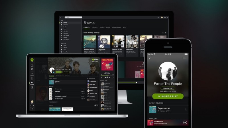
Today Spotify launched arguably the most significant overhaul to the look and feel of its service since it was introduced some 6 years ago. Spotify users on browsers, the desktop and iOS should notice an all new painted in black look, along with a number of other UI changes across the entire service. According to reports, Android will see the update in the "near future."
The previously lighter look is no where to be found, the grays and whites have been replaced with black, and more black. With just touches of green and near-black shades of gray, the goal is to put the content in the forefront, and so far it appears to be successful in doing so.
There are also a number of other changes made including the use of blurred background images and a new rounded type face that really seems to help modernize the entire feel of the interface. Other changes seem to borrow from Google+ and other social network designs, such as the new rounded profile photos set on large hi-res background images. Users will also notice that search results are presented in a larger panel style with images, and that there is generally more imagery throughout the entire service.
Most of the above changes apply to both desktop and iOS, but there are a number changes specific to mobile as well. Along with a significant use of blurred background images, Spotify is doing everything it can to automatically move modules and content out of the way when not needed, as well as using transparency in order to keep what's important most accessible.
Most of today's update comes in the way of aesthetic changes, but we also get an extremely fast and fully integrated search "delivering even more relevant and localised content", and the Your Music feature that allows you to save, organize and browse your music from a unified place across all platforms. Spotify says the new design and features will be rolling today to iPhone, desktop and web users and will soon be available across all platforms.
