In brief: Google tweeted that it is in the process of rolling out a redesigned News tab for the desktop version of search. It will use a card-style layout similar to what you see with prominent news items in organic search results. It will also feature the names of publication more prominently.
The changes will only take effect on the main Google page. The dedicated Google News page will remain as it is.
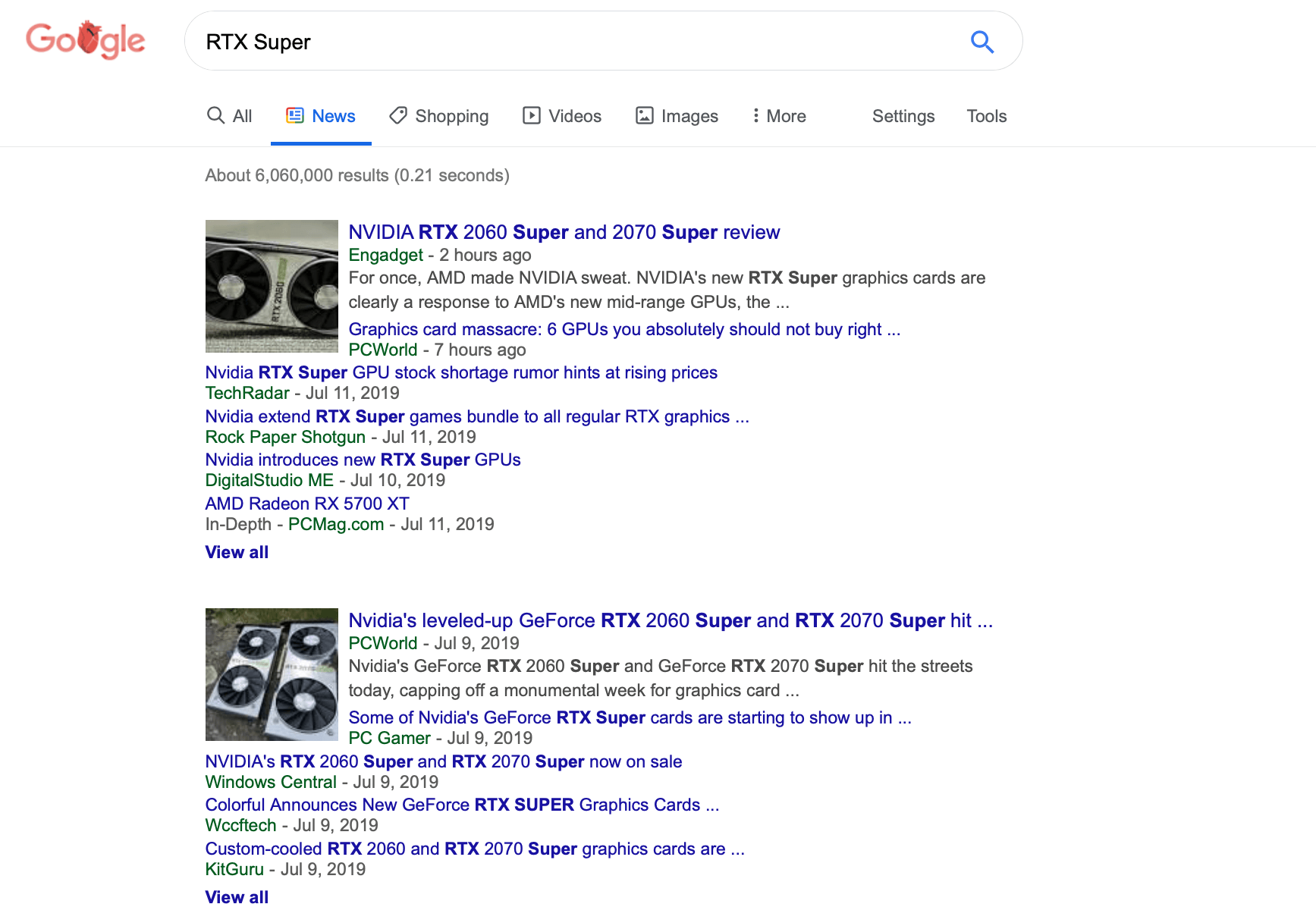
Currently, the News tab (below) is formatted into compact groups of story listings based on the search terms. The results include the headline and publication both hyperlinked to the article and publisher, respectively. Additionally, a picture and a brief snippet appear for the top story of each grouping. Lists also show qualifiers like In-Depth, Highly-Cited, Local Source, and others when applicable.

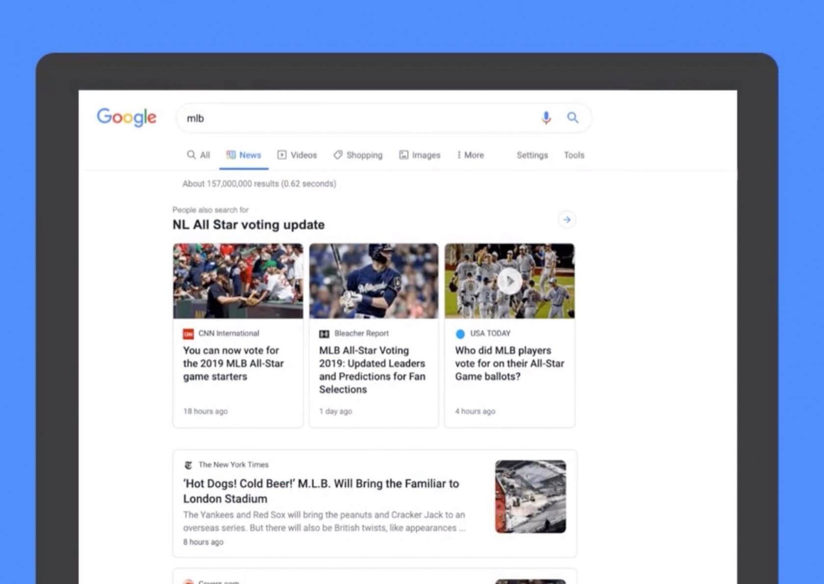
The new layout (below) will display a carousel of vertical cards at the top tagged "People also searched for." Below that is the results of the search organized in horizontal cards. Visually it is something of a hybrid between organic (All tab) search results and what you will find on the Google News domain, except that the horizontal cards will have article snippets and the carousel will not be the top stories of the search.

The new design is more readable and is aesthetically pleasing. Publisher names are more prominent and their logo appears next to the story. However, aesthetics and readability come at the cost of the compact listings that show you more at a glance without the need to scroll.
Personally, I don't care for the layout. The more spaced out results are just going to cause articles like this one to get pushed further down in search results ultimately negatively the views of articles that do not appear high in the list.
Google says it will be rolling out the new format over the next couple of weeks.
