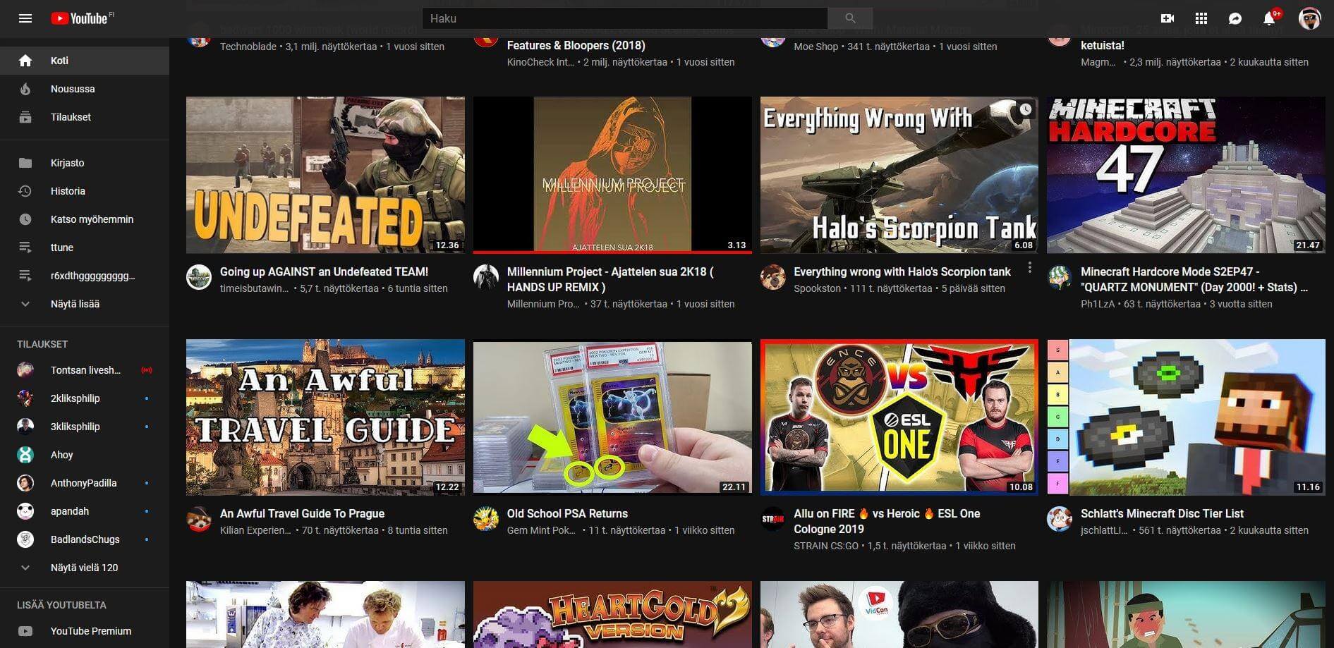
WTF?! According to buzz on Reddit and Twitter, YouTube began testing a new homepage design Tuesday morning. The consensus --- it is giving everybody eye cancer.
It has been some time since we have seen such severe backlash against Google. The last big uproar in recent memory (not including the Project Dragonfly debacle) was when everyone was up-in-arms about Google's Duplex being too human-sounding. This time it is over a design change YouTube seems to be testing.
The outrage began shortly after YouTube developers implemented changes to some users' homepages at around 2 am this morning. The new layout is entirely different than before.
Gone are the categorial groupings like "Recommended" and "Recently Uploaded." Most noticeable though are the thumbnails --- they are huge! Not only do they look terrible on the page, but also fewer fit on the screen requiring more scrolling.
It is not at all popular with those who were unlucky enough to be selected as test subjects. The response on Twitter was very --- shall we say --- vocal.
umm @YouTube what the hell did y'all do to the homepage? why would you make it so the recommendations aren't in categories anymore & HUGE thumbnails this is so disorienting & unorganized
--- bel (@anabelrios__) August 13, 2019
So if anyone wants a way around this dogshit update (Thanks you dickheads @YouTube ):https://t.co/nNQyd653rH
--- Rishi (@Rishi_K_S) August 13, 2019
you lose dark mode, but its worth it. At least I feel like my monitor is about 3 feet away again
Reddit was equally disturbed with most Redditors calling it an unwanted forced update.
"Looks to be a forced update," said sethoffuture. "Makes sense since [YouTube has] been wanting to do away with the tabs showing your subscriptions on the home page. Now it's alllll algorithmicly [sic] recommended garbage with no way of knowing why any of it is being shown."
With such harsh blowback from the community, the layout will probably not be finalized, leaving us to wonder what inspired the change in the first place. Some think that the update was geared toward the trend of websites making themselves more mobile-friendly, but that's not a good enough excuse for most users.
"[I'm] getting tired of companies putting mobile designed layouts on PC websites, just because one thing worked on mobile doesn't mean it'll on PC," said Redditor billybobiswatching. "Big thumbnails are fine on mobile because of the smaller screen but on PC it's unnecessarily large for the average viewer."
The Redditor makes a good point. Whatever the case, I'm sure that the designers responsible for the change have gotten the message loud and clear.
