Display & Software
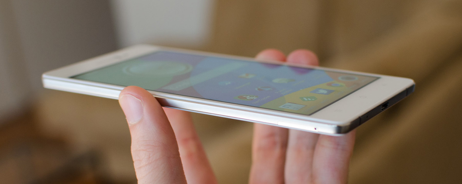
Considering the thinness of the Oppo R5, it's no surprise to see it using an AMOLED display, which is the thinnest type of panel going around. This particular display is 5.2 inches in size, and comes with a resolution of 1920 x 1080, equating to 424 pixels per inch. As the density of this panel is high (but not as high as 1440p flagships), a PenTile subpixel matrix is used, which reduces the subpixel resolution but is hardly noticeable at standard viewing distances.
The R5's display is a fairly typical AMOLED. It doesn't have the same level of quality as the most recent Super AMOLEDs from Samsung, as seen in the Galaxy S6 and Galaxy Note 4, but it's similar in quality to AMOLEDs seen on other devices from the past year. That's not to say the display is bad, because it's definitely not; you're just not getting a pack-leading panel as good as current generation flagships.
The pros and cons list for the R5's display is pretty typical for an AMOLED panel. Color quality is generally great, with images looking vibrant and saturated, though perhaps not the most accurate. Color tone is okay: this particular AMOLED has a tendency to display whites as slightly grey or tinted towards the blue end of the spectrum, especially when compared with other smartphone displays. However, as with basically all AMOLEDs, contrast is excellent.
Brightness from this display is average at best, occasionally being a little hard to see outdoors on a sunny day. On the flip side, the display certainly can go quite dim, with auto brightness often making it too dim for indoor use. Viewing angles are great from this panel, as you'd expect, with basically no color distortion at off angles. The touchscreen is also very responsive, with high sensitivity permanently enabled that allows you to use the display with gloves or wet hands.
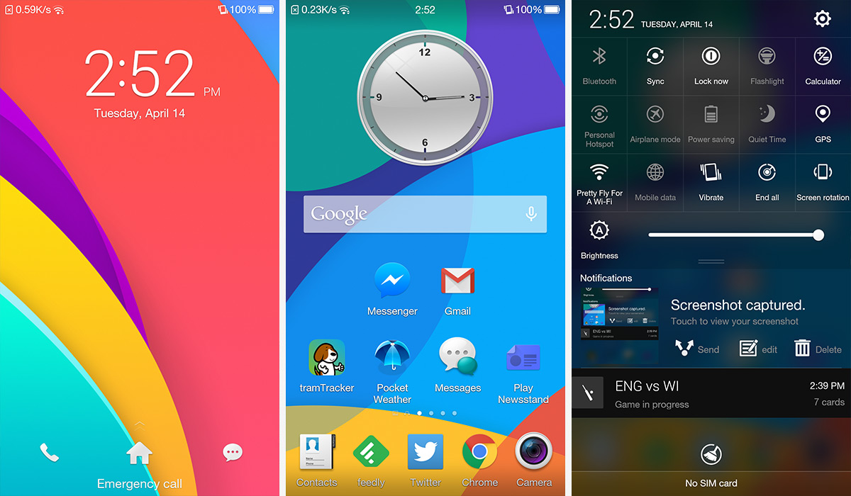
The Oppo R5 includes the now-outdated Android 4.4.4 out of the box, with the company's own ColorOS skin that significantly changes the stock look of Android. If you're a fan of the vanilla Android appearance, you're definitely not going to like ColorOS, which looks dated and significantly less slick in comparison.

Pretty much every inch of the Android UI has been modified by ColorOS, including the basic launcher functionality. Instead of having an app drawer, your homescreens are the only place apps appear, meaning apps must appear on a screen somewhere just like an iPhone. Sure, you can just put unused apps into a folder, but the app drawer found on most other Android devices is a much nicer way to display your less frequently used apps, leaving your homescreens to display your most used apps and widgets.
Oppo has also included a few "exclusive spaces" which are found to the left of your primary homescreen. You can choose to enable or disable a music or photo "space", which is basically a homescreen pane entirely occupied by that functionality. For example, the music space is a record player that can be used to play, pause or skip songs; while the photo space has a live camera widget with a timeline of recently taken photos. The spaces are interesting additions, but throughout my time with the R5 I seldom used them.

The lockscreen is a simple affair with unchangeable shortcuts to the dialer and messaging apps. Unfortunately there's no lockscreen notifications, which is a downside to the R5 not coming with Android 5.0. On the other hand the notification pane is quite good, with easy access to a huge range of settings without having to pull down a second pane.
Most of the apps included in ColorOS are unattractive skins of the stock Android apps, often without any interesting additional functionality. The one app I did quite like is the calendar app, though it runs quite sluggishly on the R5 when you have lots of upcoming events. Aside from that there are a lot of vaguely useful apps preinstalled on the R5 (that you can't remove), including backup utilities and file managers, an office suite, a security center, and even an app that simply turns off the display and locks your handset.

While it can be handy to have all these extra apps installed on the smartphone from the start, better alternatives are available for many of them through the Play Store. And as you can't uninstall the apps preloaded on the device, I'd prefer there were fewer of them to clog up my homescreens.
Diving into the settings reveals a few interesting features. As the status bar has a non-standard layout, with the connectivity icons and notifications on the left, and other icons on the right, you can modify some of what is shown. I liked the ability to remove the carrier name from the status bar, and I could even replace it with a handy network speed counter. However you can't revert to the standard Android layout, which is a little disappointing.

Other interesting features include a range of gestures that can be implemented when the screen is on or off; theme support for the homescreens and the ability to change launcher animations; and an option to turn on or off the device at certain times, such as overnight.


