Something to look forward to: Apple has unveiled a redesigned macOS sporting a new design language, giving it design parity with the rest of Apple's software ecosystem, while trying to keep the spirit of the Mac. Other updates include a greater focus on privacy and (many) more features pulled from iOS.
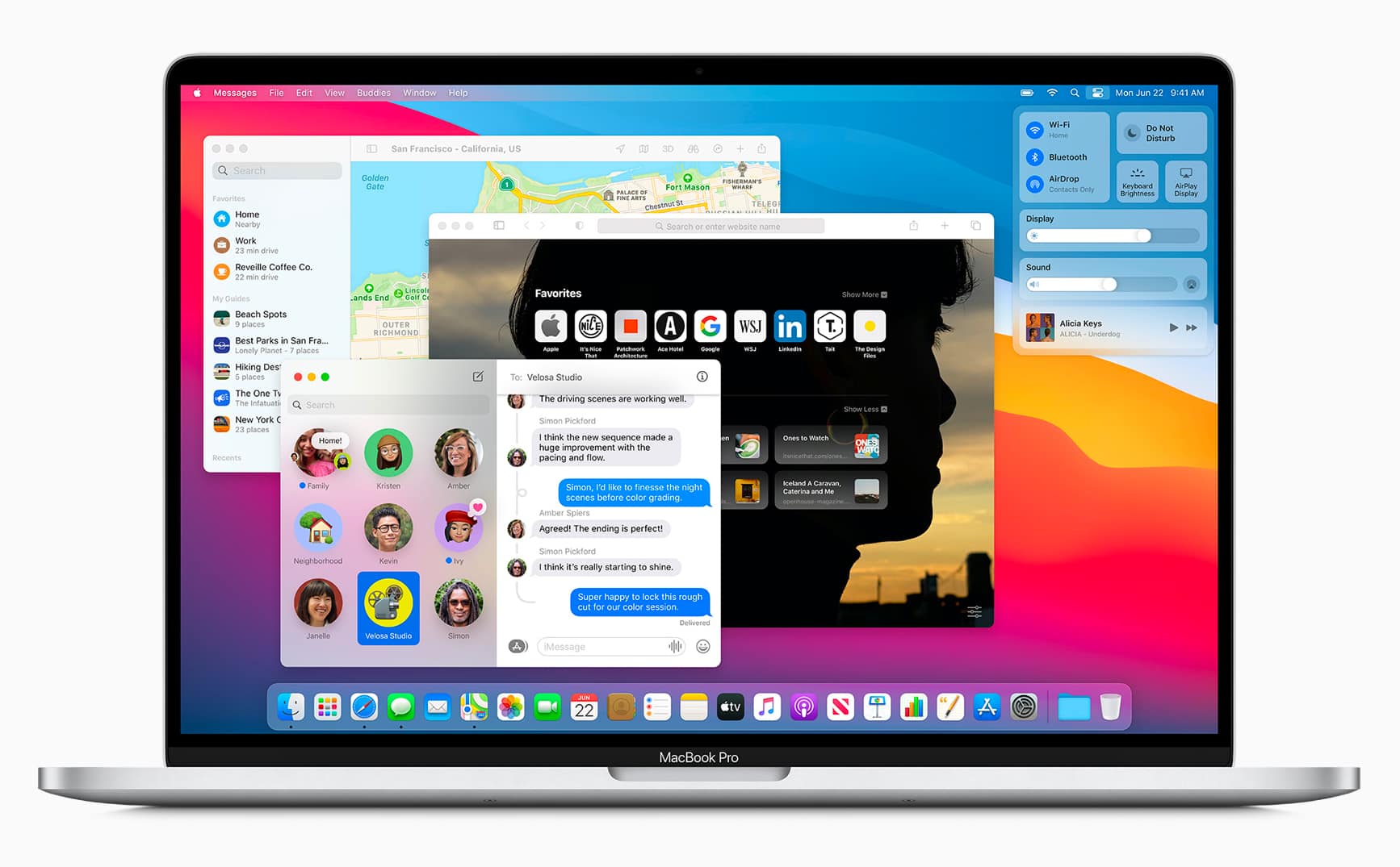
The new upcoming version of macOS will be called "Big Sur" and comes with new features and an updated design language to match the aesthetic of iOS. MacOS Big Sur overhauls the design with sleeker icons and updated color palette. Apple has changed the design of the dock icons to stay consistent across the entire ecosystem. That said, Apple has ensured that the redesigned dock icons still retain their "Mac personality." Overall, the move seeks to reduce clutter and visual complexity and bring content to the forefront.
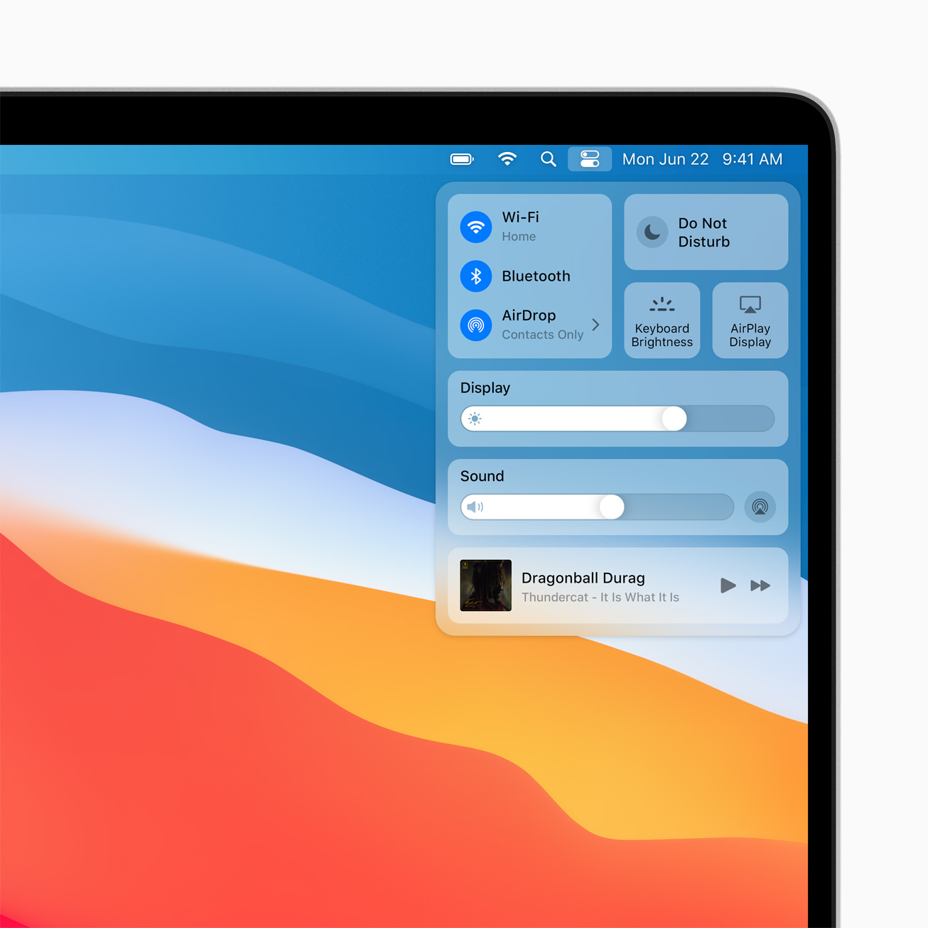
Continuing with the theme of consistency, Apple is also bringing new iOS 14 features to Big Sur. This includes Control Center and an updated Notification Center that adds the widget features from iOS 14.
Messages is also getting its own search function, the ability to create and edit Memoji, group messaging features, and pinned conversations. The Messages app is basically at feature parity to the iOS version now.
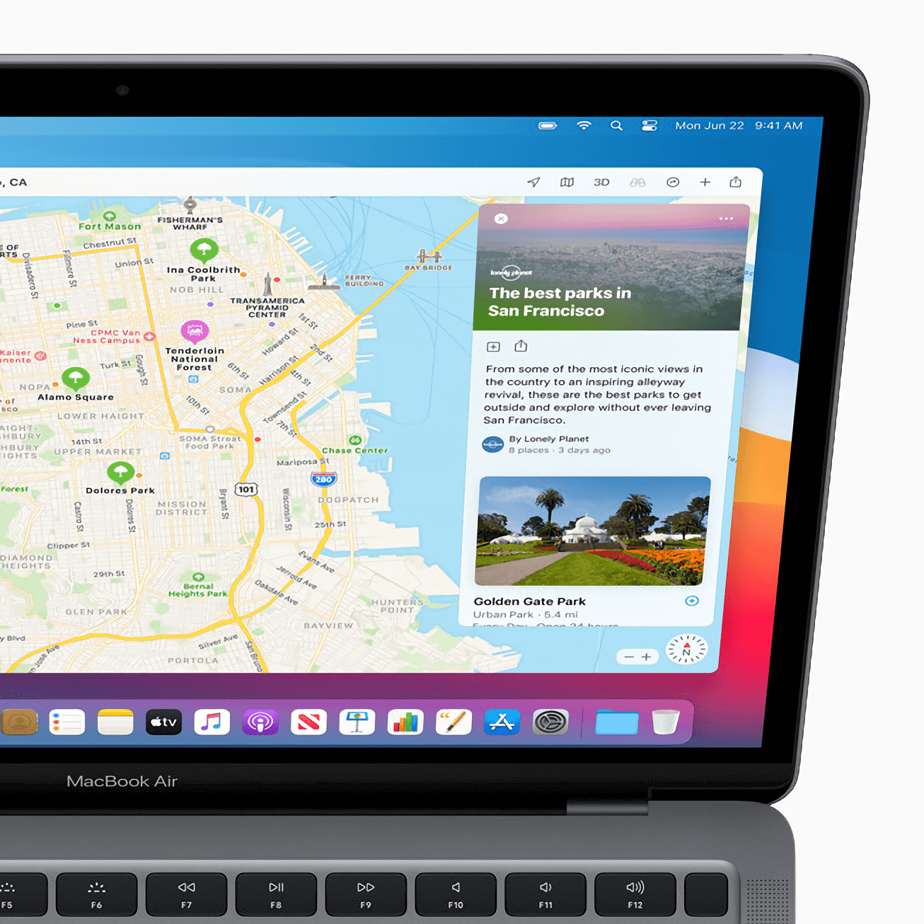
Maps has been updated with a new design in line with the overall simplicity of macOS. Users can now browse indoor maps and use Look Around to see a 360-degree view of the area. Those with electric cars or bikes can now set routes in Maps and then send it directly to the iPhone.
Like the iOS version, owners of electric vehicles will be able to plan routes with charging stations along the way to reduce range anxiety. Finally, you'll be able to see the progress of friends who share their ETA.
Safari isn't the market leader in the browser wars. Nonetheless, Apple has added more useful features to it that may make it more competitive and robust. Users can now customize the start page with a different background image. Safari can also natively translate websites from seven languages, something Chrome users have long since enjoyed.
Apple also claims that Safari is 50% faster than Chrome when loading pages.
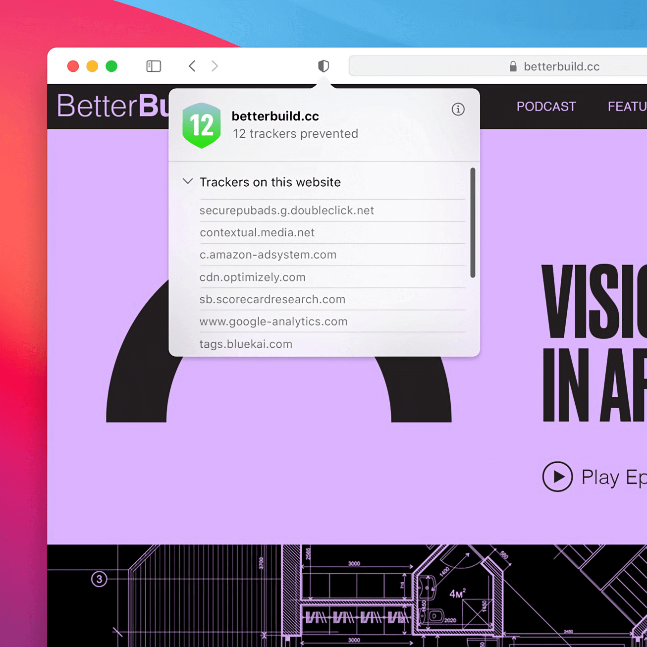
Leaning into Apple's focus on privacy, Safari now features Privacy Report, which gives visibility into what data websites are tracking. There's also a built-in password monitor that alerts users if their password was compromised in a data breach. Along with enhanced tracking prevention, this is a worthy upgrade to privacy on Safari.
Catalyst, the program that enables developers to port iOS apps to macOS, is adding more APIs that allows apps to automatically inherit the design language of macOS. Even more importantly, macOS Big Sur lays the groundwork to transition Mac applications to work on Apple's A-series chips including the ability to support ARM and Intel chips using a single binary.
“macOS Big Sur is a major update that advances the legendary combination of the power of UNIX with the ease of use of the Mac, and delivers our biggest update to design in more than a decade,” said Apple SVP Craig Federighi, “With its modern and clean look, huge improvements to key apps including Safari, Messages, and Maps, and new privacy features, we think everyone is going to love the breakthrough experience that macOS Big Sur offers.”
Watch the macOS portion of the WWDC 2020 keynote below:
https://www.techspot.com/news/85727-apple-unveils-redesigned-macos-big-sur-bringing-new.html

")