What just happened? For all of the privacy-related changes it has received in recent years, Facebook hasn't been tweaked much from a visual standpoint. For better or worse, that's finally beginning to change now, though: Facebook's new look -- first revealed in April -- is now rolling out to several users, and it's quite the overhaul indeed.
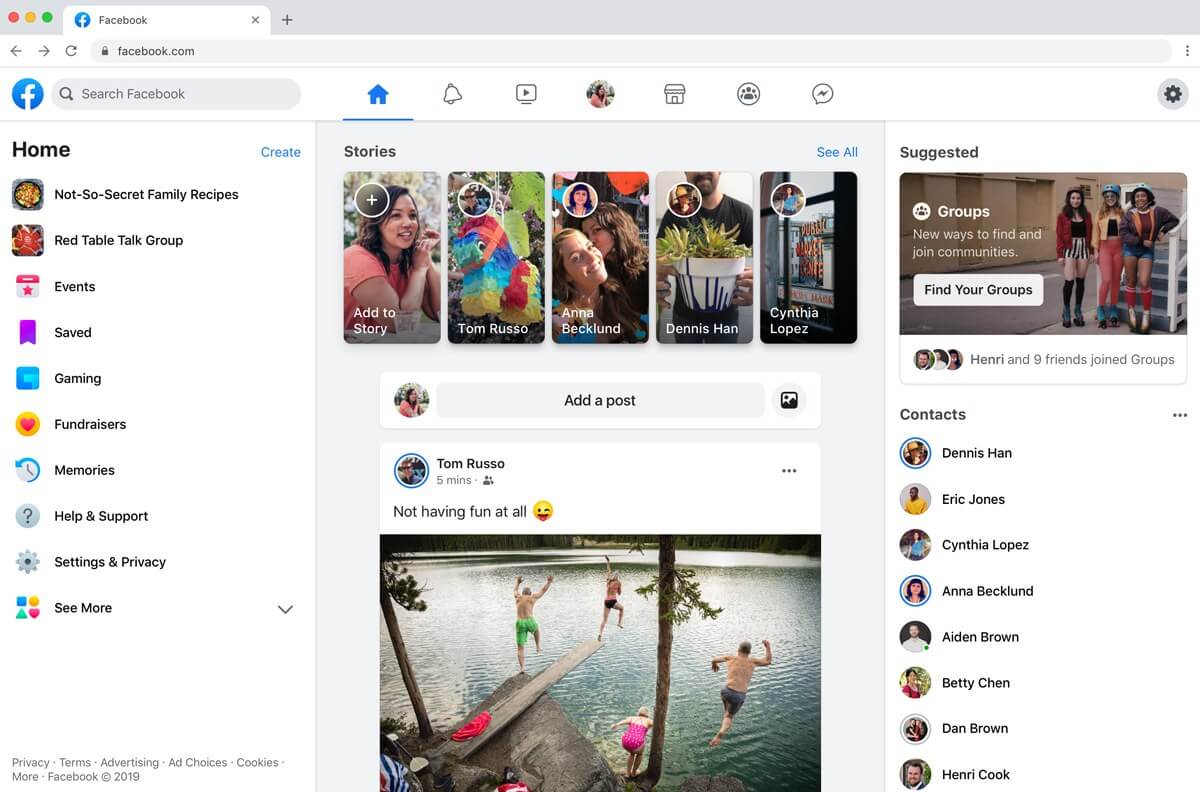
The new Facebook resembles Twitter more than anything else. It has simple, flat colors as well as a very Twitter-like top banner and home feed -- not to mention plenty of rounded corners. All in all, Facebook is now sleeker, more minimalist, and decidedly more modern.
Now, whether or not that's a good thing is up to each individual user to decide. This stripped-down interface does seem to have come at the cost of information density -- you're going to find a lot more empty areas than before, due to the increased spacing between various elements.
As far as we can tell, Facebook's new look doesn't seem to have brought many functional changes to the site, but there is a new Dark Mode for users to fiddle with. Switching it on is as simple as clicking the options button at the top right corner of the website, and toggling the appropriate option.

Once you've done so, Facebook's interface will go from white to various shades of black. This should make your late-night social media binges a bit easier on the eyes, at least on desktop platforms.
In terms of other more concrete changes, navigation has been "streamlined," according to Facebook, and the News Feed has a new "save your spot" feature, which will let you pick up where you left off if you click elsewhere on the site and return later.
There doesn't appear to be any way to opt-in to Facebook's new design manually, so you'll simply have to get lucky (or unlucky, depending on how you look at it). If you are randomly selected to receive the new design, you'll receive a notification asking if you want to participate.
Image credit: Mantas Rukuiža
https://www.techspot.com/news/82436-facebook-new-look-dark-mode-beginning-roll-out.html