In brief: Google is revamping the logo for its Chrome browser for the first time in eight years, though you’re unlikely to notice anything different upon first glance. The new logo is very similar to the previous one -- certainly no shiny Chrome in there anymore -- albeit slightly more vibrant.
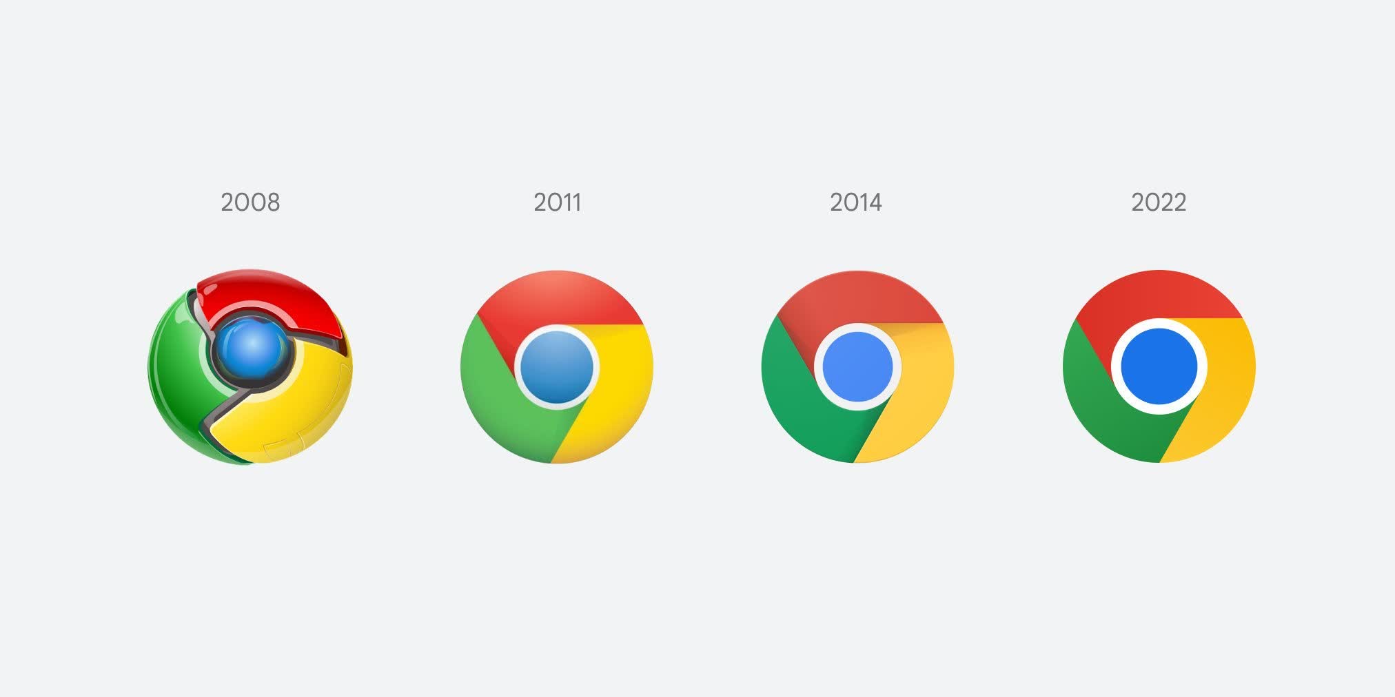
Elvin Hu, a designer for Google Chrome, showed off the new logo and revealed some of the thinking behind its design on Twitter. The overall shape and the red, yellow, green, and blue colors remain the same, though the blue circle in the middle is now a little larger.
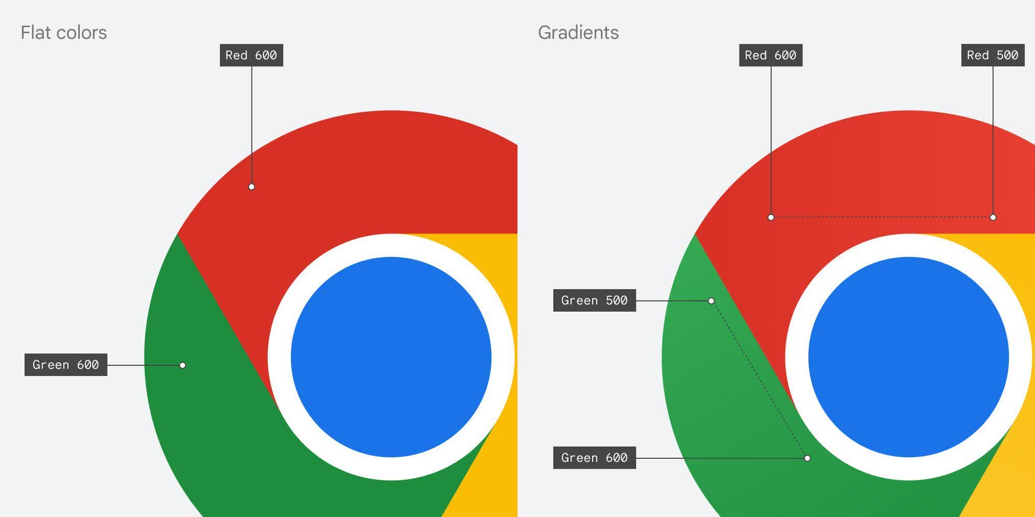
Another change is that the shadows sitting near the borders between each color have been removed. That makes the logo appear slightly flatter, but it does look more vibrant as a result. “Fun fact: we also found that placing certain shades of green and red next to each other created an unpleasant color vibration, so we introduced a very subtle gradient to the main icon to mitigate that, making the icon more accessible,” Hu explains.
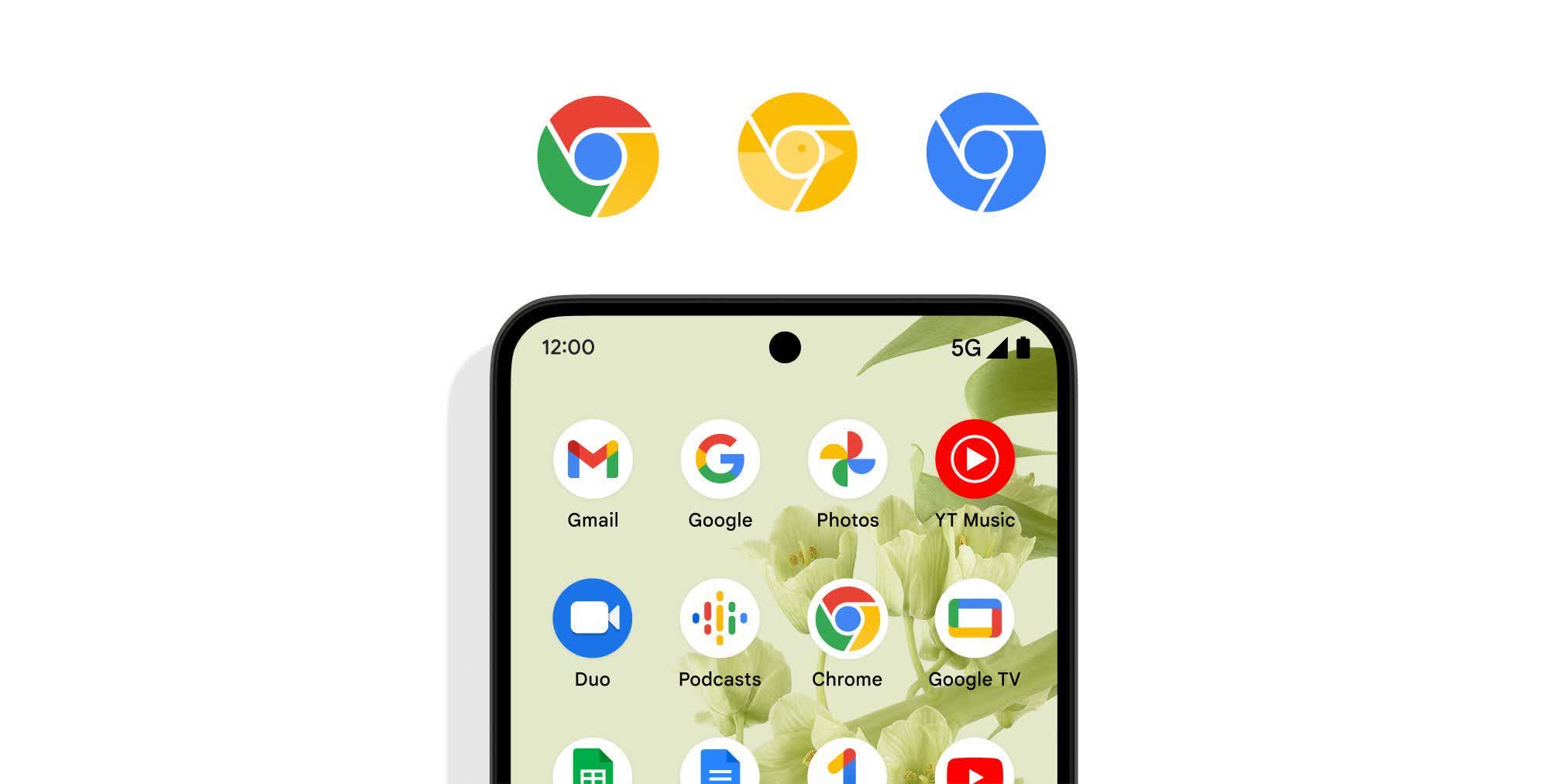
Hu notes that the design team created OS-specific customizations of the logo so they match the other icons on Windows, macOS, ChromeOS, etc. Google did consider creating something more recognizably different from the previous icon, including adding a space between the borders, but this shrunk the overall size of the image and made it more difficult to identify next to other Google apps, apparently.
Hu says users will start to see the refreshed version of the Chrome logo in the app, on the web, and elsewhere in the coming months, not that you might notice. In a follow-up tweet, the designer thanked users for the feedback, especially the ones related to the colors, adding that “We will be refining the direction based on them.”
https://www.techspot.com/news/93290-google-revamps-chrome-logo-first-time-almost-decade.html


