Throughout 2018, Google went on a bit of a redesign spree. It rolled out facelifts for a wide variety of its properties, ranging from Google Chrome, to Gmail, to Hangouts, and even Google News -- in other words, just about every major service under the Google umbrella got at least a few visual tweaks.
It seems Google is going to continue that trend in 2019, according to a blog post published today. In the post, Google Search's "Senior Interaction Designer" Jamie Leach unveiled a slightly-tweaked look for Search on mobile devices.
The tweaks are focused on making website branding much more clear, helping users to recognize them at a glance, without the need to pay attention to the smaller green text you would previously see below each Search result.
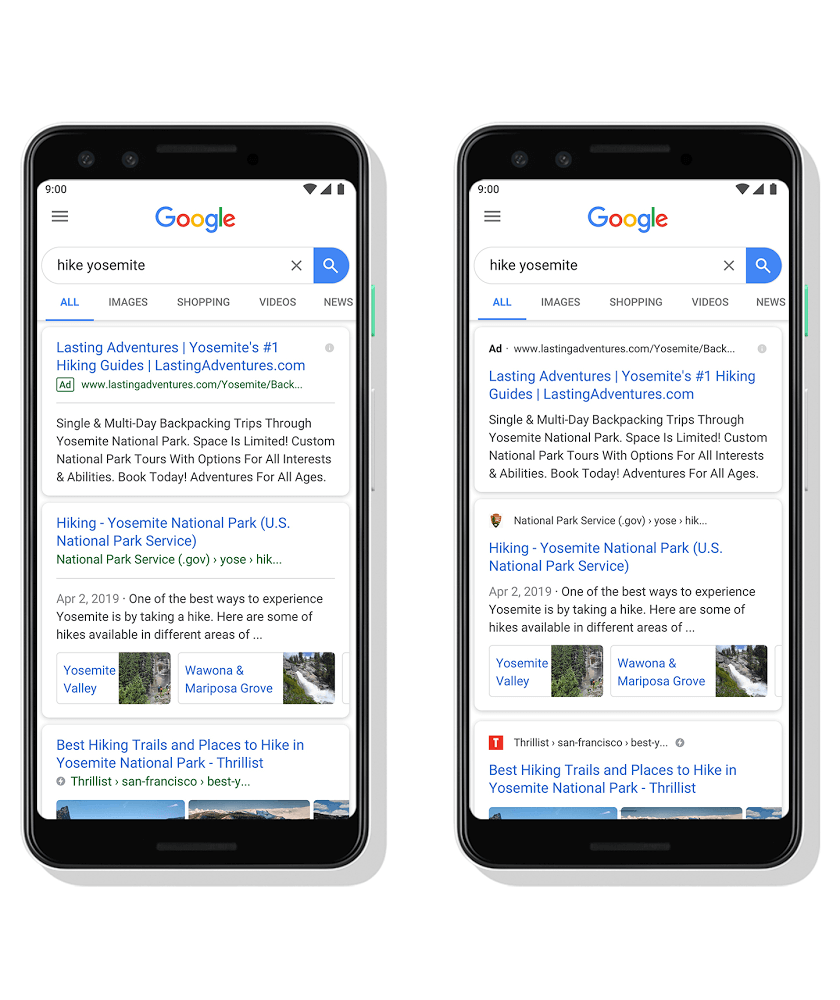
Moving forward, website names and "Favicons" (the small logos you see in browser tabs) will be displayed directly above mobile Search results. Not only is this handy for swift website recognition, but it also helps you more easily detect ads -- see an example of this in the above comparison image.
Google hopes these changes will help users make more informed decisions about which websites they want to visit. More obvious branding means Search users can avoid websites they dislike -- perhaps they contain obtrusive paywalls, ads, or other frustrating design elements -- or simply steer clear of ads. Anyone who uses Search regularly knows how easy it is to accidentally click on a genuine-looking result, only to be redirected to an advertiser (which may or may not have the information you were seeking).
As nice as these small changes are, Google hasn't announced whether or not they will be arriving for desktop users. Mobile users can look forward to seeing the redesign roll out over the "next five days," however.
https://www.techspot.com/news/80194-google-search-latest-mobile-facelift-makes-ads-website.html