Microsoft redesigns Office icons as part of a larger Office design overhaul

David Matthews

Posts: 437   +88
Staff member
Why it matters: Microsoft is redesigning its Office iconography as part of a greater push to implement its Fluent Design language and create unique yet instantly recognizable icons across platforms.

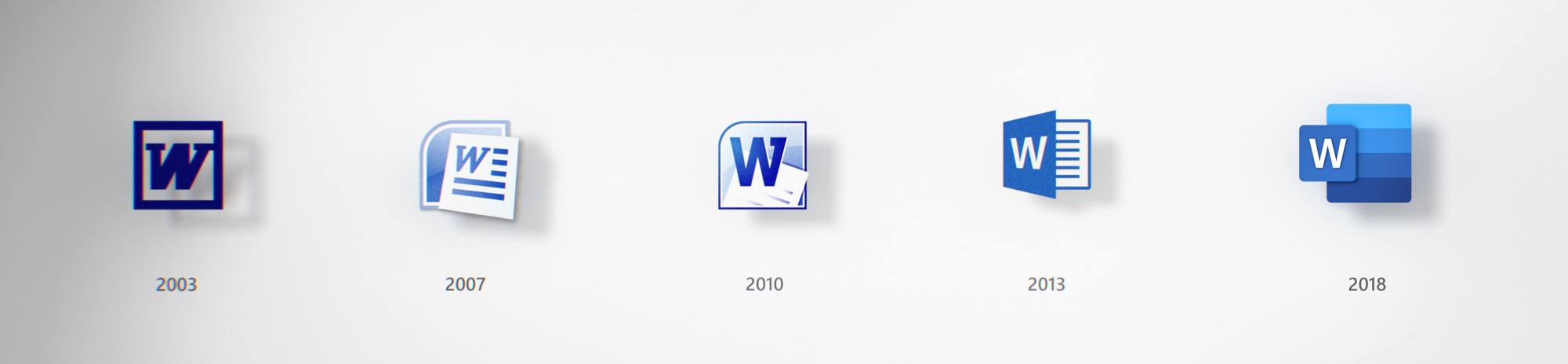
Part of the promise of Windows 10 is continuous updates throughout the life of the operating system. Part of those updates involve gradually implementing Microsoft's Fluent Design language throughout the operating system. Now, the software giant is updating Office to reflect the new design starting with the Office icons themselves.

The head of design for Office, Jon Friedman, explained the design philosophy:

"From the get-go, we embraced Office’s rich history and used it to inform design decisions. Strong colors have always been at the core of the Office brand, and new icons are a chance to evolve our palette. Color differentiates apps and creates personality, and for the new icons we chose hues that are bolder, lighter and friendlier — a nod to how Office has evolved.

We also used gestalt principles to further emphasize key product changes. Simplicity and harmony are key visual elements that reflect the seamless connectivity and intuitiveness of Office apps. While each icon has a unique and identifiable symbol, there are connections within each app’s symbol and the collective suite."

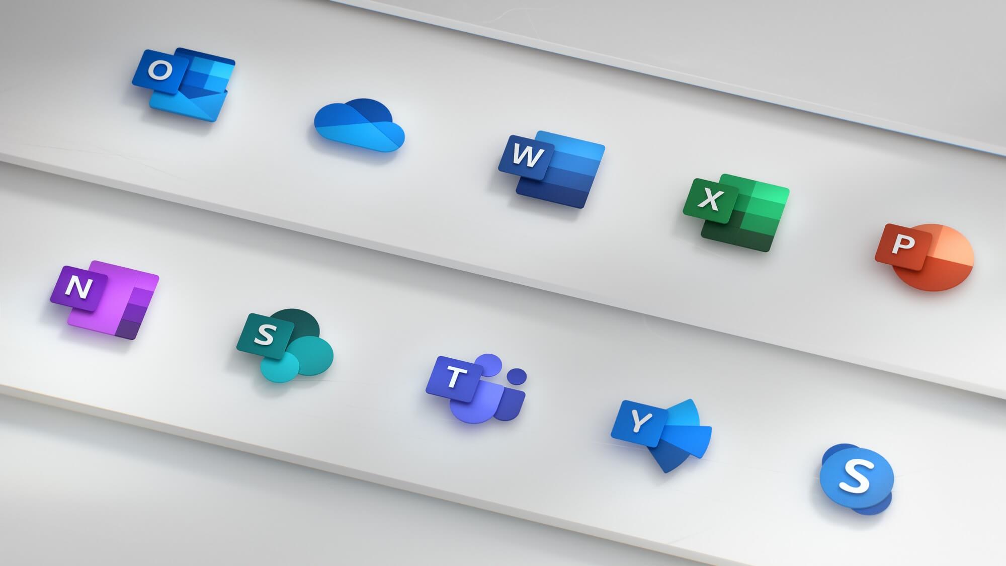
One of the striking changes is the decoupling of the letter and symbol. For example, for Excel, letter 'X' is in it's own green box while the symbol representing spreadsheet cells are behind it as it's own element. Remember, part of the Fluent Design language emphasizes depth and reinforces Microsoft's desire to push 3D creativity.

Since the death of Windows Phone, Microsoft has changed focused and embraced other platforms. The Office suite can be found on almost every platform including iOS, macOS, Android, and the internet itself with web apps. Microsoft says it wants to have a common design language that transcends platforms yet easily recognizable.

Friedman went on to describe how the redesign relates to content creation:

"Similarly, we’ve changed the letter-to-symbol ratio. Traditionally, the letter occupied two-thirds of the icon, and the symbol took up one-third. We’ve changed this ratio to now emphasize the symbol because while the letter represents the tool itself, the symbol speaks more to people’s creations."

The new designs definitely look more modern and even fun. It reflects a new Microsoft which seems to care a lot more about design than it has in the past. The design changes to Office go beyond just the icons, however. Microsoft will be updating and modernizing the look and feel on each of the platforms Office resides on. Outlook Mobile, in particular, is getting overhauled with support for shared mailboxes and updated gestures.

Now, if only the company could fix the headaches with the new Windows update.

Permalink to story.

 
I wonder how much consumer money goes into needlessly changing these icons, each time there is a new version released. It's stupid!

I wouldn't say it's entirely stupid. If you consider the icon to essentially be one of the primary components of their software brand recognition, then there is definite value in making newer versions of their product visually distinct from current/older versions.

How much they spend on such endeavours would be interesting to know. More than we'd consider "normal" I'm sure.
 
The icon's do nothing for the operating system. I am so happy with many of the free or low cost substitutes especially since Microsoft broke up the bundled programs after 2011 and charges extra. They totally lost their mojo and are ripe for being completely upstaged by another software maker one of these years.
 
Microsoft topped out in 2009 and its all been downhill since. Anyone know what the S, T, Y or the cloud-looking one are for? They used to have a web design tool, can't remember the name.
 
I wonder how much consumer money goes into needlessly changing these icons, each time there is a new version released. It's stupid!

I wouldn't say it's entirely stupid. If you consider the icon to essentially be one of the primary components of their software brand recognition, then there is definite value in making newer versions of their product visually distinct from current/older versions.

How much they spend on such endeavours would be interesting to know. More than we'd consider "normal" I'm sure.

You kind of proved his point. Branding in and of itself is a waste of money. It's purely marketing.

I wouldn't mind icon updates but microsoft is just terrible at design in general. These icons as far as design go are mediocre. An icon is supposed to be instantly recognizable and easy to understand. The letter for program name and different colors representing different apps are nice and help distinguish the different apps. The use of the cloud and mail for the appropriate apps is also nice as everyone knows what the envelope icon means. What's not nice is that some apps share the same color like Skype, word, and outlook. The human brain is going to first identify the color before it even gets to reading the letter or finer details. The fact that multiple apps share the same color means your brain is going to have to go at least 2 steps every time to identify which apps is which. In addition, they did a really bad job showing a visual representation of the app's main function with those multi-shaded "palettes" behind the app's letter. I have extensive experience in the office suite and it still took me a bit to realize that those shaded panels were supposed to represent a notebook or an excel worksheet. It's really poorly done and anyone without lots of experience on those apps likely wouldn't make that connection. At the very least the word shade palette should have alternating rows, not progressively darker rows. At least then it would more closely resemble a notebook, right now I have no idea what they were thinking. Right now it serves more as visual noise and they would be more recognizable without it at all.

Microsoft topped out in 2009 and its all been downhill since. Anyone know what the S, T, Y or the cloud-looking one are for? They used to have a web design tool, can't remember the name.

Sharepoint, teamspeak, MS Cloud Drive among others. I haven't used their webdesign tool in over a decade but I think they don't make it anymore.
 
Change the icon manually to the one you want.
Microsoft-Office-2010-IconPack_1.png

microsoft-office-2010-icon-pack.jpg

microsoft-office-2010-icon-pack.jpg
 
I have already made the transition to using google docs and it's kin. I love how easy it is to 'share' a document with friends and colleagues and even work on the same document simultaneously.

Most importantly it's "free". Well providing I keep providing google with my personal information that is lol.
 
Lame as hell. From a functionality prespective, eg, easier to read with higher dpi monitors or smaller icon sizes, there's no question 2003 & 2010 are the two clearest ones. Just like Microsoft's "Modern Design" in general ("if it doesn't contain at least 80% pointless white-space, it's useless"), they seemed to have fired the last of their competent UX designers somewhere around 2011 and replaced them with junior art student interns trying too hard in all the wrong areas.
 
I don't like it, and for me ... MS is a mess at keeping a mindset.
They have Fluent design rules and guides ...
and then
they have ... these Office Icons.
 
MS just stop it! Keep the same icon for each of your applications. I don't care what's behind a word document opening, just make it seamless for the end user!

:mad::skull:*nerd*:sleeping:
 
I like it. Maybe because I am not full of negativity like predecessors. C'mon people what's wrong with you?
It's not just subjective opinion, but has objectively measurably worse ergonomics. Eg, take the side by side pic in the article, copy it into a photo editor, resize it from 2000x464 pixels wide to just 400x93px height (essentially making each icon the same 24x24 size you'd find in a Start Menu / Quick Launch / Taskbar) and zoom to 100%. Now look at basic readability. Two of those (2003 & 2010) are significantly easier / faster to "read" the W on higher ppi / laptop displays than the other three, with 2007 & 2018 being the two worst and 2013 in the middle.

In short - if an icon only "works" when it's enlarged into an over-sized "tile", then it's a design failure as an icon.
 
You kind of proved his point. Branding in and of itself is a waste of money. It's purely marketing.

I wouldn't mind icon updates but microsoft is just terrible at design in general. These icons as far as design go are mediocre. An icon is supposed to be instantly recognizable and easy to understand. The letter for program name and different colors representing different apps are nice and help distinguish the different apps. The use of the cloud and mail for the appropriate apps is also nice as everyone knows what the envelope icon means. What's not nice is that some apps share the same color like Skype, word, and outlook. The human brain is going to first identify the color before it even gets to reading the letter or finer details. The fact that multiple apps share the same color means your brain is going to have to go at least 2 steps every time to identify which apps is which. In addition, they did a really bad job showing a visual representation of the app's main function with those multi-shaded "palettes" behind the app's letter. I have extensive experience in the office suite and it still took me a bit to realize that those shaded panels were supposed to represent a notebook or an excel worksheet. It's really poorly done and anyone without lots of experience on those apps likely wouldn't make that connection. At the very least the word shade palette should have alternating rows, not progressively darker rows. At least then it would more closely resemble a notebook, right now I have no idea what they were thinking. Right now it serves more as visual noise and they would be more recognizable without it at all.


Sharepoint, teamspeak, MS Cloud Drive among others. I haven't used their webdesign tool in over a decade but I think they don't make it anymore.

I think you'd be hard pressed to find a successful company that thinks product branding and marketing are useless. Don't get me wrong, I'm in the camp that generally believes too much time and effort is spent on those activities. But I think arguing that they're entirely useless is a measurable fallacy. "How much is too much?" would be a question with many opinions, but "It's all useless, never spend any time or money on it" isn't something I expect to get much traction.
 
Who cares? Seriously... they could have paid some liberal arts student starting in graphics design $1,000 to make new icons. Hell, I'm sure plenty of people would do it for free just for the prestige alone.

Yay, who doesn't love paying for new icons?
 
I think you'd be hard pressed to find a successful company that thinks product branding and marketing are useless. Don't get me wrong, I'm in the camp that generally believes too much time and effort is spent on those activities. But I think arguing that they're entirely useless is a measurable fallacy. "How much is too much?" would be a question with many opinions, but "It's all useless, never spend any time or money on it" isn't something I expect to get much traction.

Oh I'm sure it's valuable to the company. Just as a customer any money spent on branding is netting you nothing.
 
Back