New Look of TechSpot

RealBlackStuff

Posts: 6,450   +3
I like the new layout with its brighter colours.
Guess it'll take a bit before I find my way fully around again.
Lovely job, Julio and Team!
 
I too like the new look, I've just sung it's praises at Meeting Spot. I'd like to ask why some members are shown as Registered User, yet others, who joined at a later date are shown as Techspot Member?, it doesn't bother me, I was shown as Enthusiast before, this seems a better idea, is there a new "Ranking Table" now.
I agree with one of the other members, access to spellcheck would be a boon, how about it, Julio & team?....nah, you've done an excellent job as it is, well done!, perhaps later.....?

Maurice :giddy:
 
Nicely done! Bravo guys! :cool:

Sidenote: Maurice was right.....I'm showing up as Registered User now as well. Interesting. No biggy. Not here for the name, just for the friends. :approve:
 
At one point it seemed a bit laggy but then I noticed it was a problem with the ads once again (the culprit server still seems to be itxt2.us.intellitxt.com).

Other then that, it's nice to rediscover TechSpot.;)
 
I think its alright.

The icons are a little on the big side on the forum home page. The in thread modes I notice you can change. I'm going to have to play with them for a while until I find one I like best.

I agree with Godataloss about the colors though. I think we need something bolder.
 
Young & Wild, don't misunderstand, I don't like the term "Rank"....had enough of that in the R.A.F., & I'm not anxious, just curious.

Didou, I too, noticed the lag whilst I was transferred to the site. I can't quite see why one "reply" is included in the e-mail, otherwise, it's growing on me!

Maurice :hotbounce
 
The only thing I would suggest changing is putting hte TechSpot OpenBoards Statistics back at the top of the page. Sometimes it's good to see how many members and threads are available at the top of the page. Just my advice. I'm not even sure if it's possible.
 
I honestly dont like how avatars are above the post now. Takes up way too much room. Needs to be back on the left side. (and it hurts my eyes) :suspiciou
 
Well I thought that at first, but after visiting several times today I'm beginning to like it better. But Mict is right, it takes up lots of space at lower resolutions.
 
I like the general look and feel of the new pages, but I agree with Mict that I'd like the rendering to be more flexible. My laptop has no option but be 1024x768.. with Trillian open as a sidebar, that means this page looks really wierd.


AcidOsmosis is having problems with the tables being cut off by the side banners, apparently a CSS issue based on the .jpg he gave me. I dunno if it's stale cache or not.. but it's another issue that comes with static sizing.

One thing I'd personally like to see adjusted would be to make the name banners smaller- With large font names and so forth, it quickly gets to be a long page. I'm not sure if adjusting the time posted page would help, or if maybe moving the instant messenger icons to the side.. it seemed less intrusive when the text flowed beside the name. I could be a minority on that, and I'll live if it's not touched at all.
 
It looks to me as if most of us will come round to the new look, it's just a case of getting used to it, obviously the technos will see some snags, & no doubt these will be looked at, & adjusted, if at all possible.
Now there are more joining this thread, can I repeat my comment as to why there is now "Techspot User" for some, & "Registered User" for others, seems odd,.....Julio or team, any comments please??

Maurice
 
Some of the "ranks" did not get transferred properly from the old system. Julio is aware of this and he is working on it, but it is low priority.

I agree with others, that there is an awful waste of "real estate" space with the new layout. The former one was definitely better, with the name/avatar/rank/posts at the left.
 
You will want to know I have followed your feedback pretty closely :).

I will appreciate if you report any problems you may have here or if you want to state your opinion on how things could be better. Yesterday I worked 12 hours straight (from 11pm to 11am) in the move, luckily things went pretty smooth, just that there was a ton of stuff that needed to be done. Now I'm on the 6th hour, second day, still polishing and adding things here and there.

Rather than finding bugs in the forum software which is more unlilkely since vB3 is a very solid package, you may find some in the site implementation (browser compatibility... etc), not only in the forums but in the rest of the site, news and downloads sections belong to the new CMS.

Soon I will be putting up a form so that you can submit news & downloads suggestions, a new frontpage poll that doesn't need registration should be going up soon... update some of the forum colors (current is vB default merged with TS layout)... as you can see, plenty to be done. I'll keep in touch.


Oh and before I forget, because the news comments no longer belong to the forums, it has become less of a hangout for you, I would appreciate if you can still post there when you feel like it (same vB user, etc.) and encourage other people to continue posting there. Eventually I will find a way to promote those better, too.
 
Julio, I appreciate you coming forward with info, as I am sure we all do, wow, that is some workload, & overnight too! There were bound to be bugs, I expect you'd have been amazed if there weren't, Rome wasn't built in a day.
Luckily for you & your team, I would think that, looking at the overall improvement, there will be no need to to re-vamp for some considerable time,.....if ever! [I can hear you say "I wish!"]
I think it's a good idea to have a resume of all the posts in the thread, at the base, under the "reply to thread" section, I used to have to remember what different members had said, or print off certain pages, if there was a lot of posts.
Can I make a further observation?, as the column is that much wider, on print-outs, I lose a significate amount from the r/h side, perhaps I do more print-outs than some, but I like to have some hard copy by me for future reference.

Maurice :hotbounce :hotouch:
 
I still cant get used to the avatars. The site looks a little less professional because of the avatars and large text.

Also, still having problems with the way the page layout. About 10 pixels on the right side of the page is getting cut off and it the rest of the right side shows up on the left edge of the page.

I attached a screenshot of the page showing the problem.
 

Attachments

  • IE_TS.jpg
    IE_TS.jpg
    99.7 KB · Views: 12
I like the new forum / look.

I did notice that the hide my online status was on by defaultin my profile but
it's showing my on-line status anyway, doesn't bother me.
 
Acidomosis, your problem looks somewhat like mine, although I do see the whole of the text, it's only when I print, that I lose some, my guess is that that there are still teething problems, Julio monitors this thread, so he will see your post & screen shots.
I reckon that it will take a little while yet to get everything ship-shape, I was talking to a friend who builds websites for a living, & he reckons that what they have done here, is the equivalent of building about three websites.

Maurice
 
I have enabled 'similar threads' feature, look for those at the bottom of the pages. I have found that to be extremely useful in the past when looking for information in other sites/forums.
 
JS/CSS Problem?

Acid's gonna go ape here, but we've talked about this issue in the IRC channel, and amazingly he's the only person that was seeing that issue- other people in the channel had the same builds of software and so forth, didn't see the issue. That doesn't mean it's not there, just our suspicion was on a local problem and not TS per se. Still could be TS.

Now, that being said, it's MY turn to post a found bug that I'm guessing I may be the only one to see. It appears to be JS or CSS related in Firefox. Internet Explorer sees it fine. I hope, to be honest, that people tell me I'm the only one with issues.

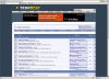
If you look at the top, the bar with THread Tools, Search this Thread, and Display Modes does not render properly at all. You click on a drop down. Thread tools displays properly, Search thread is clipped on the right side by an unknown number of pixes. Display modes show highly clipped once. Then if you move off of it and come back, it only displays as a single line. No way you can click something on it (Ironically, the new feature I was most eagre to try!)

Anyone else seeing this, or is it just me? Is it my machine, or TS (And we can all beat Julio with nerf bats until he fixes it?)

My build is: Mozilla/5.0 (Windows; U; Windows NT 5.1; rv:1.7.3) Gecko/20040913 Firefox/0.10.1 :chef:
 
Back