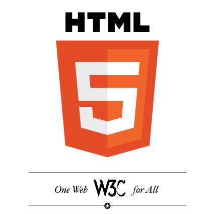
The World Wide Web Consortium (W3C) has unveiled a new logo for HTML5. The logo links back to W3C, the place for authoritative information on HTML5, including specs and test cases.
The logo is meant to be taken and used by all members of the web developer and designer community. You can customize your own badge according to the technology you use, with eight classes to choose from: Device Access, Performance & Integration, Semantics, CSS3/Styling, Offline & Storage, Connectivity/Realtime, Multimedia, as well as Graphics, 3D & Effects. There are even official stickers (you'll need to send a self-addressed, stamped envelope) and $22.50 T-shirts with the new HTML5 logo.

W3C gives the following description as to why a logo is necessary: "It stands strong and true, resilient and universal as the markup you write. It shines as bright and as bold as the forward-thinking, dedicated web developers you are. It's the standard's standard, a pennant for progress. And it certainly doesn't use tables for layout. We present an HTML5 logo."
The logo was designed by boutique agency Ocupop, a firm that focuses on branding, identity, and web design. "The term HTML5 has taken on a life of its own; there has been significant confusion and debate both within the developer community and in the public at large as to what exactly HTML5 is when the term is used outside of simply referring to the spec itself… The standard needs a standard," Michael Nieling, Ocupop's logo designer, said in a statement. "That is, HTML5 needs a consistent, standardized visual vocabulary to serve as a framework for conversations, presentations, and explanations."
https://www.techspot.com/news/42034-w3c-releases-an-official-html5-logo.html