Netflix has updated its Web-based video player, tweaking the look of existing controls and adding a few new ones. You'll notice that the interface is streamlined with all of the controls on a single line, whereas the previous interface was more disjointed with buttons scattered across two lines (there's a comparison below). Also, instead of using words to explain the purpose of each button, Netflix now uses icons.
By cramming everything onto a single line and using icons, the buttons appear more visible. In that same vein, Netflix says the control bar can now scale appropriately no matter where you're watching videos. It gets larger if you go full screen or connect your PC to a TV, and it gets smaller if you shrink the Netflix browser window, such as when you're watching a video while doing something else on your system.
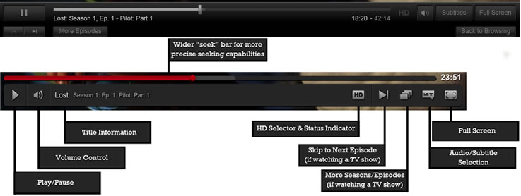
Skipping to a specific point in a video should be easier as the progress bar is notably thicker and finding new episodes should be easier than ever. You can hover over "forward" (beside the HD button) to see a thumbnail of the next episode as well as its description, while the button next to that displays a list of episodes in the current season with progress bars showing how much of each video you've watched.

Image via Gigaom
When a video is paused, the player now displays a translucent overlay with information about the content you're watching, including show and episode titles, season and episode numbers, as well as a description of the video. Netflix says one of the biggest changes is the "back to browsing" button's location. Instead of being tucked into the bottom right of the control bar, it now prominently appears in the top left.