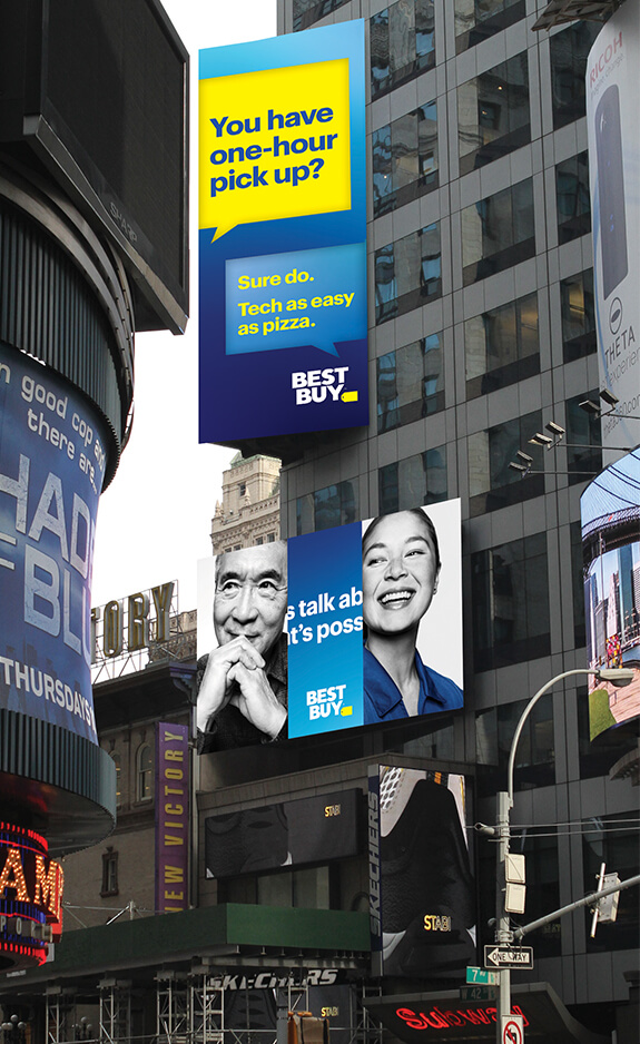
Consumer electronics retailer Best Buy on Wednesday launched a refreshed logo as part of a revised marketing strategy that also includes a new overall look and feel with updated colors, photography and "conversational language."
As you can see, the company's iconic yellow price tag has been put on a diet and now plays second fiddle to the large "Best Buy" text that appears front and center in a clean, bold font. Best Buy says the logo is now more modern and easier to read, especially in today's digital world. I can't agree more.
While iconic, the giant price tag logo felt quite dated, especially in today's modern retail landscape where brick-and-mortar stores aren't the dominating forces they once were. Of all the tech rebrands I've seen in recent memory, this is by far my favorite.

Best Buy Chief Marketing Officer Whit Alexander described it as an evolution toward the future.
The new logo is already being featured on Best Buy's website and in digital and TV ads and will soon be added to uniforms, signage and shopping bags, we're told.
Best Buy's new commercials, meanwhile, were directed by Academy Award-winning director Errol Morris. They were shot in black and white with the only color being the bright blue of the Best Buy employees' shirts. Look for them to debut on May 13.
