The big picture: Health concerns aside, the Covid-19 outbreak and resulting mitigation efforts are proving to be a fascinating case study in cause and effect. Change one thing in an equation and suddenly, you're witnessing a domino effect that impacts dozens of seemingly unrelated industries.
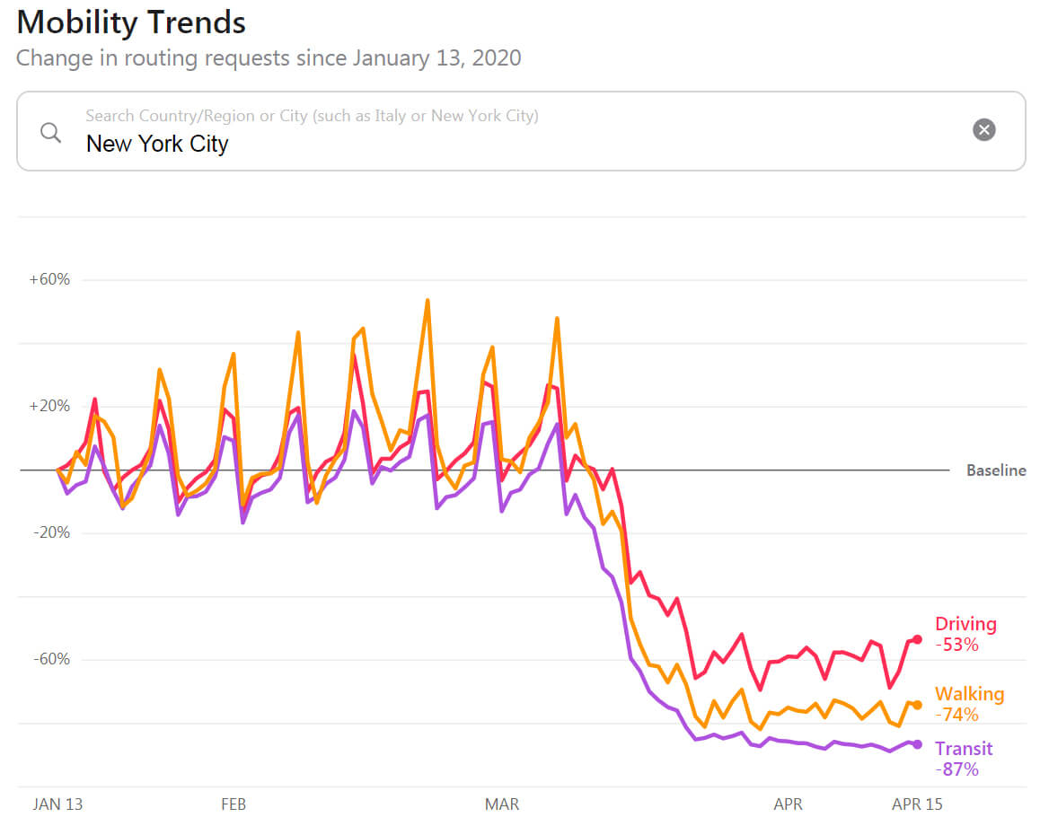
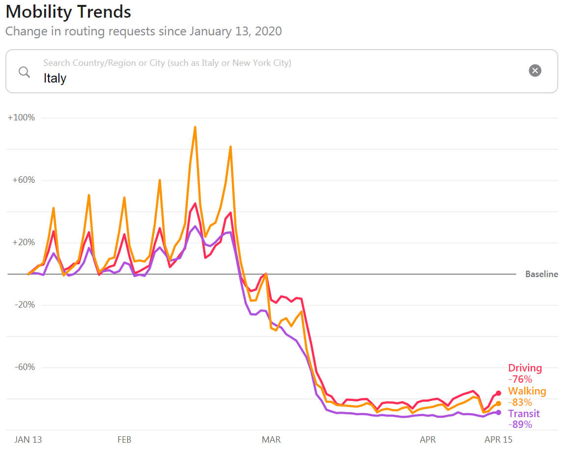
To help visualize what stay-at-home orders actually look like, Apple has published daily reports based on requests for directions in Apple Maps. With fewer people venturing outside the confines of their homes, requests for directions have predictably dropped. The suddenness of it all and the steep curves, however, may surprise you.

In New York City, one of the world's most populated regions, we can see that behavior really started to change in the first week of March. Just a couple of weeks later, transit direction requests were down a staggering 87 percent as the city effectively slow down.

The impact is even greater in Italy, one of the countries hit hardest by the Coronavirus. Here, we see that requests for mapping data started falling off near the end of February with all three modes of transportation having essentially flatlined since the middle of March.
Google is also sharing community mobility reports to help users and public health officials understand responses to social distancing guidelines. These are posted in the form of downloadable PDFs; in the US, for example, you can browse reports by individual states.
Masthead credit: Joshua Lombard
